Romantic’s Surprising Best Colors

Romantic beauty communicates love, passion, and luxury.
So Romantics are stunning in deep, emotional colors, like red.
As to the essence’s other best colors… they’re a little more surprising.
Below we’ll uncover:
Romantic’s ideal and less ideal colors
How the essence can work with any season
How to combine your colors for breathtaking results
Part 1. Your Best Colors
Romantic’s absolute best color?
Pink?! (And red, too.)
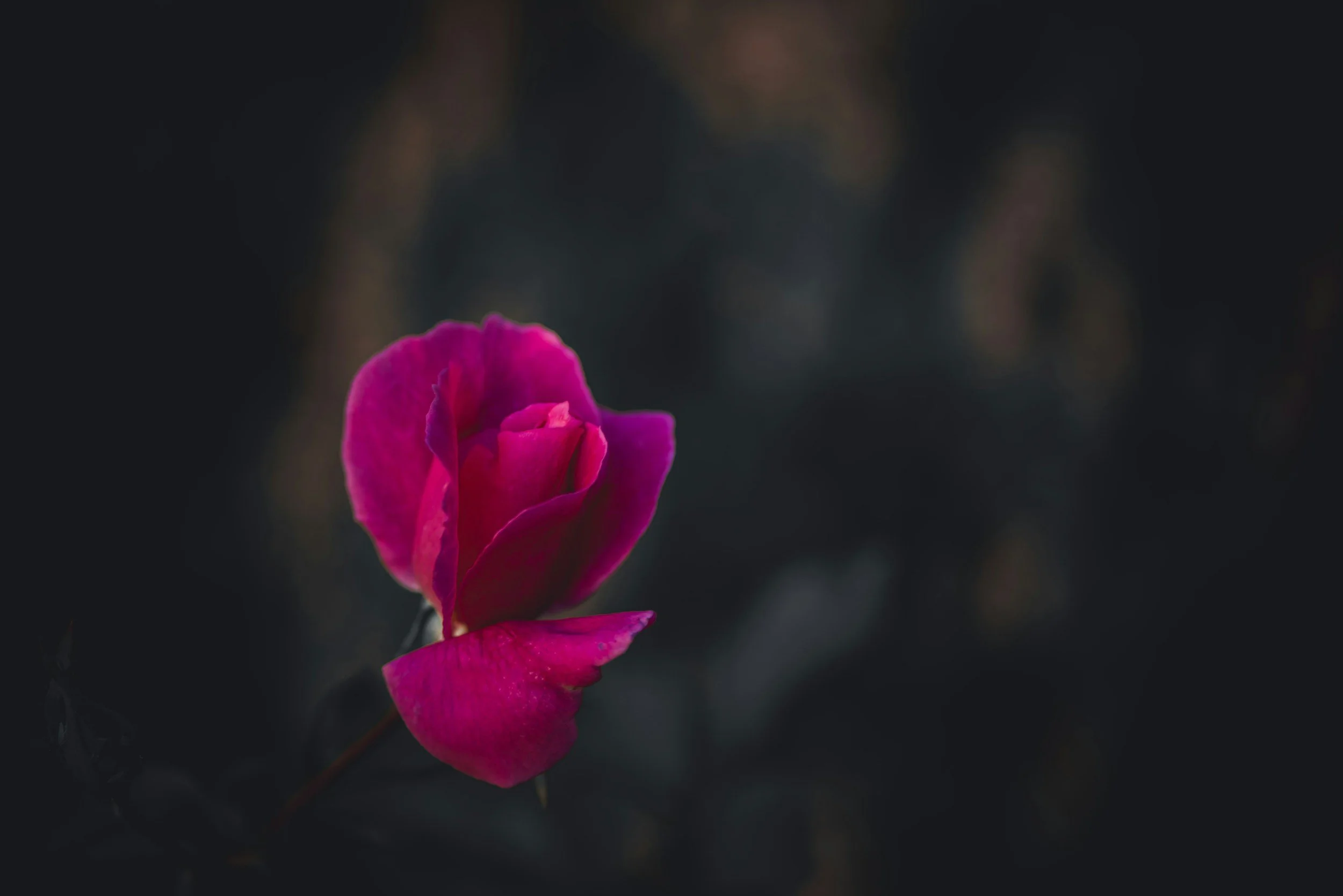
Especially deep, vivid reddish pink.
This might seem shocking, but here’s why I don’t think it’s too outrageous:
Red definitely symbolizes love. But the intense color can also represent dominance, aggression, and other qualities that don’t exactly feel loving.
Deep pink expresses romance, too, but without red’s aggressiveness.
And this means that deep pink is the slightly better match for Romantic’s soft, sensual beauty.
But, to be clear: red is nearly tied for Romantic’s best color, especially your palette’s medium or medium-dark, most vivid versions.
Really any red is sensational on Romantics.
Romantic’s runner-up best colors?
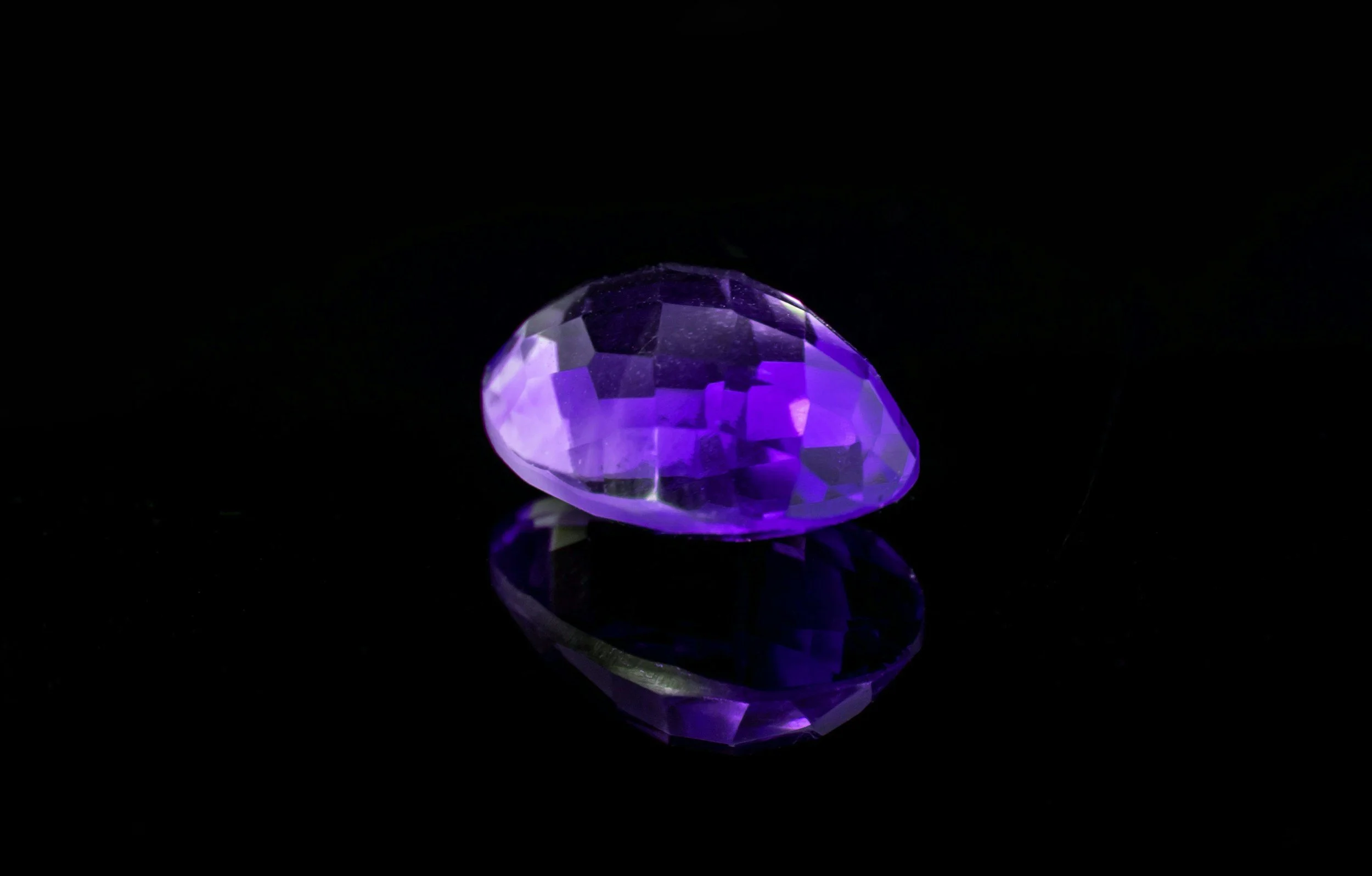
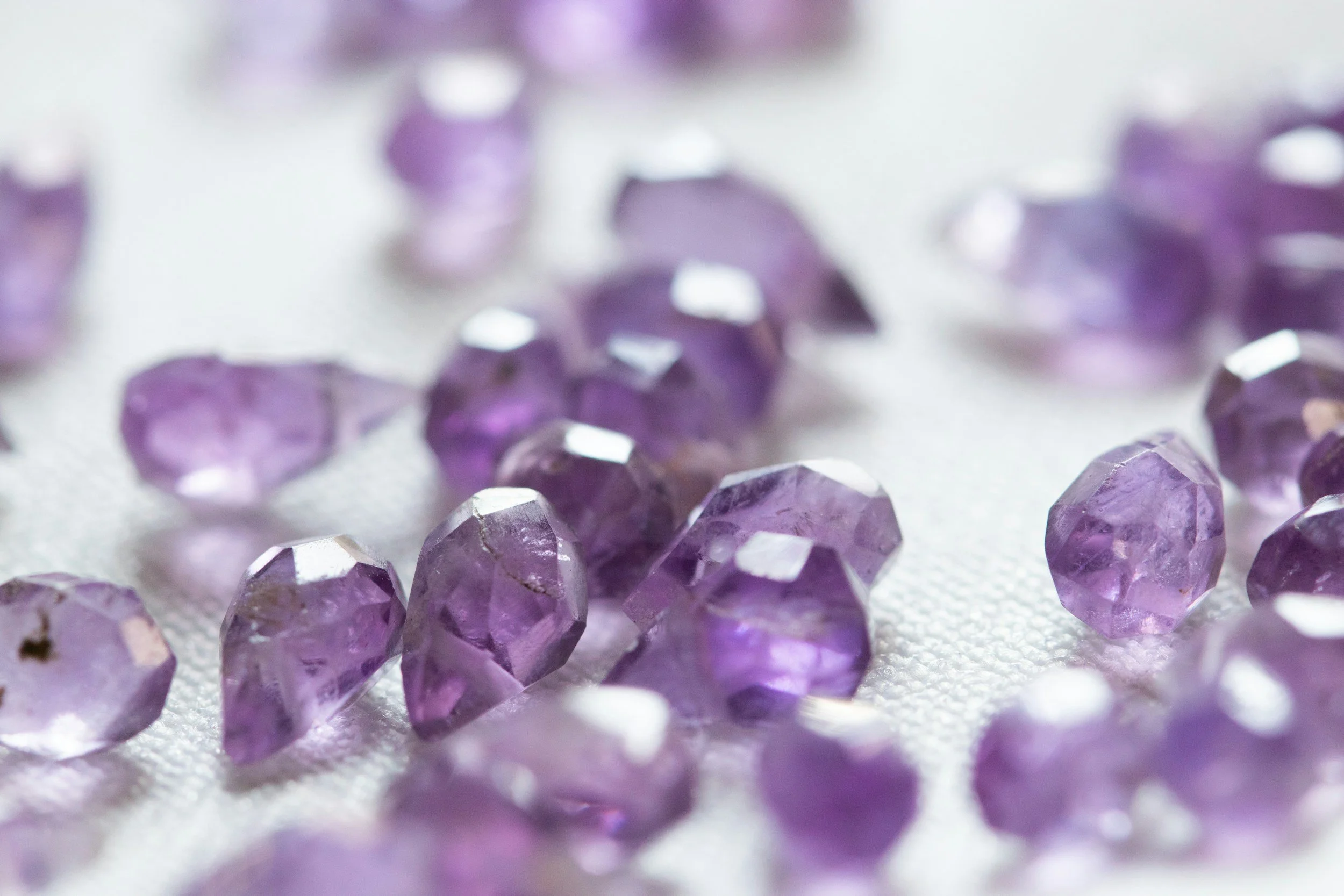
Medium and light pinks, plus medium, dark, and light purples.
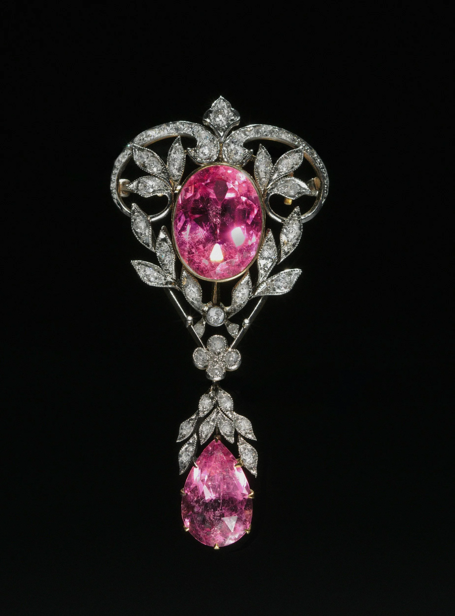
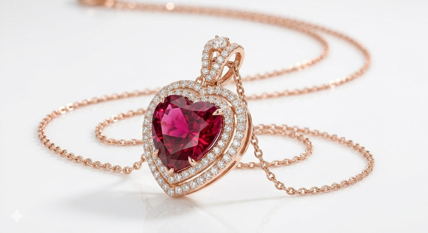
These are the colors of jewels, roses, ripe fruits, and Valentine’s Day outfits—love and luxury.
Another surprise: while light pink is iconically Ingenue, it’s also amazing for Romantic.
This makes sense—pink is symbolically linked to love and affection.
Plus, Romantic prefers contrasting color schemes, like pairing light with dark.
Color contrast expresses the intensity and vacillation of deep emotion.
So, Romantic is great in darker and lighter pinks.
Why purple? The color of royalty, it feels extravagant and elevated from the everyday—just like Romantic.
Other flattering hues?
Corals and medium to deep blues and blue-greens.
These are essentially opposite colors!
Fittingly, they connect to Romantic for different reasons.
Deep blue echoes Romantic’s luxurious side. Think sapphires and blue-green emeralds.
Coral (or pink-orange, or orange-pink) reflects Romantic’s passionate, burning-in-love side.
What about in-between hues?
Romantic is fantastic in red-pink, pink-red, or red-purple (“berry”).
Blended colors communicate the essence’s soft, sensuous nature.
Romantic is intriguing because it tends to feel simultaneously soft and intense.
So with Romantic fashion (and makeup), you’re aiming to express both.
One way to do this is choosing inherently bold colors (like red) that appear softened (like red mixed with pink).
Romantic’s best neutral?
Black, dark gray, dark brown, or whatever your palette’s darkest neutral is.
What other neutrals work?
Light neutrals, like white and light gray. Medium and dark versions work, too.
Compared to colors, neutrals typically feel more subtle.
So to make neutrals express Romantic emotion, the easiest way is to choose the extremes—your darkest palette shades.
Romantic also enjoys color contrast, like pairing dark with light. So, light neutrals can work well, too.
And so can medium! Compared to colors, neutrals feel more “emotionally neutral,” and this neutrality allows them to assimilate into the vibe of any essence, without any conflict.
Is Romantic best in color or neutrals?
Color!
Pinks, reds, purples, corals, and deep blues most flatter Romantic. Compared to neutrals, colors feel more passionate.
That said, neutrals are also extremely useful for communicating Romantic sophistication and maturity.
What colors don’t work too well?
Green and yellow.
Though these colors can sometimes work amazingly.
They tend to work best when they feel conspicuously luxurious, like in elaborate jewelry or shiny textures.
But green (the literal and figurative opposite of passionate red) can also easily feel down-to-earth, especially in casual fabric.
And while there are some scenarios where yellow can really suit Romantic (especially yellow-golds), most yellows don’t have a strong connection to love or glamour.
Do Romantic’s best colors differ based on season?
Nope. Romantic prefers your season’s pinks, reds, purples, pink-oranges, and deep blues—regardless of your specific season.
Part 2. Color Season and Romantic
Romantic truly works beautifully with any season. Here’s how:
Romantic and Autumn: Romantic Poet
Autumn’s defining qualities of warmth and depth are perfect for embodying Romantic passion.
And Autumn’s softness (or “mutedness”) helps embody Romantic’s softer, gentler side.
Merging warmth, depth, and softness, this season/essence combo feels poetic, like hidden or just-beginning love.
The main tricky thing about the Autumn/Romantic pairing is that Romantic’s jewel-like colors are stereotypically saturated.
An easy solution is to choose your palette’s brightest shades, which will feel vibrant enough for Romantic in the context of your personal coloring.
Creating Romantic color schemes by combining your best colors (described below in Part 3) can also ensure that your palette feels passionate.
Plus, the fact that Autumn is muted can even work in Romantic’s favor.
This is because very intense hues—such as fire engine red—can sometimes feel Gamine or Dramatic.
So, the mutedness or “softness” of Autumn palettes helps your colors to read as “passionately in love” rather than “aggressively in love” or just “aggressive.”
Autumns, particularly True Autumns and Soft Autumns, express Romantic’s softer, poetic side.
And Dark Autumns, since their palette has Winter influence, will likely find there’s no conflict between their colors and Romantic’s intense nature.
Here’s examples of Romantic colors for each Autumn—you can also use these as color combinations in your outfits!:
Soft Autumn

True Autumn

Dark Autumn

***
Romantic and Winter: Pure Romantic
Winter palettes have the most obviously Romantic colors—vivid pinks, reds, and purples, plus many jewel tones and dark neutrals.
Winter and Romantic both embody luxury and deep, intense emotion.
Plus, high-contrast color schemes tend to flatter both the essence and the season.
The main issue is that wearing your intense Winter colors can sometimes feel Dramatic.
One easy solution is to focus mostly on your palette’s medium, brightest colors. These are best for Romantic, anyway (whereas Dramatic tends to favor your absolute darkest shades). So this is often sufficient to make Winter feel un-Dramatic.
If you’re still concerned, another solution can be to wear a lot of pink, since pink isn’t exactly Dramatic’s favorite color.
You can also combine your best colors to create “Valentine’s Day” color schemes, which again won’t really scream Dramatic. More on that in Part 3 below.
Finally, the truth is that there is some overlap between these two essences’ flattering color pairings, like red with black—and that’s ok.
If you’re wearing Romantic silhouettes and/or fabrics, then your impression will generally be Romantic, not Dramatic—even if the color scheme could also suit Dramatic.
Here’s some of Romantic’s best colors for every Winter. Each two-color combination can also be used in your outfits:
Bright Winter

True Winter

Dark Winter

***
Romantic and Spring: Passionate Romantic
When warm, vibrant Spring meets Romantic, it feels like infatuation—dizzying, electrifying, all-consuming love.
So this is a natural match—particularly for Bright Spring, with its Winter influence.
If you’re a True or especially Light Spring, you might feel that your colors appear somewhat light compared to Romantic’s iconic jewel-like hues.
The simple solution is to focus on your darker colors and neutrals, while also incorporating some amount of your lighter hues, to add the contrast that Romantic wants. In the context of your coloring, this will feel very Romantic.
If you prefer to wear your lightest colors, that works, too. Light pink and purple do suit Romantic.
They can also feel Ingenue, but it’s ok if you end up creating a color scheme that could suit either Romantic or Ingenue, since there is overlap in these essences’ flattering colors and color schemes.
If you’re wearing at least some Romantic silhouettes, then your colors will tend to read as Romantic on you, even if they could also suit Ingenue.
Here’s some of your best Romantic colors. These two-color examples are also colors that you can combine in outfits!:
Bright Spring

True Spring

Light Spring

***
Romantic and Summer: Dream Romantic
Summer is fantastic for evoking Romantic’s soft, sensual beauty.
In fact, if we think about the other “soft,” curving essences—Ethereal and Ingenue—they tend to be a more natural fit with Summer than any other season.
This is because Summer colors are iconically gentle and delicate.
So, Summer represents a calmer but still emotional side of Romantic—Romantic in a euphoric, dreamlike experience of blissful love (vs. the high-energy, hyper-in-love, infatuated side of Romantic that Spring more easily embodies).
And since Summer leans cool and light overall, there’s less chance that even your most intense colors, like deep red, will create a bold Dramatic or Gamine feel.
So, Summers pinks, reds, and purples are amazing for Romantic, especially since many of your colors feel inherently blended— reddish-pink or pinkish-red.
You may find that it’s helpful to focus on Romantic’s very best and runner-up best colors as a Summer. Colors like blues and neutrals can work, too, although can also easily create a more understated Classic, Ingenue, or Ethereal impression.
However, you can still look amazing by wearing those colors in iconically Romantic silhouettes or fabrics.
Here’s some of your best Romantic colors. Each two-color example also represents colors that you can combine together in an outfit:
Soft Summer

True Summer

Light Summer

Part 3. Color Combining
Romantic has a wide range of options for color schemes.
The following guidelines can be a good starting point, but you should feel free to experiment with other combinations, too:
Colors or neutrals?
Colors generally feel more Romantic than neutrals.
But completely colorful outfits can sometimes feel playful or youthful. They can work, but it’s often easier to create a Romantic outfit by including notable color and neutrals:
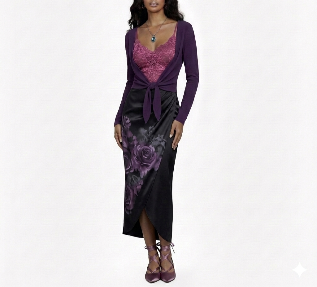
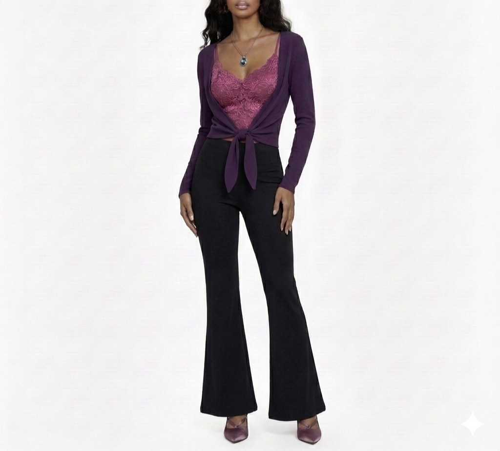
One of the most basic Romantic outfit formulas, which has infinite variations, is a dark neutral skirt or pants with a lighter top and medium-dark sweater. This allows for both contrast and cohesion.
Romantic Ethereal blends are flattered by soft flared pants.
Wearing a highly or entirely neutral outfit can also work, especially dark neutrals—these can express intensity and luxury, reading as put-together and chic.
If you wear a mostly neutral outfit, you could optionally bring in color around your face, especially in elaborate jewelry.
How to combine colors?
Like Ethereals, Romantics are gorgeous in tonal color combinations, like pairing lighter and darker pinks or reds in the same outfit:

People often pair red with pink on Valentine’s Day, but if you’re highly Romantic, you may want to do so year-round.
If you have lower contrast coloring, you can choose colors that differ more subtly in darkness, like pairing light with light-medium or light with medium.
If you have higher contrast coloring, you can try light with medium-dark or light with dark.
Romantics are also stunning when they wear two of their best colors in the same outfit—like a pink top layered over a purple top:

You can choose colors of similar darkness, as seen above, or vary the depth of your colors, like pairing a light pink top with a deep purple skirt.
Romantics are great when they pair adjacent colors on the color wheel, since this easily creates a soft color transition (as opposed to a harsh, color-blocked effect).
But Romantics can also be amazing in far-apart color combinations—even something as seemingly wild as deep blue with coral, or hot pink with teal:

This can be surprising, because we tend to think of this sort of extreme color-combining as playful (Gamine).
The reason this can flatter Romantic seems to be that Romantic loves elaborate, eye-catching fashion. That’s part of why Romantic generally prefers wearing your season’s most vibrant palette colors, and it’s also why Romantic can be flattered by pairing complimentary colors, like orange with blue or yellow with purple—because these opposite colors tend to be eye-catching and make the individual colors stand out more.
The catch is that compared to adjacent colors, it can be a trickier to combine far-apart colors without creating a playful feel. Some methods for making it work:
Do complimentary color combinations in outfits that contain at least some highly Romantic fabrics (e.g., satin, floral lace) or silhouettes (e.g., sweetheart neckline top, wrap skirt), to signal that you’re creating a Romantic impression. You can also do one of your colors mostly or entirely as jewelry, which again can signal that this is an elaborate Romantic look, rather than a playful one.
A safe way to combine opposite colors is to pair gold or yellow gold with blue or purple.
Red paired with blue can also be a safe way to experiment with more extreme color-combining.
Since Gamine tends to favor medium colors, sometimes choosing one of your colors as quite light, and/or one as quite dark, can also help to create more of a serious Romantic feel.
But since Romantic also tends to be most flattered by medium (or medium-dark) colors, you can also be great in pairing two medium colors together.
Romantics can also pair three or more different colors in the same outfit. The safest way to do this is by pairing reds, pinks, and purples. But you can also expand and try farther apart colors, especially if you incorporate some of the colors in relatively small amounts:

Gold and silver are great for Romantic, especially as jewelry, such as large hoop earrings.
Fashion guidelines don’t always apply directly to makeup, so makeup will be a separate topic. But Romantic’s pinks and reds will generally be flattering on you in makeup, too!
***
Upcoming posts will explore the best colors and color combinations for the remaining essences!