Classic’s Surprising Best Colors
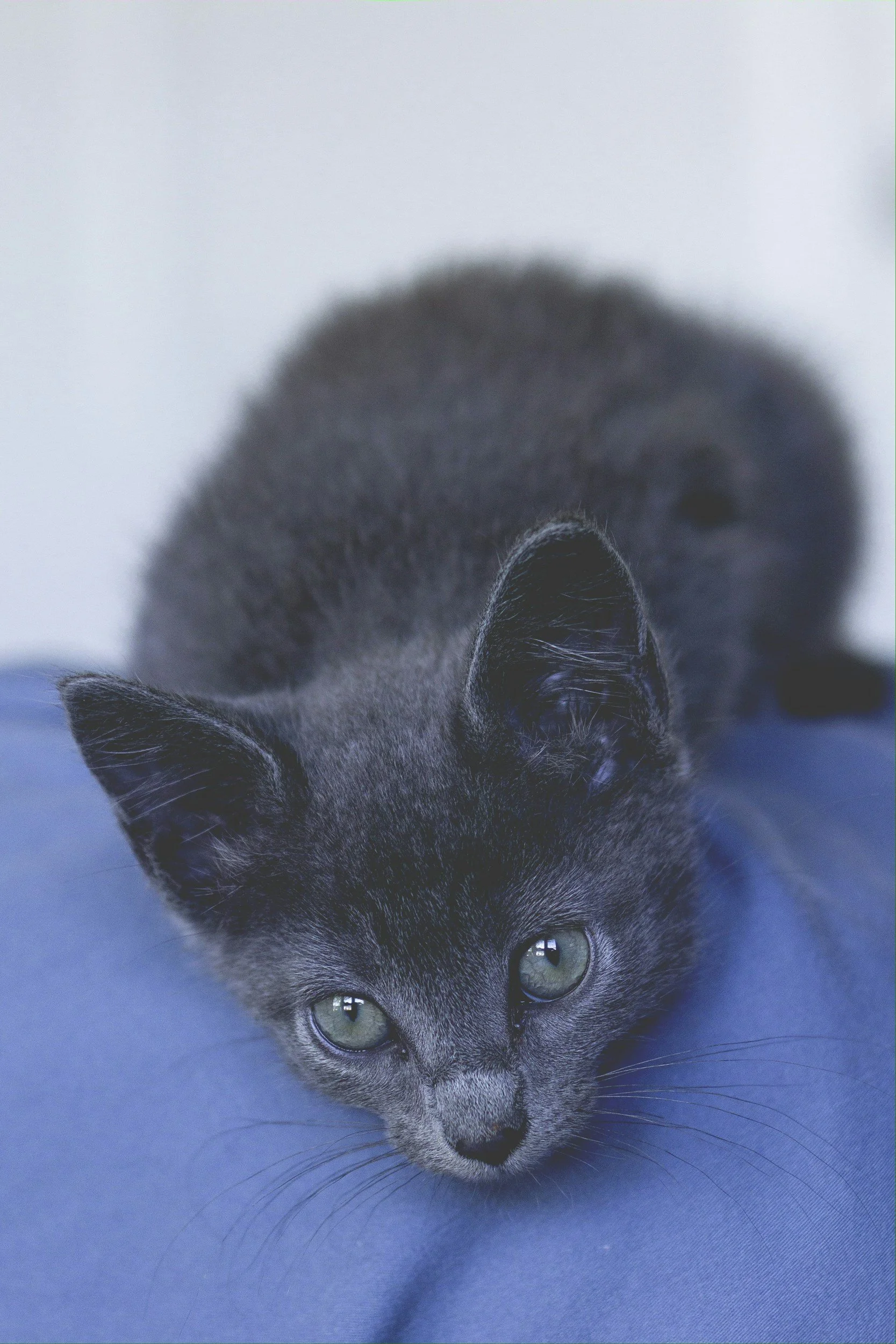
A Classic color scheme and classic adorable cat pic.
So far, it seems like the style essences decisively prefer colors over neutrals.
Does Classic—with its sophisticated, chic, timeless beauty—finally defy this pattern?
Below we explore:
Classic’s ideal and less ideal colors
How Classic can harmonize with any season
How to combine your colors for mesmerizing results
Part 1. Best Colors
Classic’s absolute best color?
Blue.

Especially medium blue, since Classic loves moderation.
Classic is more flattered by color than neutrals??
To my eye, yes. Any shade of blue—from very light to very dark—tends to suit Classic more than any neutral.
This may be surprising, but it makes sense when we consider that compared to neutrals, colors are the better communicators. Colors generally feel more emotional, evocative, and expressive.
So, compared to neutrals, blue is better suited to express Classic’s calm, content, dignified feel.
But… aren’t neutrals amazing for Classic, too?
Yes! This leads to:
Classic’s runner-up best colors?
Medium grays, medium browns, and other medium neutrals.
Plus light and dark shades of gray, brown, and beige. Also extreme neutrals like black and white.
Essentially, every neutral.
This is where Classic starts to look very different from the essences we’ve seen so far.
Ingenue, Gamine, Ethereal, Natural, and Romantic all have at least several colors they prefer over any neutral.
But Classic is unique. Compared to those other essences, it does tend to feel more refined and minimalist. And these are qualities that neutrals (and blues!) are optimally suited to express.
Other flattering hues?
Mint green and red. Especially darker reds like burgundy and maroon, and also true red.
A popular gum and toothpaste flavor, mint connotes neatness and cleanliness.
So mint green embodies Classic’s neat, polished beauty.
And red is the ultimate “power color,” evoking Classic’s professional, corporate side.
What colors don’t work too well?
Kind of a lot them.
Yellows and oranges aren’t ideal—they feel playful, in contrast to Classic seriousness.
Pinks and purples also don’t tend to feel especially timeless or understated.
It’s not that you can’t wear those colors—in fact, in the context of an otherwise neutral outfit, they can sometimes work well. But you may find they aren’t your favorites.
If you want to wear a color that isn’t standard for Classic, it can help to choose an understated version. So instead of a sunny or neon yellow, you could choose a very pale yellow. Or a yellow mixed with neutrals, like a yellow-brown.
Is Classic best in color or neutrals?
Color (blue!)
But Classics are also amazing in highly neutral outfits. More on that in Part 3.
Do Classic’s best colors differ based on season?
Nope—regardless of color season, Classic prefers your palette’s blues, neutrals, reds, and mintiest greens.
Part 2. Color Season and Classic
When it comes to color season, Classic might be the most versatile essence.
Every season and subseason has many blues and neutrals, which are really the main ingredients of Classic’s best color schemes.
There’s not much more that needs to be said about combining Classic with the seasons. But for the sake of thoroughness, and of honoring Classic’s amazing, balanced, and timeless beauty, let’s explore:
Classic and Autumn: Collegiate Classic
Pros:
Autumn’s muted colors connect to Classic’s studious, refined vibe.
The “softness” of Autumn colors makes them especially Classic-friendly.
Cons:
Really no major ones. Though when you’re shopping, you might find that you have to sort through a lot of cool-toned Classic fashion (maybe because compared to warmth, coolness is more stereotypically associated with the formality and “coldness” of corporate environments).
But, you can of course find plenty of Classic pieces in Autumn colors.
Here are Classic color combinations that flatter each Autumn:
Soft Autumn

True Autumn

Dark Autumn

***
Classic and Winter: Corporate Classic
Pros:
A natural match—Winter palettes easily feel dignified, formal, and sophisticated.
The season’s deep, jewel-like hues emphasize Classic’s posh, luxurious side.
Plus, Winter often prefers high-contrast color schemes, and Classic likes them, too—even extreme contrast, like black and white. This emphasizes the essence’s powerful side.
Cons:
Winter enjoys bold colors and color contrasts (like pairing purple with orange, or hot pink with green). But these colors and combinations can feel too attention-grabbing or playful for Classic.
However, you could bring in color contrast in a subtler way, such as in accessories, jewelry, or even makeup.
Some of the best Classic color schemes for every Winter:
Bright Winter

True Winter

Dark Winter

***
Classic and Spring: Modern Classic
Pros:
With your blues and neutrals, you can easily create a Classic feel.
Cons:
Of all the seasons, Spring might be Classic’s least inherent match.
Spring’s iconically bright, colorful outfits feel more playful than serious.
But this isn’t necessarily a con, because wearing your Spring neutrals and blues will still create a very Classic feel.
If you want to add more color, you could experiment with doing so in subtle ways, like with accessories, jewelry, or even makeup.
Some of your best Classic color combinations for each Spring:
Bright Spring

True Spring

Light Spring

***
Classic and Summer: Pure Classic
Pros:
Summer is probably Classic’s most natural seasonal match. Calm, cool, refined, and elegant.
Cons:
When you’re shopping, you might find that Classic fashion often comes in Winter colors, such as true black and white.
But of course, there’s plenty of Classic fashion in Summer colors, too.
Here’s some of the best Classic color schemes for each Summer:
Soft Summer

True Summer

Light Summer

Part 3. Color Combining
One of the many things to love about Classics: they reveal the beauty of context.
For the other essences, wearing head-to-toe neutrals isn’t necessarily an ideal daily uniform—but for Classic, it can be! It feels chic, sophisticated, and truly mesmerizing.
Colors or neutrals?
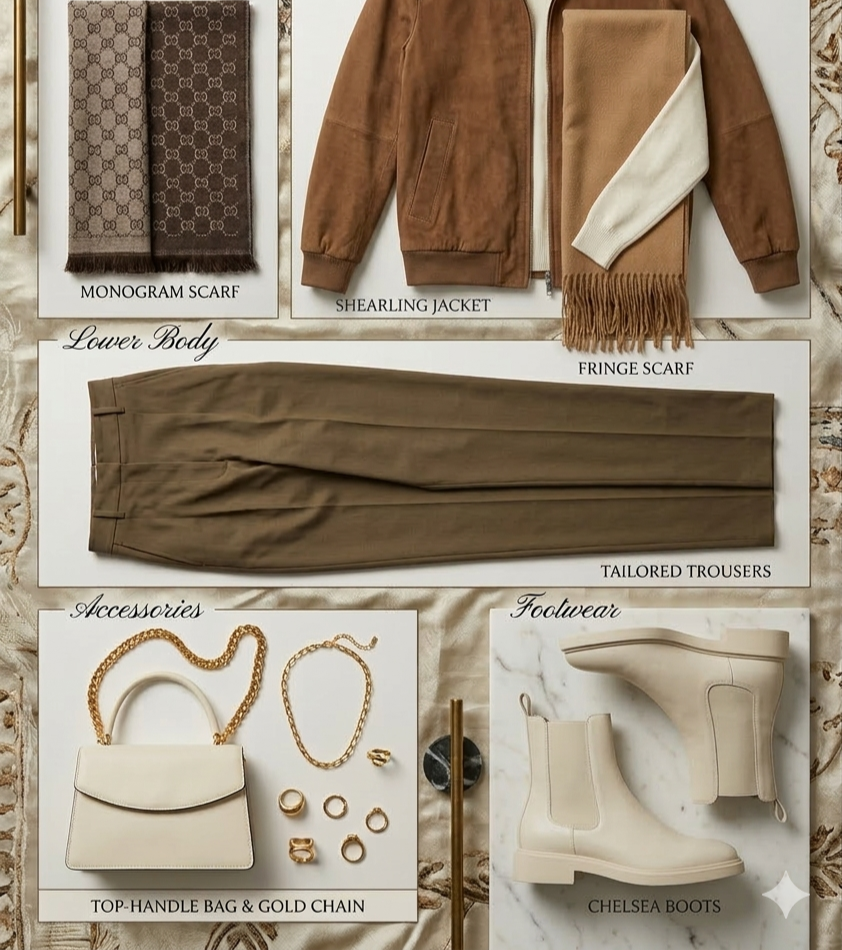
The basic Classic color scheme is blue with neutrals.
Wearing head-to-toe blue can also work—more on how below.
You can look amazing in fully neutral outfits, too, since neutrals are Classic’s (runner-up) best colors.
How to combine colors?
As noted, Classic loves blue+neutrals. While not an earth-shattering, novel pairing, it is absolutely stunning on Classics. Plus, so many people love blue, and blue+neutrals creates a calm, contented vibe
You can even do a highly or entirely blue color scheme.
This often works well when you do a tonal color scheme and vary your shades of blue.
You can also vary your textures. For example, dark blue denim paired with a light blue cashmere sweater paired with a medium blue blazer.
Navy is also great, especially since in fashion, it’s often treated like a neutral.
Head-to-toe neutrals are also fantastic for Classic, again especially in tonal combinations.
Colors as seemingly ordinary as cream, beige, and camel look absolutely stunning paired in the same highly Classic outfit.
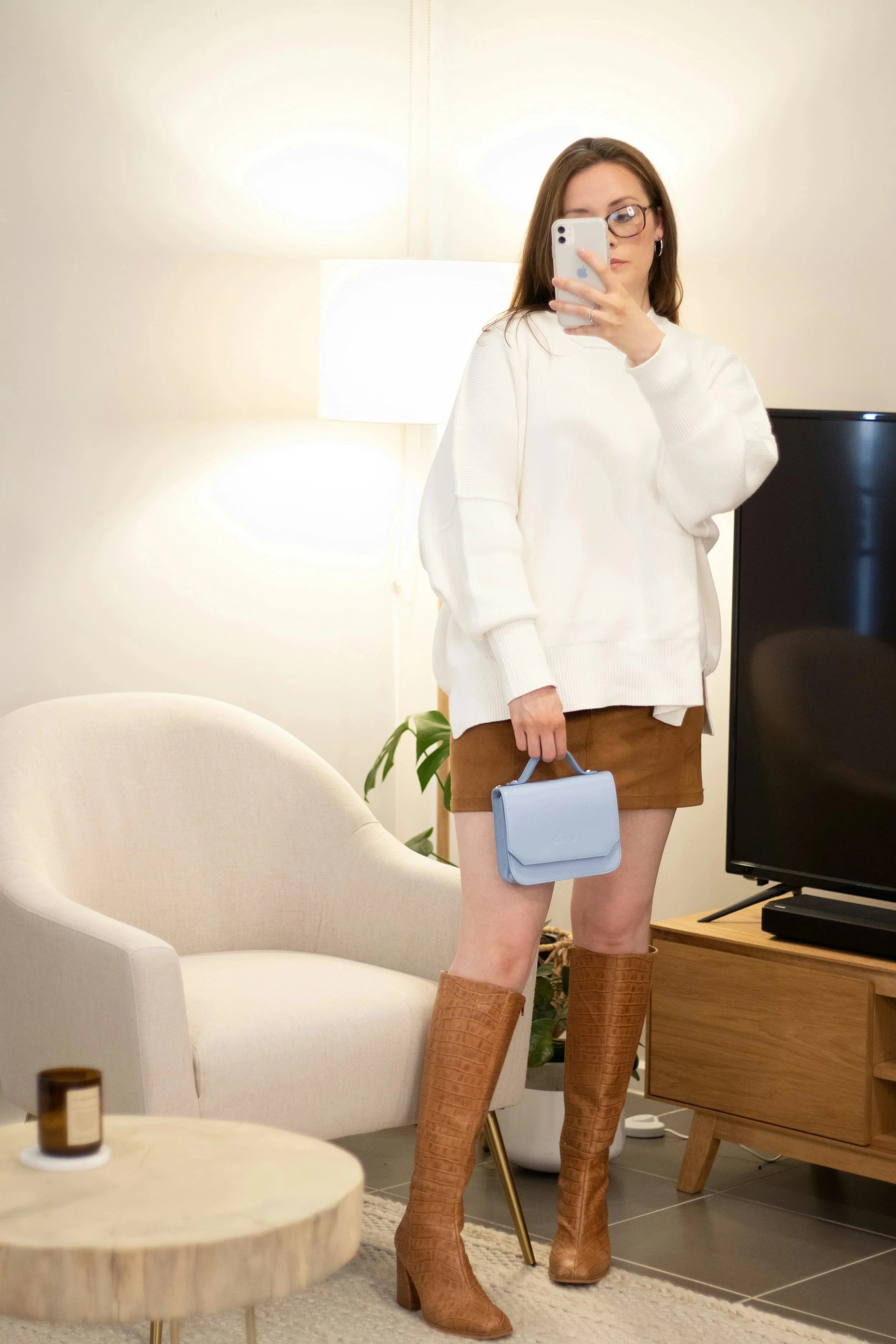
You can also do neutrals with a pop of color blue!
This is a cool look for a Dramatic Natural Classic.
Another option is wearing mint green or red. For best results, pair with neutrals—for example, mint-green button down with gray pant.
Regarding contrast level, Classics have options:
Moderate contrast, like pairing light colors with medium ones, can suit Classic very well, since Classic is an essence of moderation.
High-contrast color combinations also work, like pairing black with white or navy with cream. This emphasizes Classic’s dignified, powerful side.
Low-contrast combinations work, too, like wearing light blue with light neutrals. This tends to emphasizes Classic’s calm, refined side.
Makeup will be a separate topic, since fashion guidelines don’t always translate directly to makeup (and so Classics aren’t necessarily their best in blue eyeshadow or blue lipstick…). But, Classics do tend to be amazing in red lips!
***
Next week’s post will explore the best colors and color combinations for Dramatics!