Romantic Essence Prints
Are Romantics flattered by prints and patterns?
Yes! Especially ornate, intricate versions:
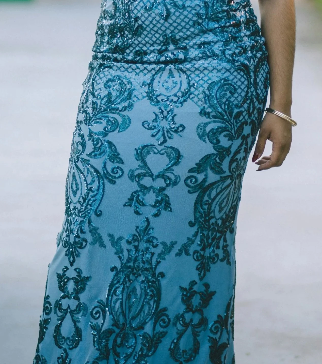
Damask print skirt
Curvy and complex designs help communicate Romantic’s:
Sensuality
Elaborateness
Extravagance
Below we’ll explore Romantic’s best prints… and whether the essence pulls off print-mixing!
Romantic Prints Qualities
Romantic’s iconic prints tend to have these traits:
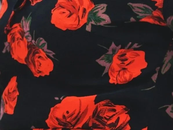
Medium- to large-scale
Passionate in color (dark, vivid, or high-contrast)
Curvy and tapered (typically teardrop, oval, heart, or floral shapes, rather than perfect circles)
But those all have exceptions. For instance:
Sometimes Romantic prints can be small-scale, like small cheetah print
Or be light, muted, and low-contrast, such as a lush rose design in pale pink and ivory
Or incorporate straight shapes, such as in an art nouveau print
Romantic prints go beyond their literal qualities.
What’s most important is that the design feels luxurious, glam, or passionate.
Romantic’s Best Prints
Some of your most flattering options:
1) Florals
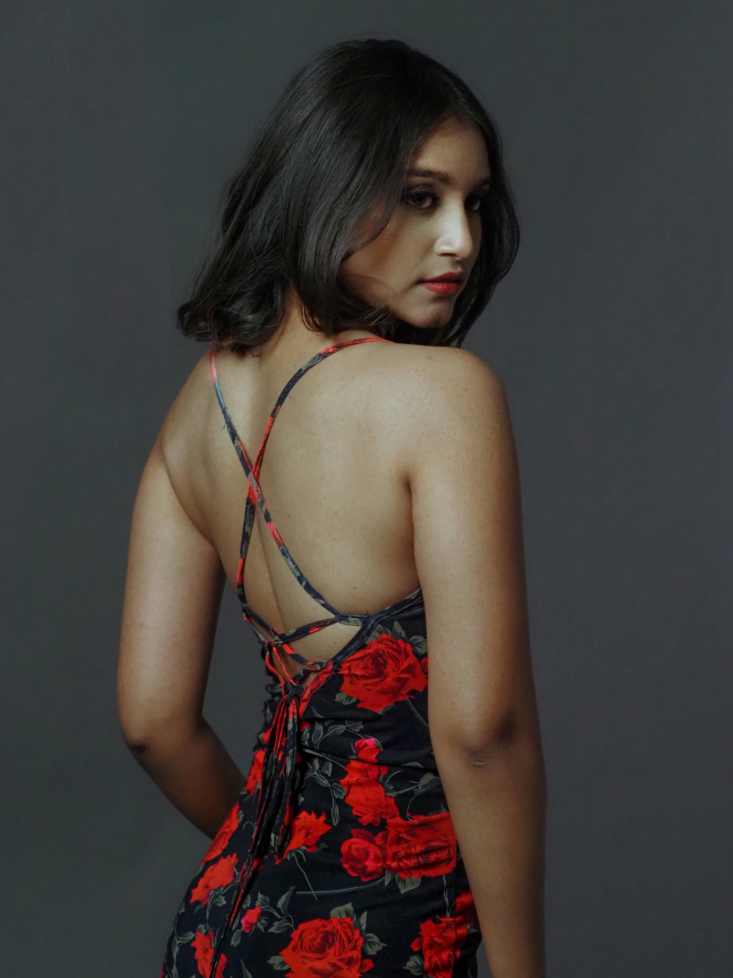
Roses
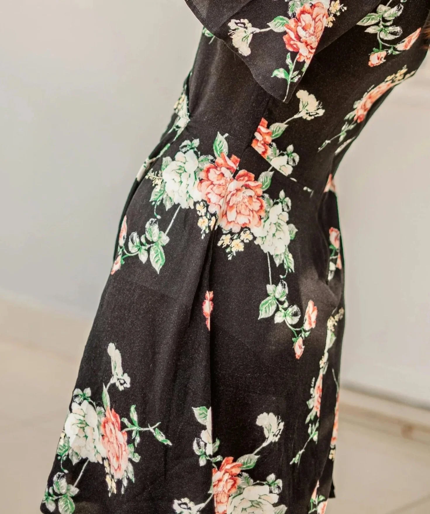
Peonies
Other moderate-to-large, elaborate florals
2) Animal Prints
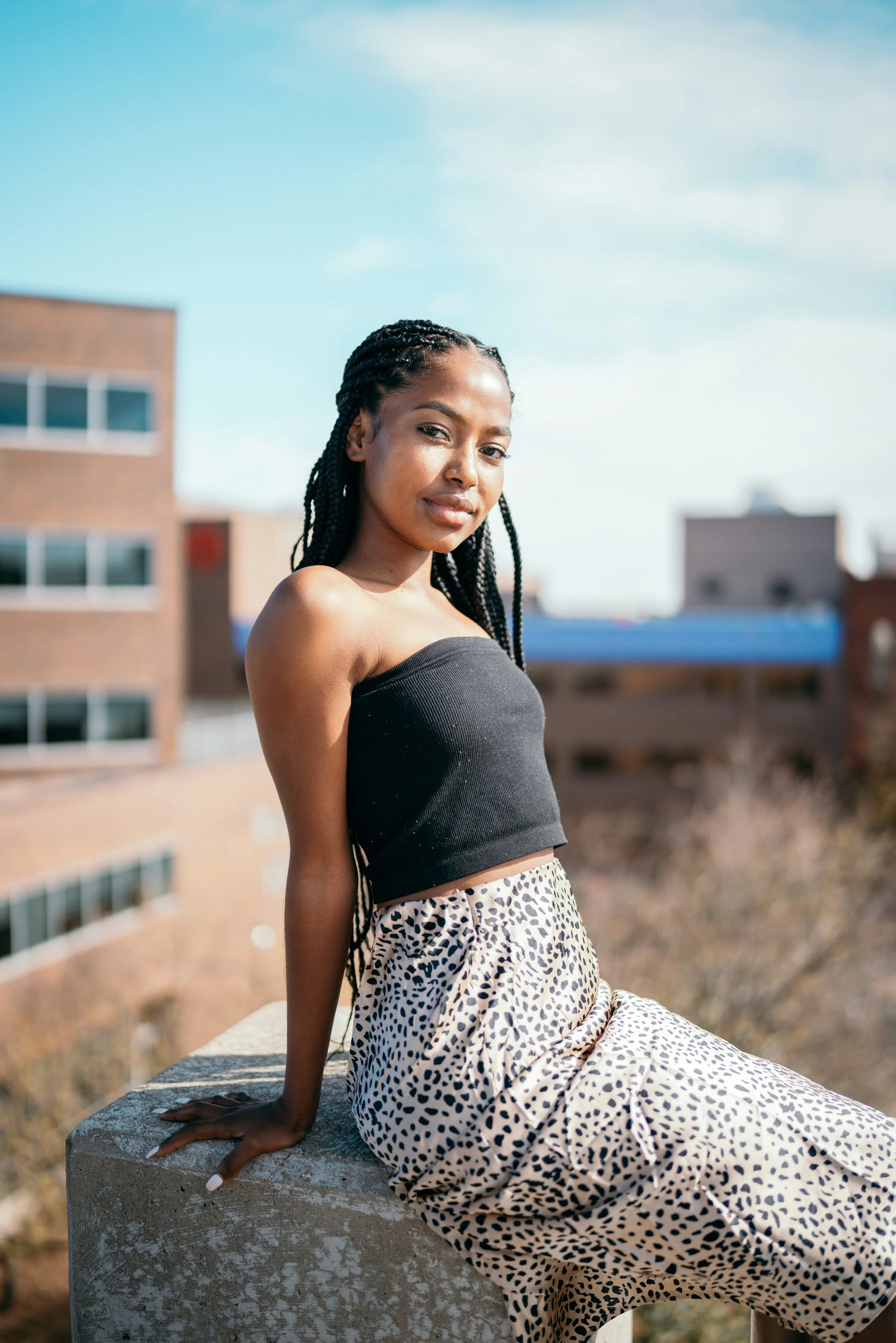
Cheetah
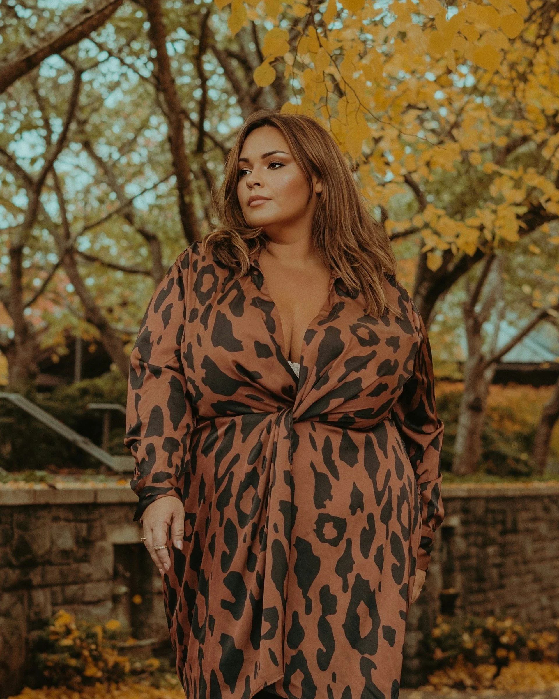
Leopard
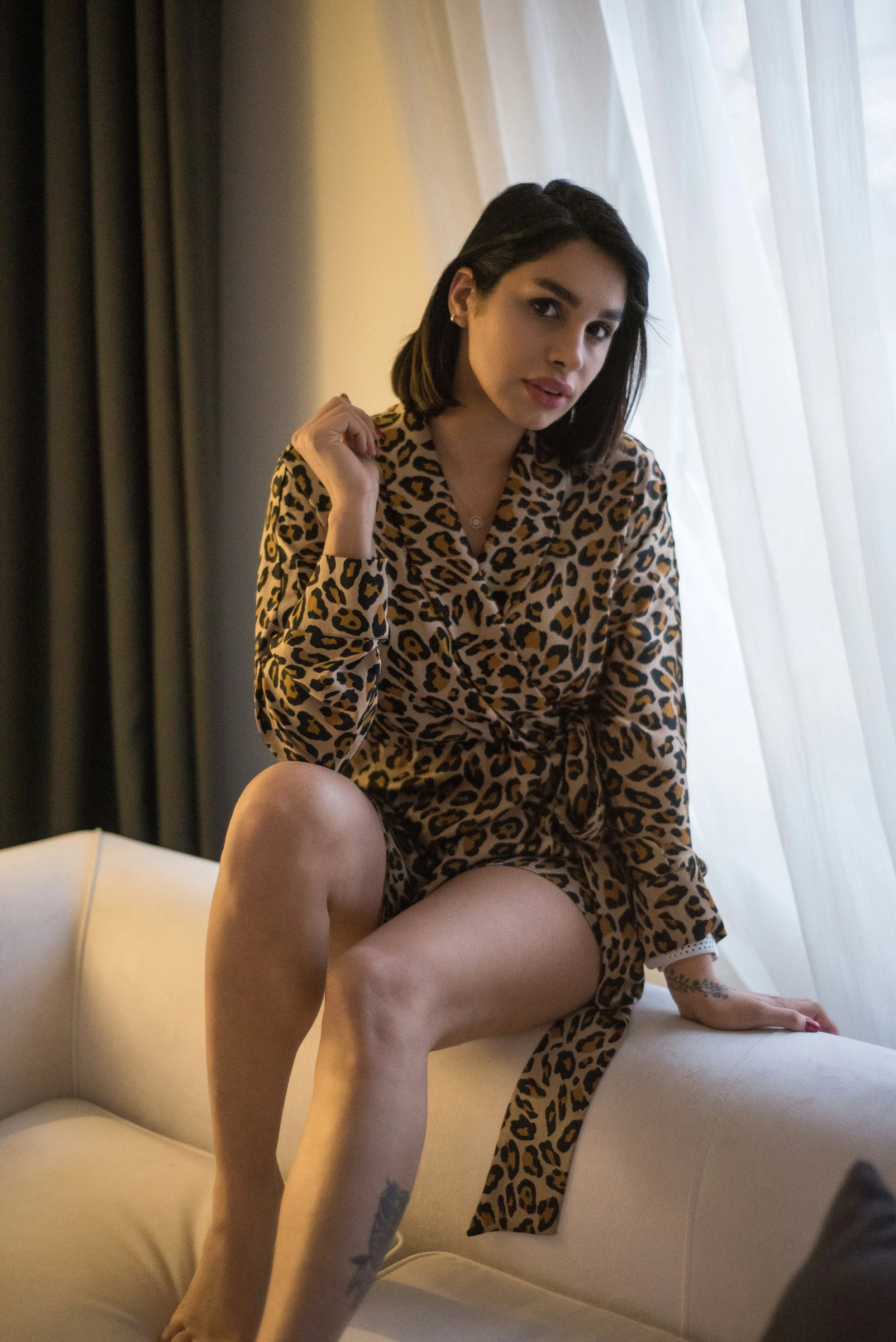
Jaguar
If you’re curious, here’s how to differentiate those animal prints:
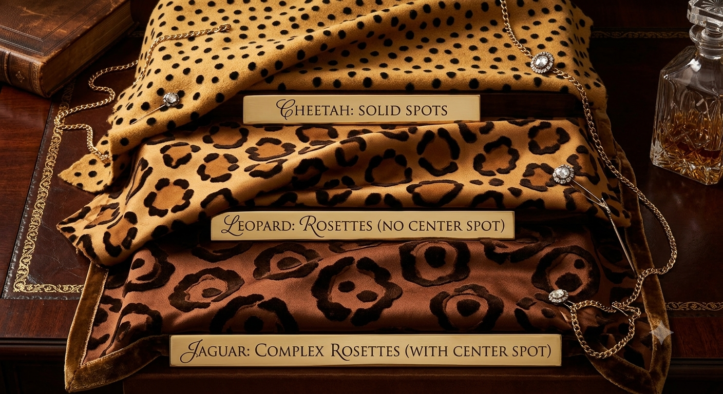
Leopard and jaguar spots are sometimes called “rosettes” in fashion, because these spots resemble the curving shapes of a blooming rose!
3) Ornamental Prints
These styles suit Romantic because they feel elaborate, luxurious, and very curvy:
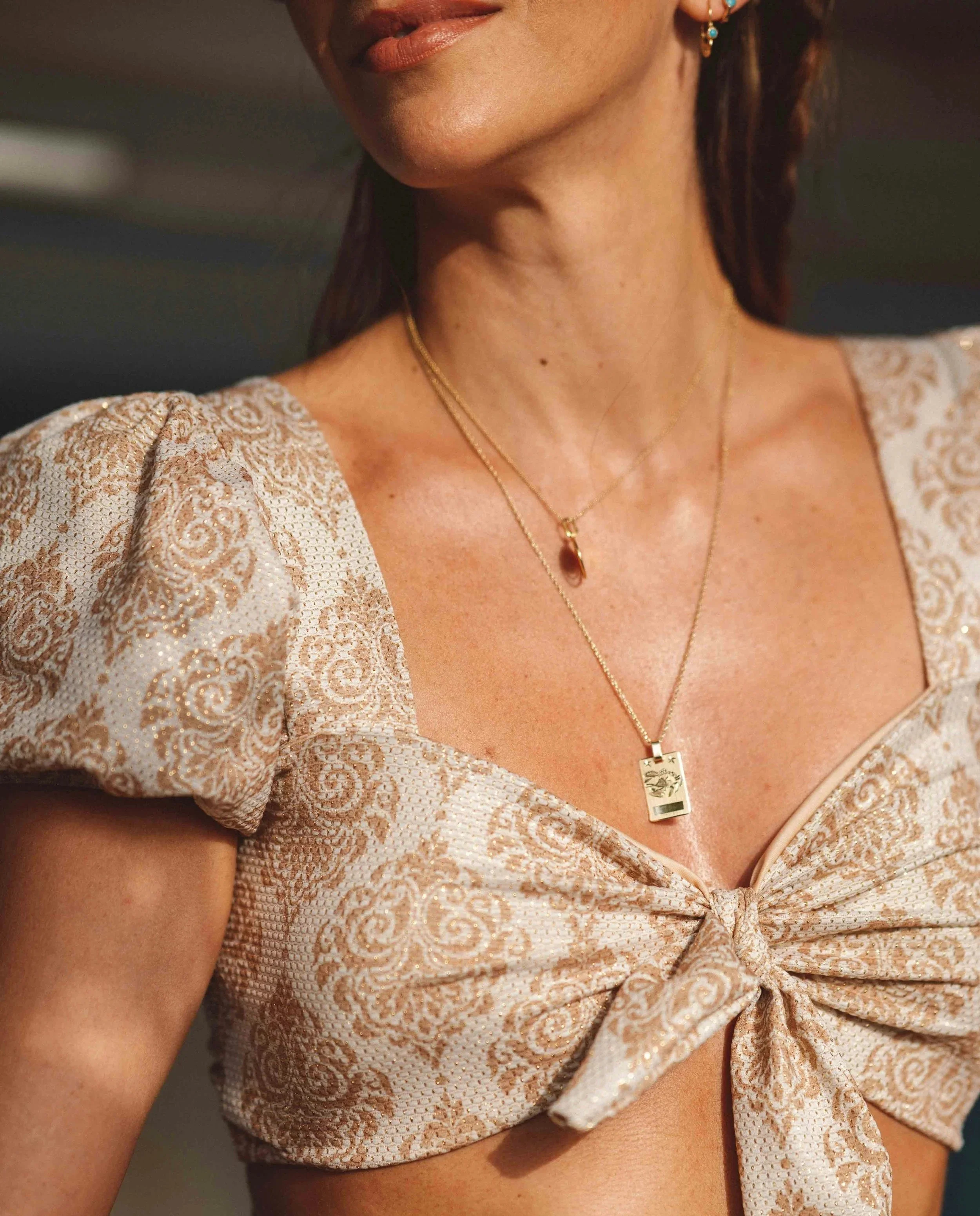
Damask
Baroque Damask
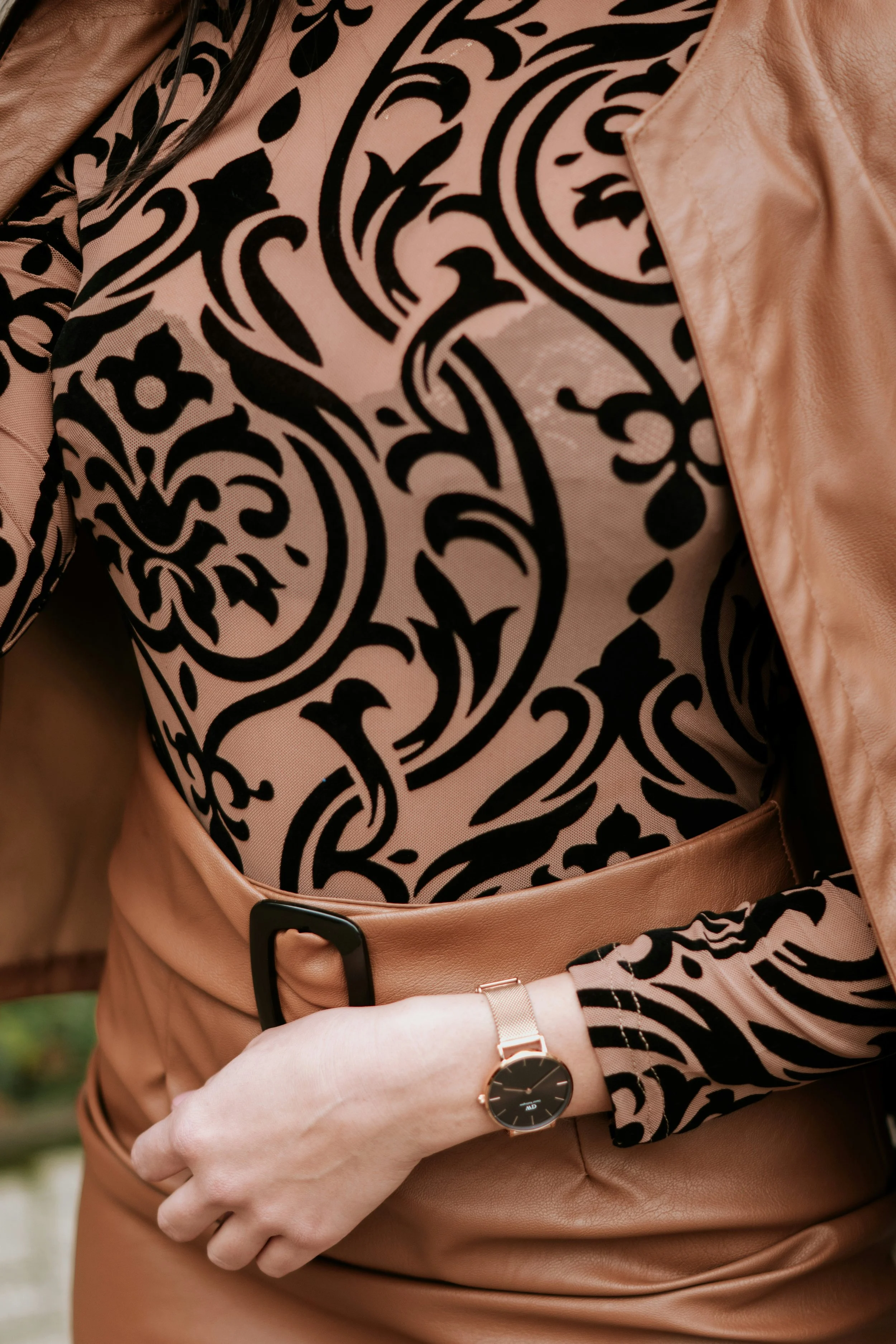
Baroque Scrollwork
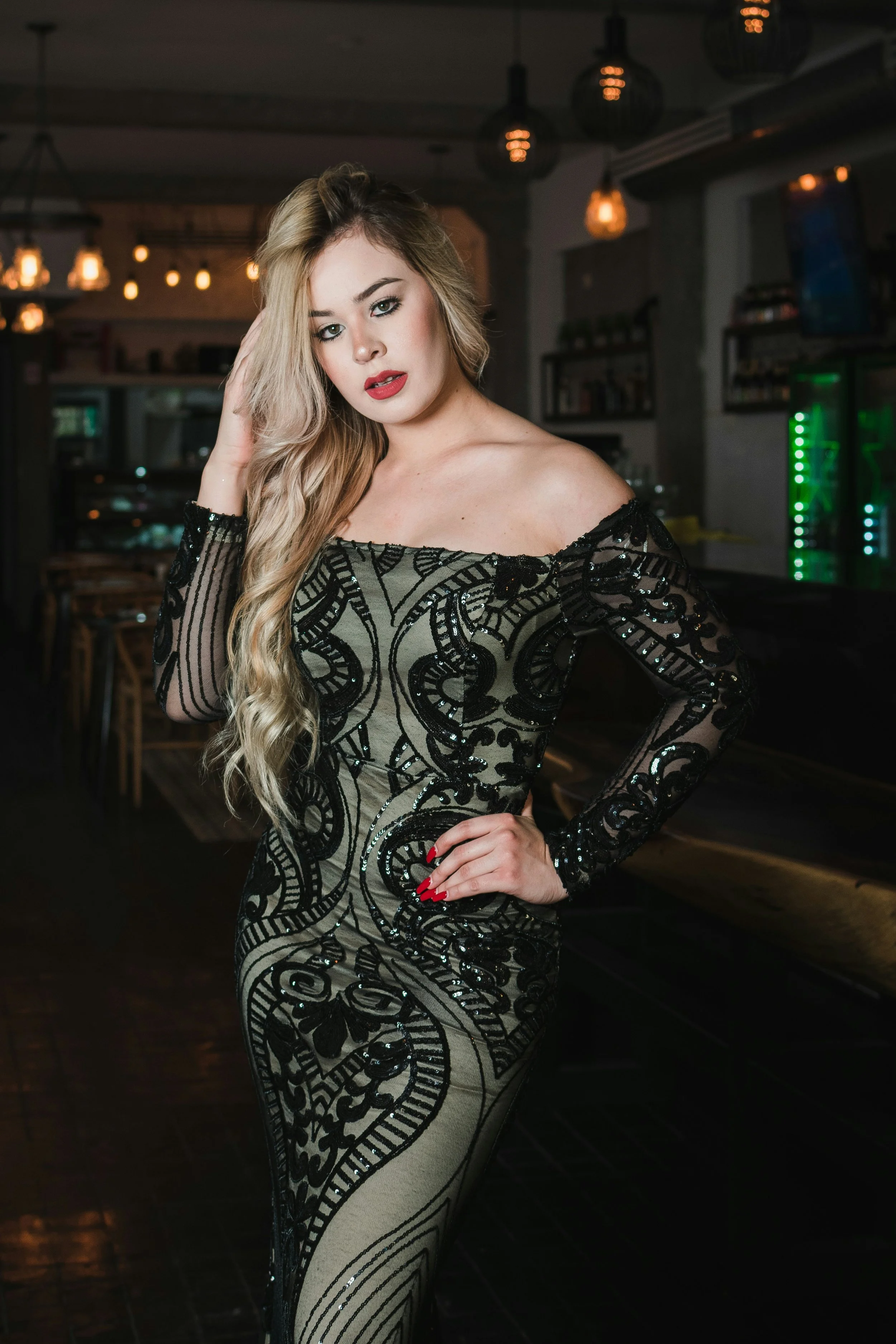
Art Deco or Art Nouveau
Look for versions with full curves. As seen here, smaller amounts of linear shapes can be ok, too, if most of the shapes are curvy, and the overall vibe is glam.
4) Chains
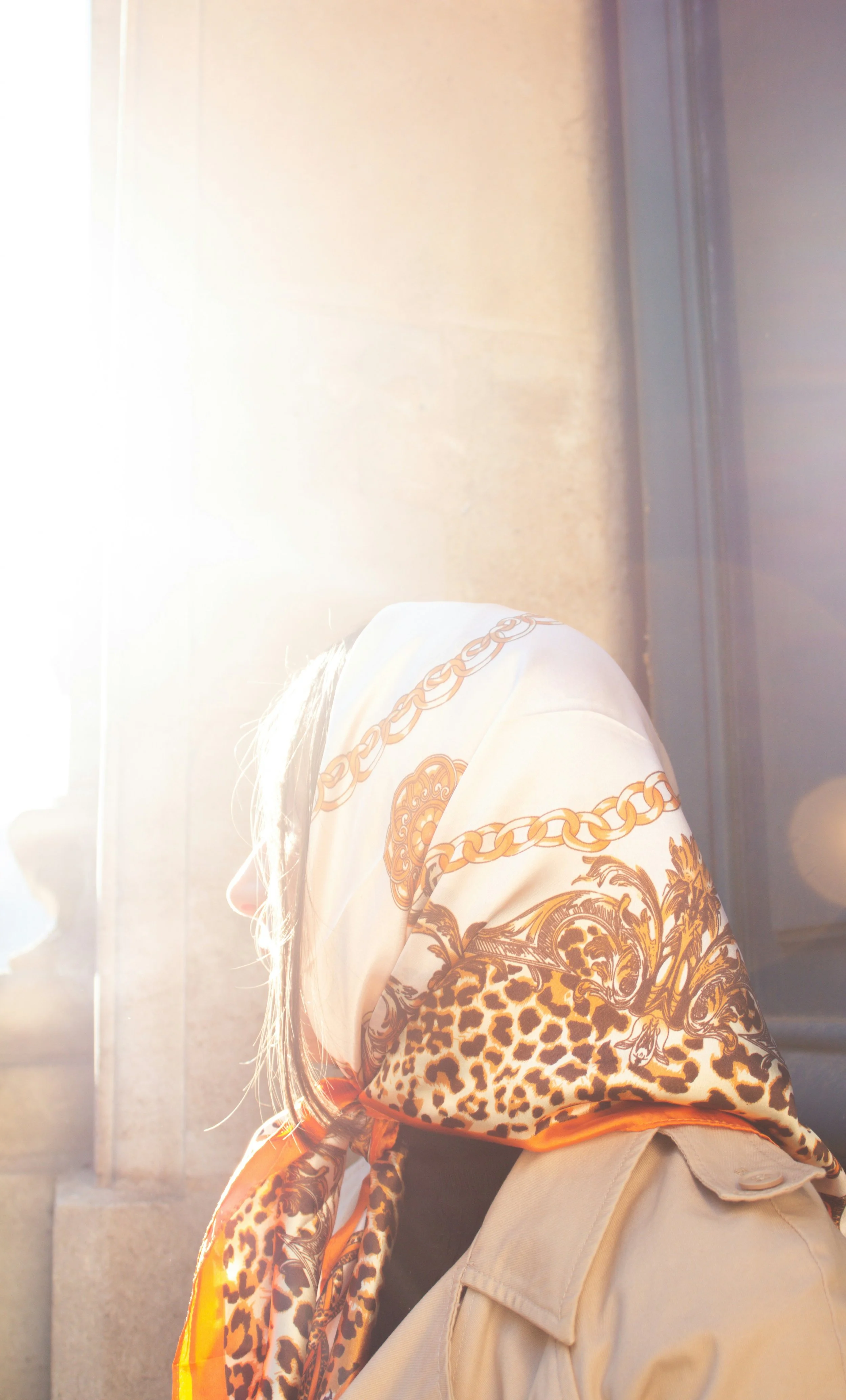
Chain Link
Chain prints sometimes incorporate animal print or ornamental detail, too.
Chain and Floral prints
5) Glam Lettering
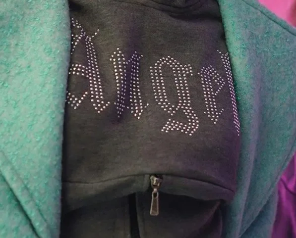
Gothic Script
Especially with rhinestone appliqué
Cursive or other curvy lettering
6) Abstract, Stylized Hearts
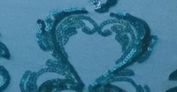
Stylized Heart Design (This is from the blue damask skirt above!)
Simple or cartoon hearts sometimes also suit Romantic (though often they’ll have a youthfulness that adds Gamine or Ingenue)
7) …and More!
Other designs that feel glam or sensual
UnRomantic Prints
If you’re a pure Romantic, you’ll want to avoid many mainstream prints and patterns.
This includes:
Basic stripes, pinstripes, plaids, and geometrics
Tiny florals
Tie-dye
Camo
Polka-dots
But you can likely still wear some of these if you have other essences in your blend.
Why not Polka-dots?
If Romantic is defined by curvy shapes, then why can’t the essence do polka-dots?
This is because perfect circles with well-defined borders often feel playful, youthful, or neat.
So Romantic prefers curvy shapes with tapers (such as teardrops or cheetah), because these feel more mature and sensual:

Curvy, tapered animal prints are awesome for Romantic.
Cheetah is essentially the grown-up, glam version of a polka-dot!
(This is true of the essence’s best sunglasses and eyeglasses, too. Tapered edges and curvy cat eye styles best suit Romantic, whereas round, perfectly circular lenses aren’t ideal. Polka-dots and round glasses are both better for Ingenue.)
Romantic can do prints with perfect circles, but they usually won’t be simple, solid, and polka-dot-esque.
Instead, they’ll incorporate ornate detail, such as in some damask prints.
Romantic Blended Prints
Most people aren’t a pure type. But even if you only have a little Romantic, you can still look great in fully Romantic prints.
You can also choose patterns that combine two or more of your essences, like:
Romantic Classic
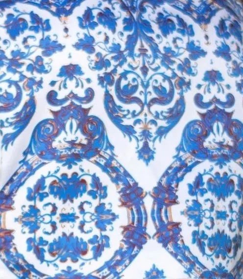
Look for symmetrical baroque or damask styles—Classic loves symmetry.
These designs will typically also suit a Romantic without any Classic. But especially if you choose a version with Classic’s best colors (like blues and neutrals), then they can be adjacent to Classic’s polished vibe.
Romantic Dramatic
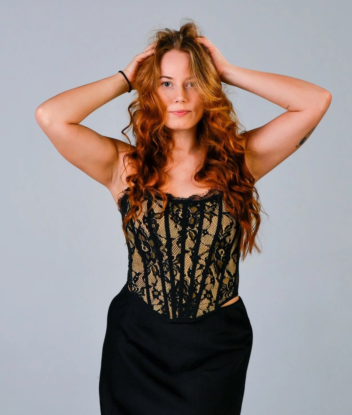
Look for styles that blend florals with large or elongated geometrics
Floral corsets with thick, linear seaming are an amazing option (since both the print and silhouette embody Romantic Dramatic’s smoldering beauty.)
Romantic Ethereal
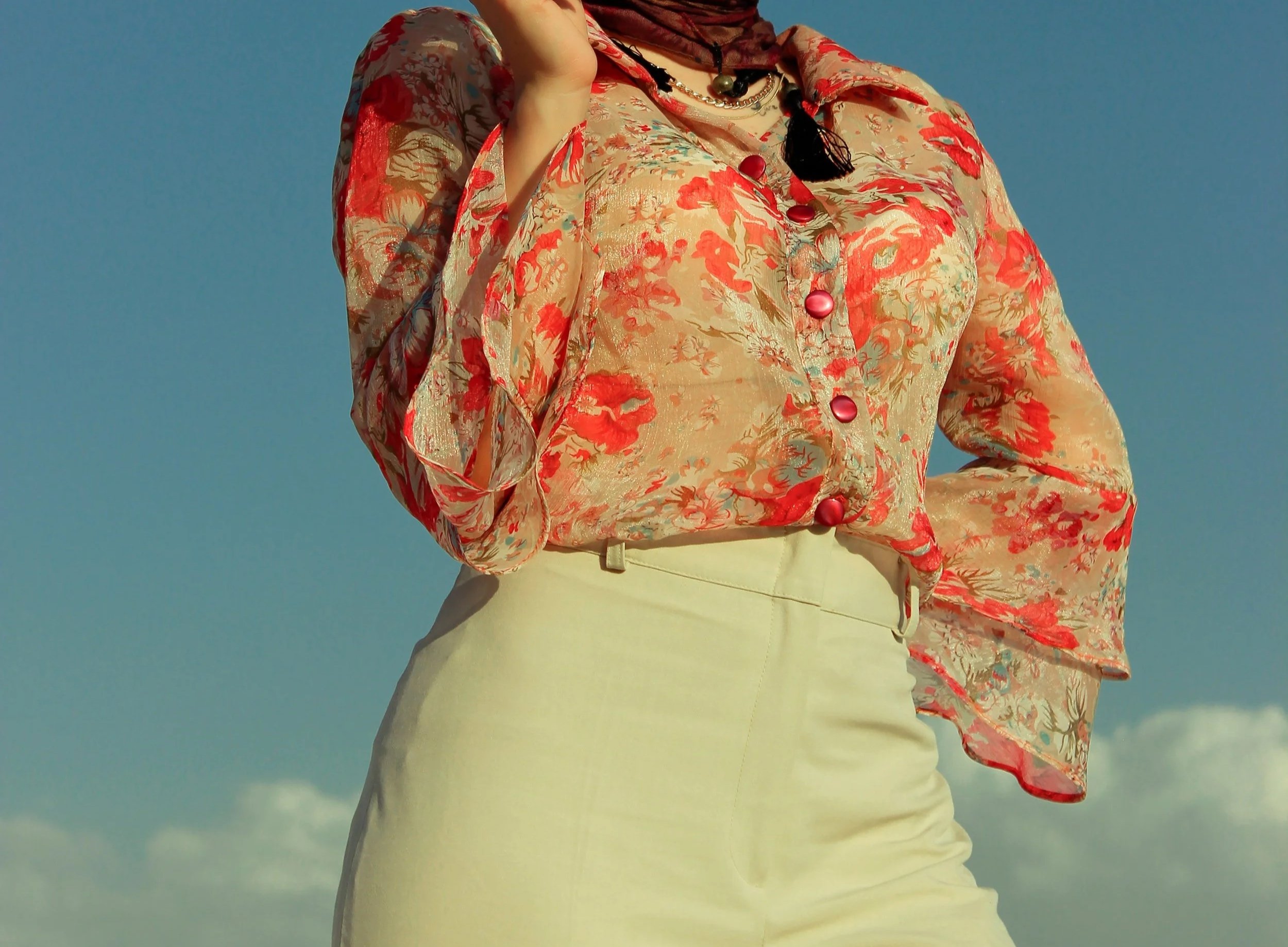
Look for “watercolor florals”—moderate-to-large scale, very curvy flowers (Romantic) with diffuse edges and an abstract quality (Ethereal).
Romantic Gamine
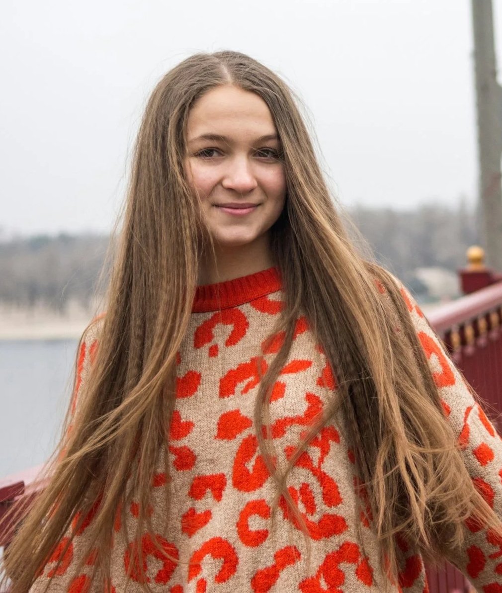
Look for playful versions of Romantic prints, like leopard in a bold, unique color scheme.
Romantic Ingenue
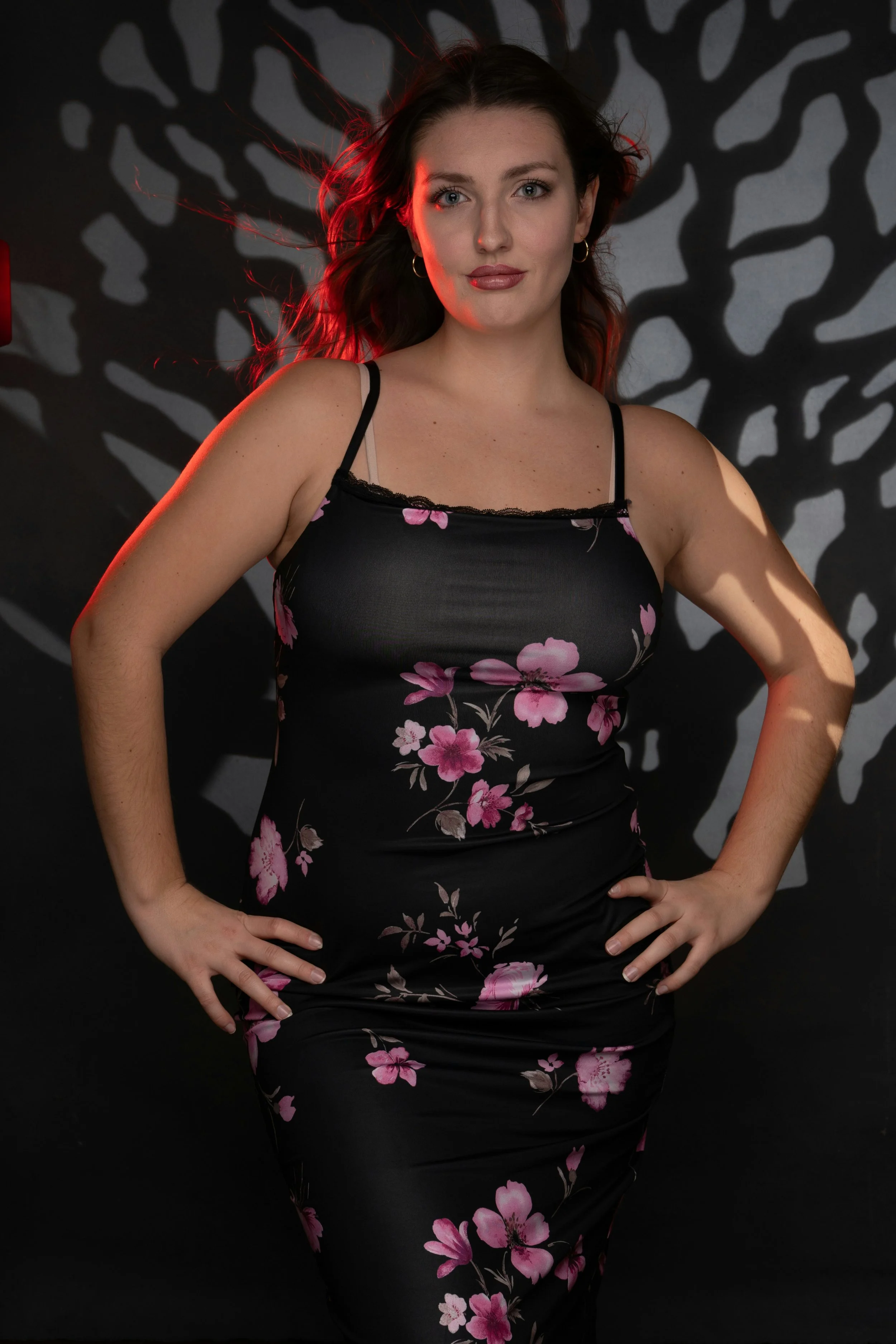
Look for designs that pair large-scale with small-scale florals, for a vibe that’s elaborate (Romantic) meets dainty (Ingenue).
Romantic Natural
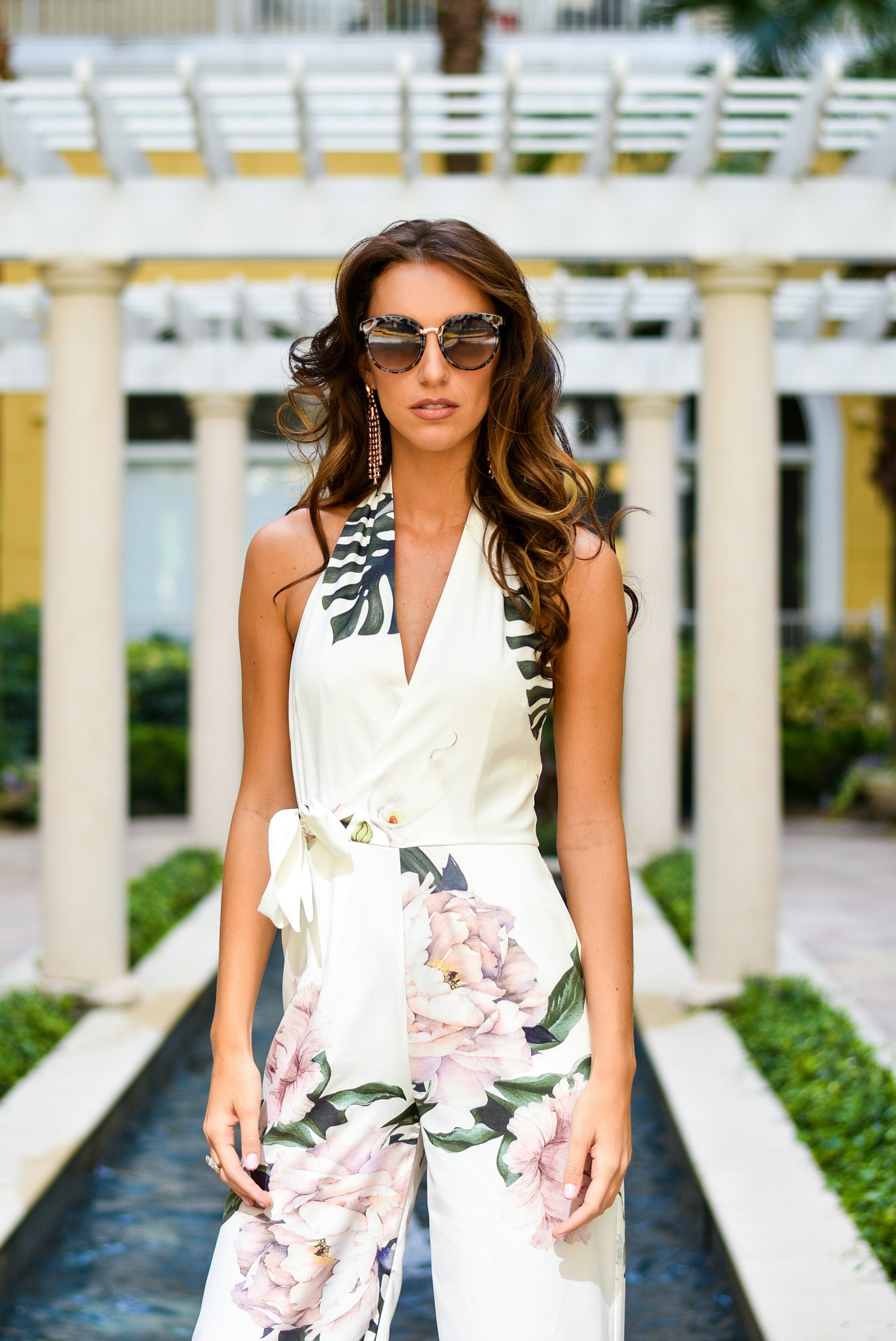
Look for patterns with oversized, sprawling florals (these often have a glam Romantic and relaxed Natural feel).
Also look for florals where both the leaves and flowers appear to be prominent parts of the design.
Print-Mixing!
One way to achieve a glam Romantic look is by pairing pieces that feel matching and cohesive.
So that might sound like print-mixing isn’t an option.
But it actually can be!
Just like Romantic beauty, print-mixing can feel:
Elaborate
Embellished
Extravagant and “Extra”—is it necessary to mix prints as a Romantic, definitely not. But it can be another tool for making your style appear eye-catching, alluring, highly detailed, and ornamented.
Print-mixing can also help your Romantic style feel a little more casual or fun (if that’s something you want).
Here’s some of the best Romantic print-mixing methods:
Use Jewelry or Accessories
Tortoiseshell print glasses paired with a printed jumpsuit—cool look for a Romantic Dramatic Natural Classic!
I love this subtle method of print-mixing. And while the print on the glasses does appear Classic, not Romantic, I do think that pairing the printed glasses with the printed jumpsuit helps communicate a Romantic vibe of elaborateness and extravagance.
We could also imagine that instead of the long dangly earrings, the model wore earrings with a medium or large floral design, adding another sort of “print” to her look.
Make Your Outfits do the Work
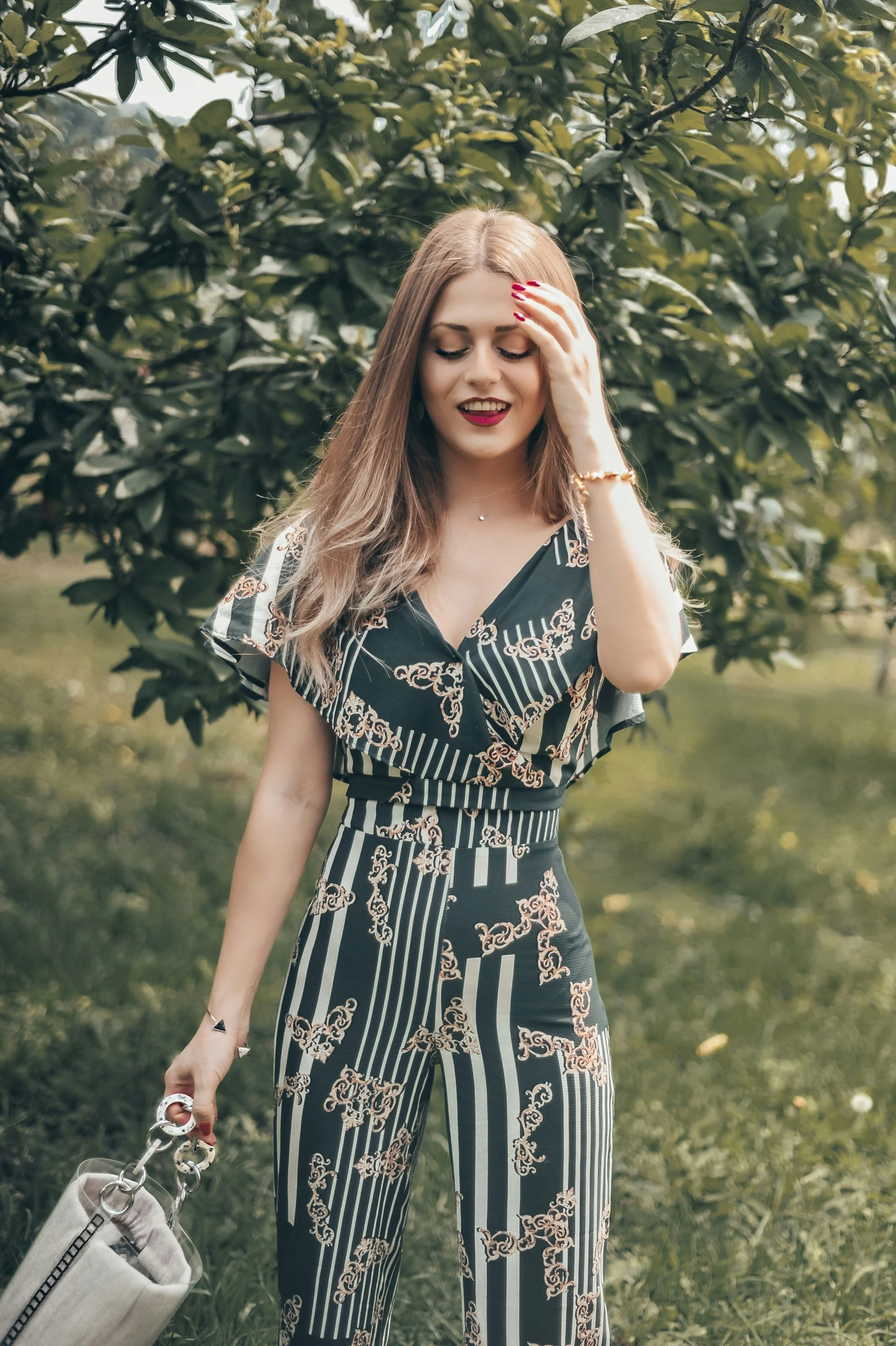
The simplest way to mix prints—make your clothing do it for you!
This jumpsuit would be great for a Romantic Dramatic Gamine, since it has:
Romantic baroque scrollwork motifs
Long, intense-feeling Dramatic vertical stripes
Short, playful Gamine stripes
Match and Match
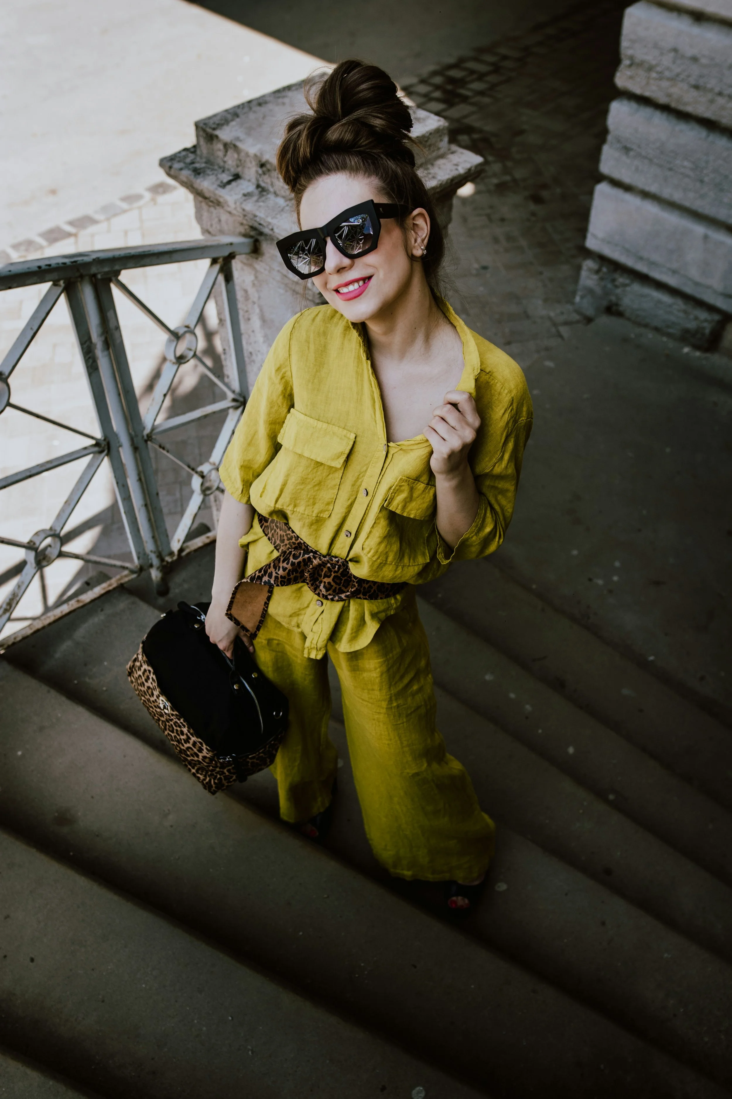
Since Romantic is flattered by cohesiveness and a matching feel, another option is to wear the same print twice in different parts of your outfit. Like say a leopard belt and leopard purse.
Leopard is a good choice for print-mixing, since it’s so recognizable, it’s sometimes considered a neutral in fashion.
This outfit would be cool for a Romantic Natural (and Dramatic with the shades!)
Be a Gamine Blend
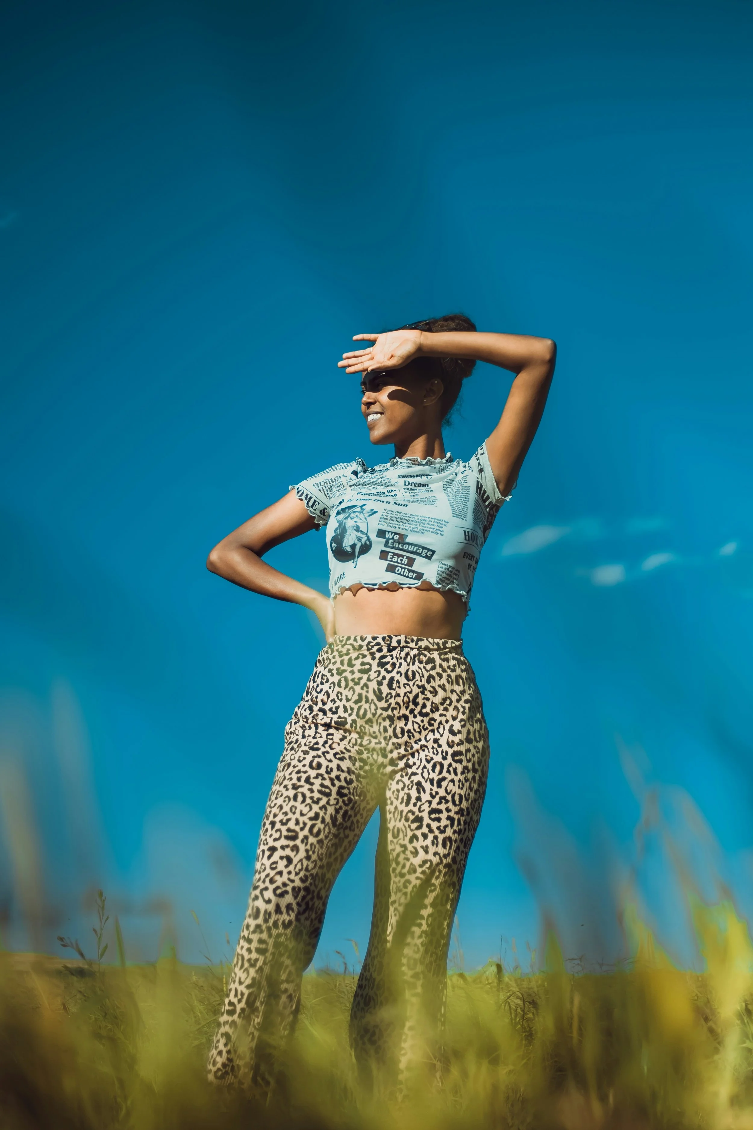
If you have a lot of both Romantic and Gamine, you can be ultra-creative with print-mixing.
Gamine printed crop top with Romantic high-waist leopard pants.
Mix Statement with Subtle
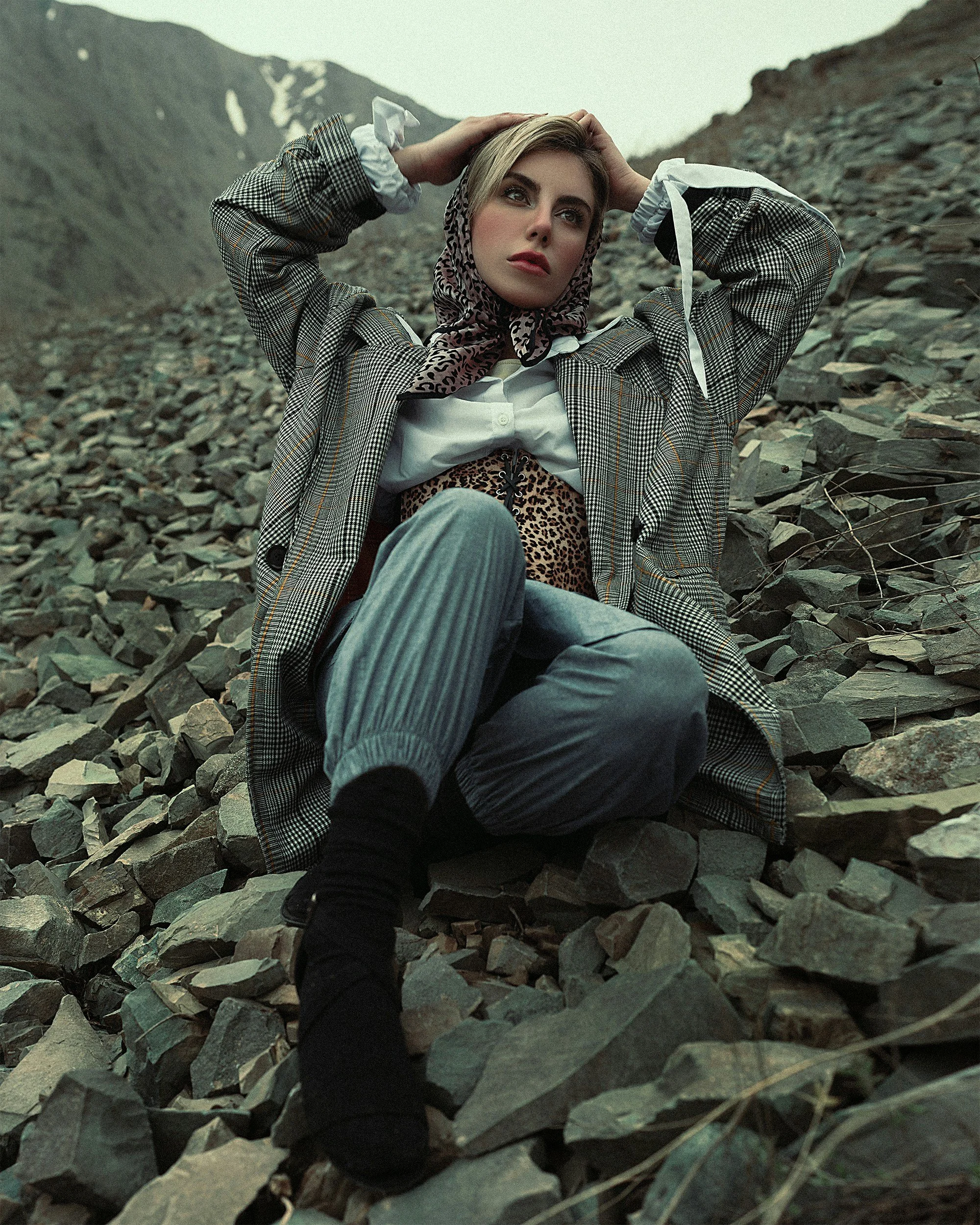
If you’re wearing something kind of bold, like a leopard headscarf, leopard corset, or leopard headscarf and matching corset, consider pairing them with an understated and conventional print, like a basic Classic neutral plaid.
Endless Options
There is so much more you could do with Romantic print-mixing, from subtle to standout.
Maybe one of the most approachable methods is pairing a printed top with printed footwear (and solid-color pants, or really go for it and do a print there, too).
Floral printed shoes can be a great option. Depending on the design and fabric, they can feel quite glam and luxe, perfect for Romantic.
You could even try more adventurous options, like pairing a floral top with a damask skirt, or a chain link top with a floral skirt.
Another iconic option for Romantic blends is stripes and florals:
Horizontal stripes paired with florals can be perfect for Romantic Gamine.
Or do neutral pinstripes and florals for Romantic Classic.
Thick vertical stripes paired with florals suit Romantic Dramatic.
What about Colors and Color Season?
Romantic prints work amazingly for any color season.
It is true that prints like roses, cheetah, and chains can come in stereotypical hues (e.g., red roses, gold chains).
But these prints don’t necessarily embody a single typical color season—there seems to be variation in which specific season they belong too.
You can also choose these designs in less traditional colors, like a black and white cheetah print or blue rose print.
So Romantic prints can really flatter any season.
Contrast?
Many of the prints we saw above were high contrast, pairing dark with light colors.
And this is one way to help communicate Romantic (since high contrast can feel passionate and emotionally expressive).
But it’s not the only way.
For instance, above we also saw examples of medium-contrast and low-contrast florals and damask prints.
Choosing lower contrast can work well for Romantic and help express the essence’s softer side.
And while cheetah, leopard, and jaguar tend to be rather high contrast, you can find low contrast versions, such as light gray leopard spots on a cream background.
Choosing a small-scale Romantic print can also sometimes read as lower contrast, especially from a distance, because the individual colors can start to appear less well-defined and more blended together.
General Print-Mixing Tips
Here’s a summary of general print-mixing strategies (we also covered all these last time when discussing Gamines!)
These are absolutely guidelines, not rules—all can sometimes be broken with success:
Pair a subtler print with a louder one
Mix a simpler print with a more complex one
Mix a more well-known and recognizable print (like roses or cheetah) with a more unusual one
Pair larger scale with smaller scale
Pair a printed garment with printed shoes, accessories, or jewelry
Have one or more of your prints be mostly neutral
Mix prints in the same or similar color schemes
Keep color season mostly consistent—if the print mostly suits your season while also incorporating some colors that are outside your season, it may still work for you. But in general, if you like to dress by your color season, then you’ll want the majority of the print’s colors to match that
Isn’t Romantic Formal?
A final qualm about Romantic prints: Don’t prints, and especially print-mixing, easily feel casual?
And doesn’t Romantic fashion have an iconically formal feel?
Yes, these things are generally true—but not always!
Prints can also feel quite extravagant and luxe, especially if you’re wearing Romantic’s iconic styles like roses, leopard, and damask.
Similarly, if you print-mix in a subtle way (like with accessories or footwear, or neutral color schemes, or with prints that read as fashion neutrals like cheetah), the result won’t automatically feel informal or highly eclectic.
Finally, there can be a misconception that Romantic fashion always needs to feel stereotypically formal.
It’s true that Romantic fashion often feels dressed-up, since Romantic’s iconic silhouettes and fabrics and jewelry, etc., aren’t strongly associated with casual settings.
So a Romantic skin-tight silk bejeweld gown—that’s probably going to read as formal.
But ultimately, Romantic beauty is defined by glamour and sensuality, and there can be very casual fashion items that exude those qualities, such as revealing silk pajamas or a sexy workout outfit.
Those aren’t really formal fashion options—you probably wouldn’t wear pajamas or workout clothes in a professional setting or to a fancy event—but they can still embody Romantic’s glam, passionate beauty.
So the point is that even if print-mixing can make an outfit feel more casual, that definitely doesn’t disqualify the technique for Romantics.
Next Time
See you next time for Dramatic prints! : )