Gamine prints can be like a full-body mood ring. And the mood is usually “happy.”
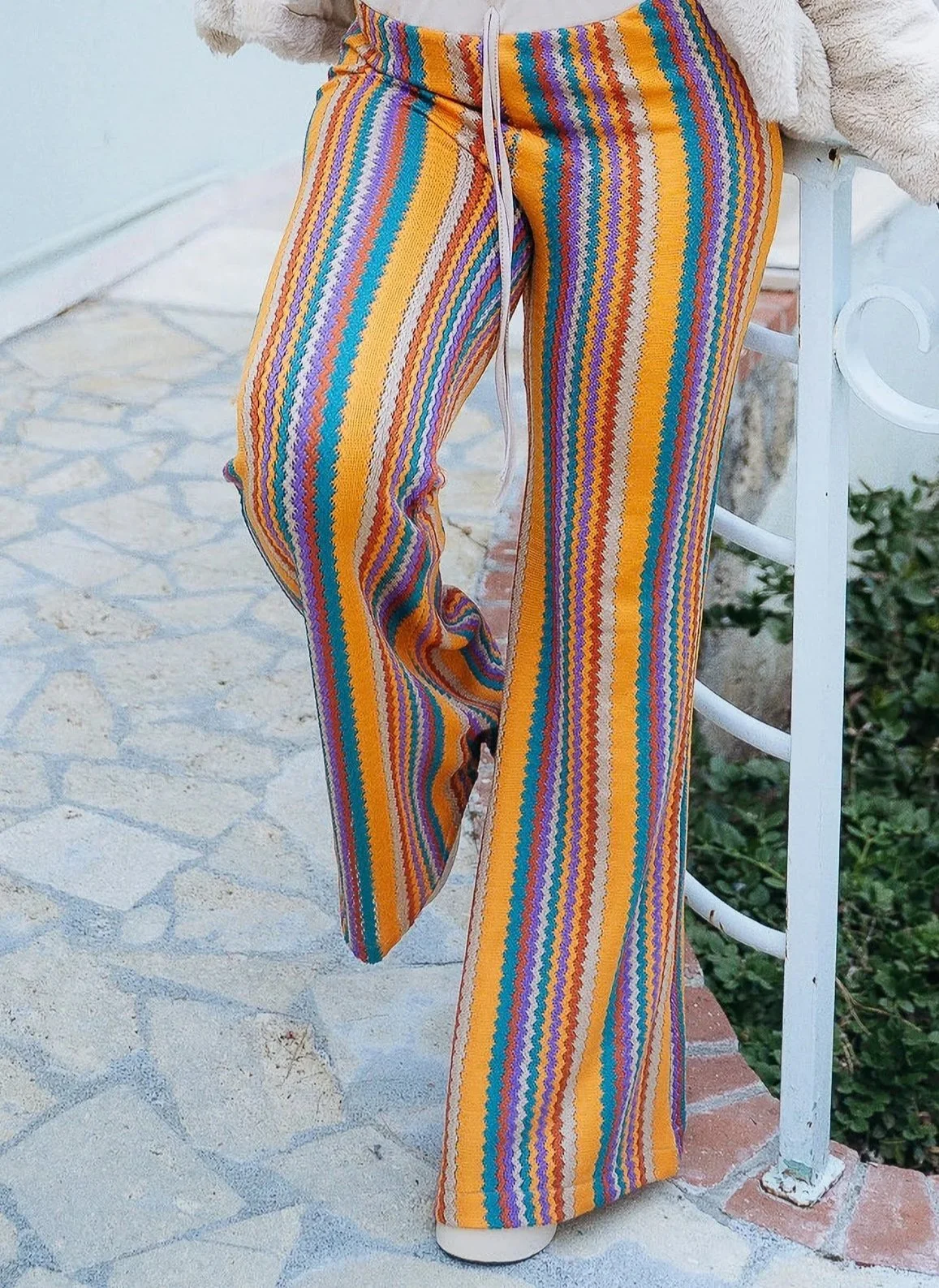
Or “ecstasy.”
This essence is like visual happiness—colorful, lively, energetic, and electric.
Gamine Prints Qualities
Gamine prints are iconically:
Geometric
Small-scale
Bold in color (bright, dark, or high-contrast)
But Gamine also loves experimenting, and the essence will cheerfully break every aforementioned “rule.”
For instance:
Sometimes Gamine prints can curve, such as polka-dots
Or be large-scale, like thick stripes
Or be light, muted, and low-contrast, such as a chevron top in light gray and cream
Gamine prints aren’t defined just by their literal qualities.
Ultimately, you’re looking for fashion with an upbeat, energetic, or playfully bold feel.
Gamine’s Best Prints
Here’s some of your best specific options:
1) Stripes
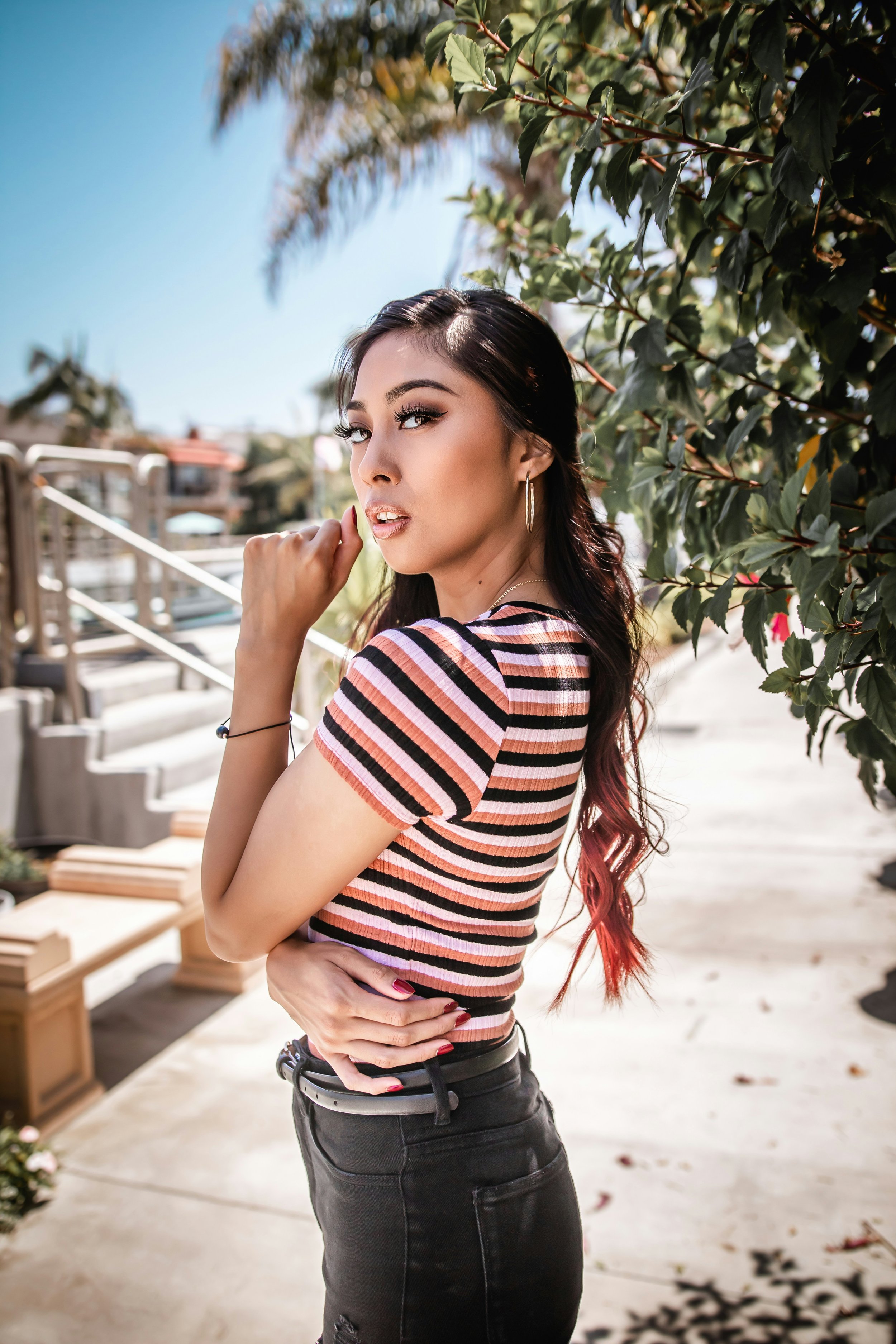
Horizontal stripes—from the simplest black and white to the most creative and colorful
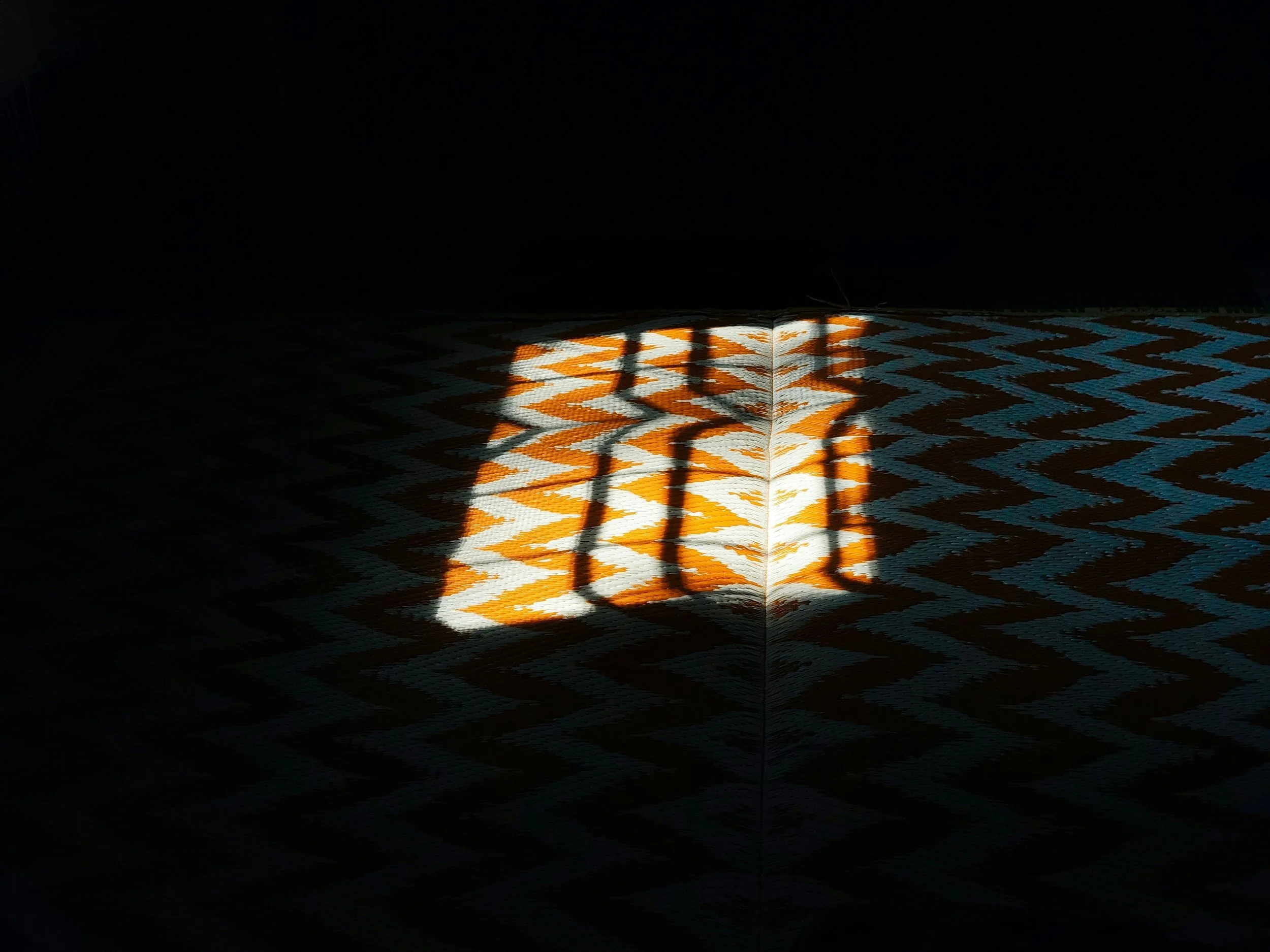
Chevron—with their zig-zag shapes, these are like extra-caffeinated stripes
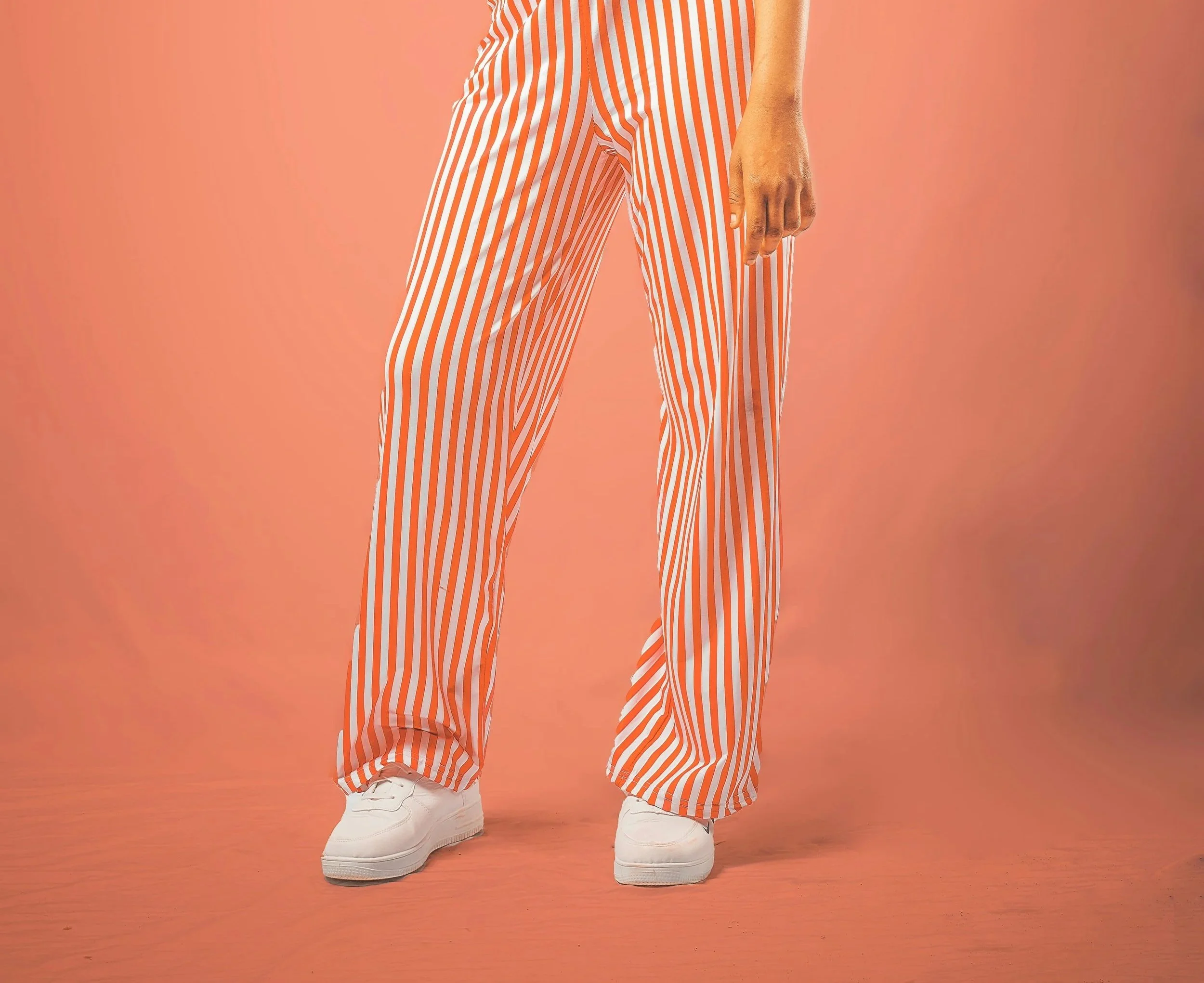
Pinstripes—often Classic, but in a cheerful or bold hue, they become really Gamine and really un-Classic
2) Plaids
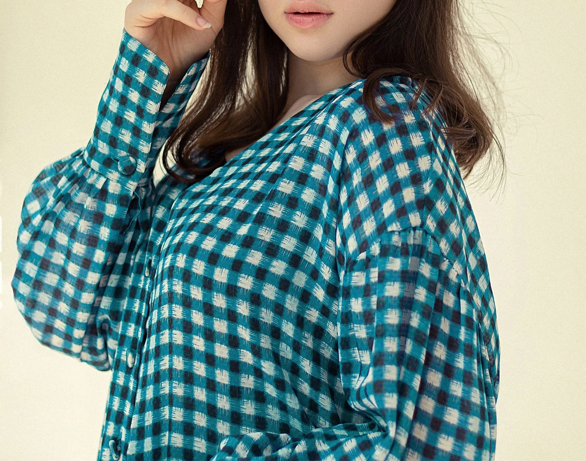
Gingham—especially high contrast or with bright colors
Small- or medium-scale colorful plaids
Checkerboard
Argyle
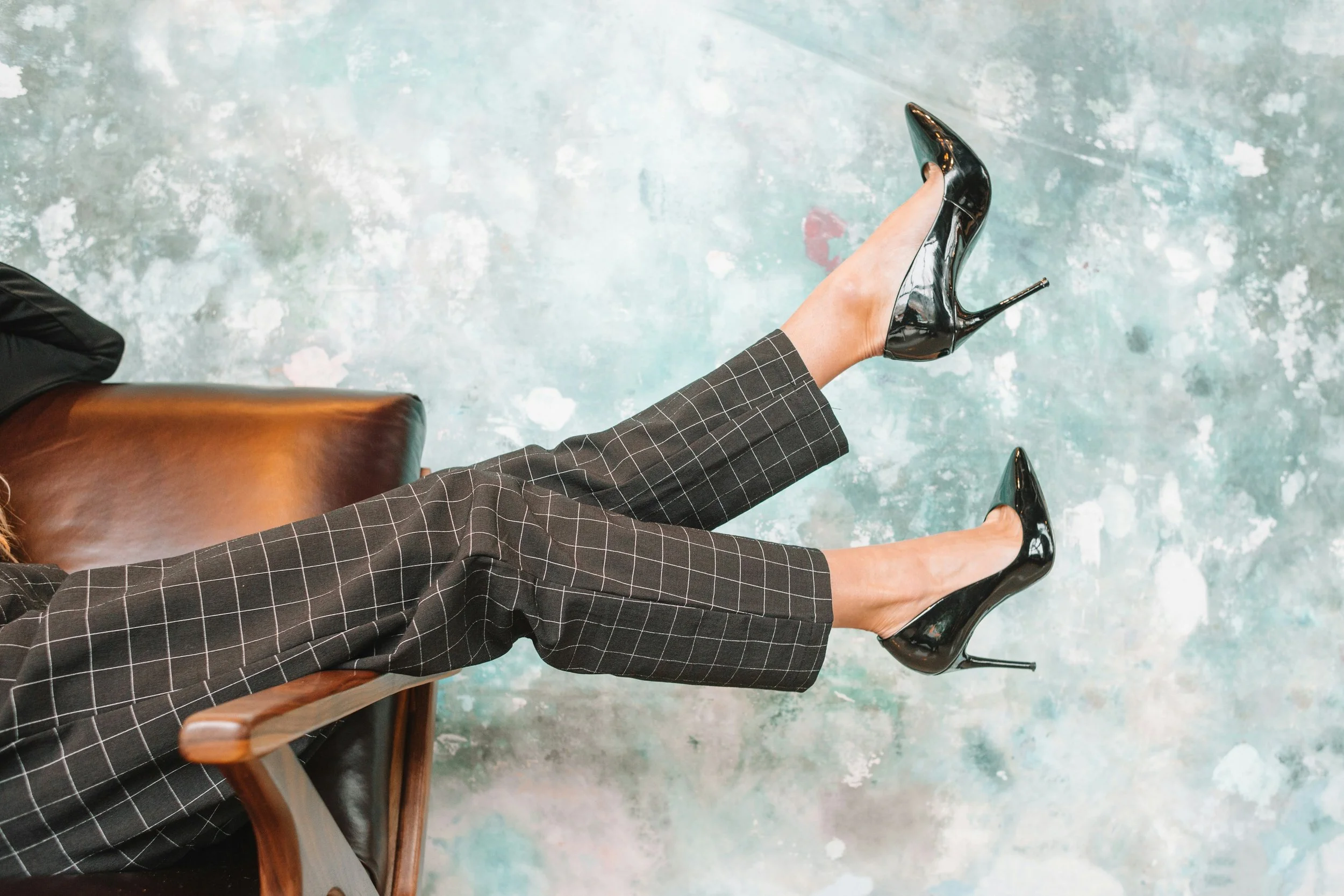
Windowpane or grid
3) Geometrics (typically small-scale)
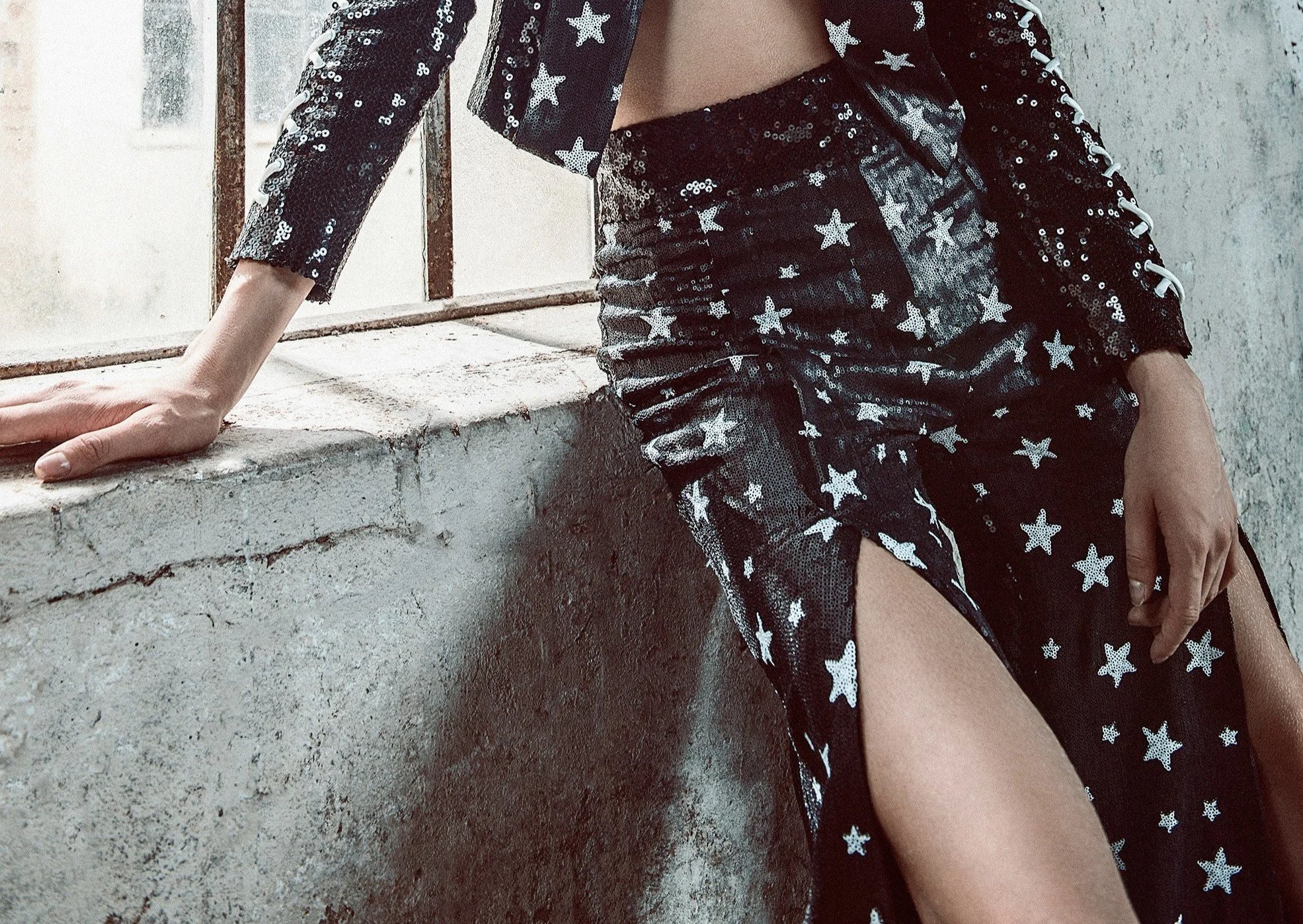
Stars
Triangles
Diamonds
Squares
Colorful houndstooth
Other small geometrics
4) Lettering
Block lettering
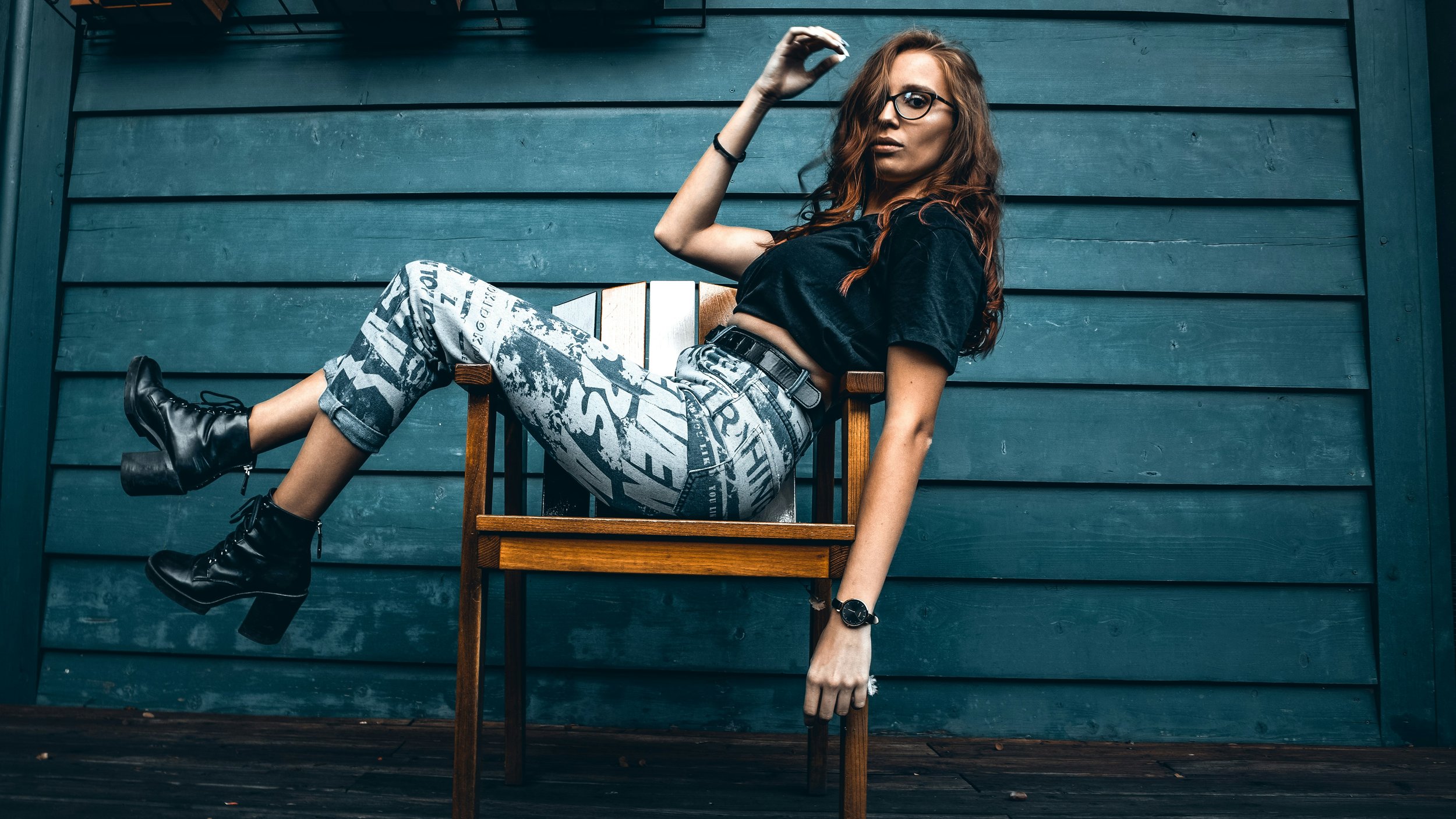
Graphic lettering

Newspaper prints
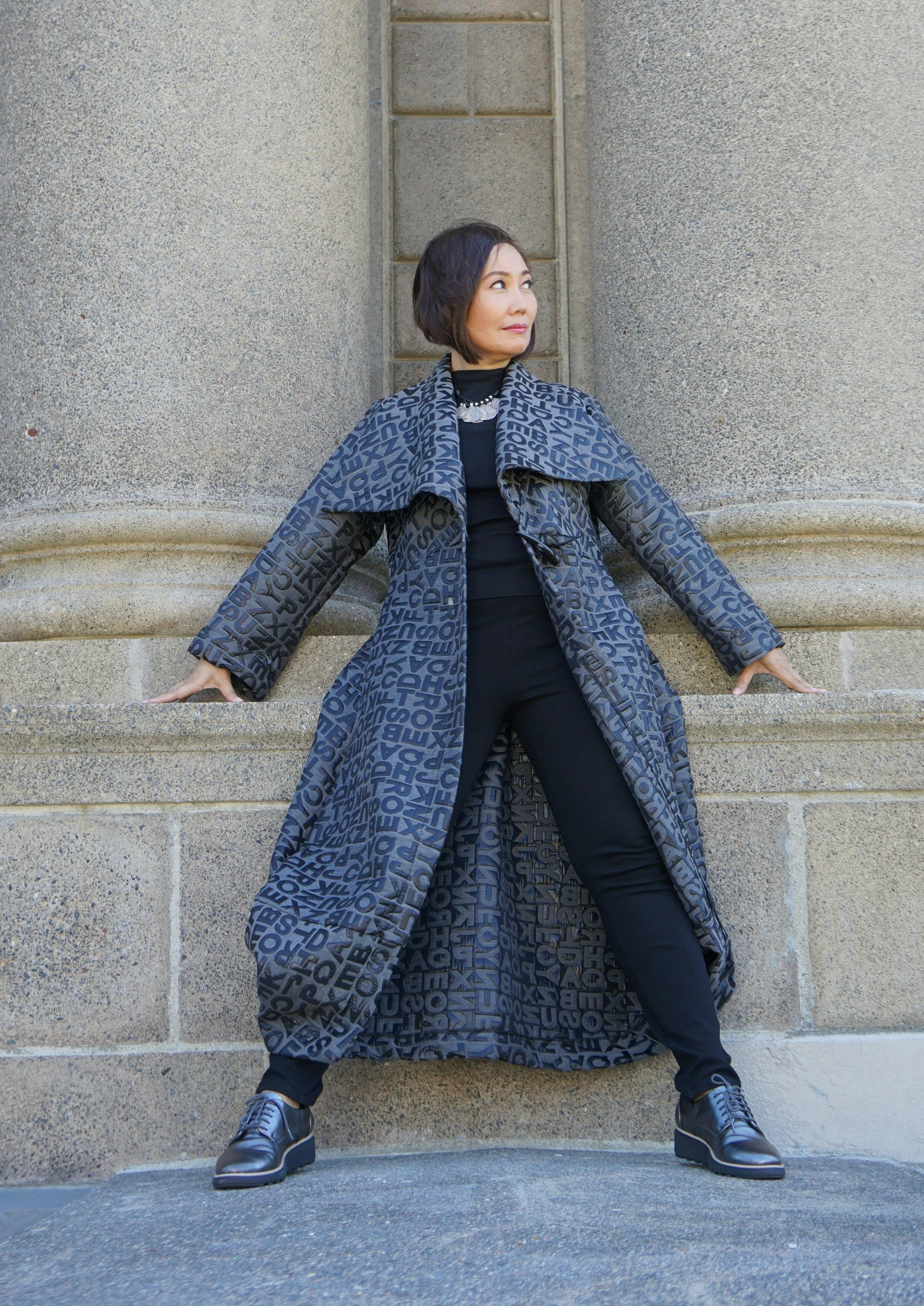
Letter or number prints
5) Playful circles
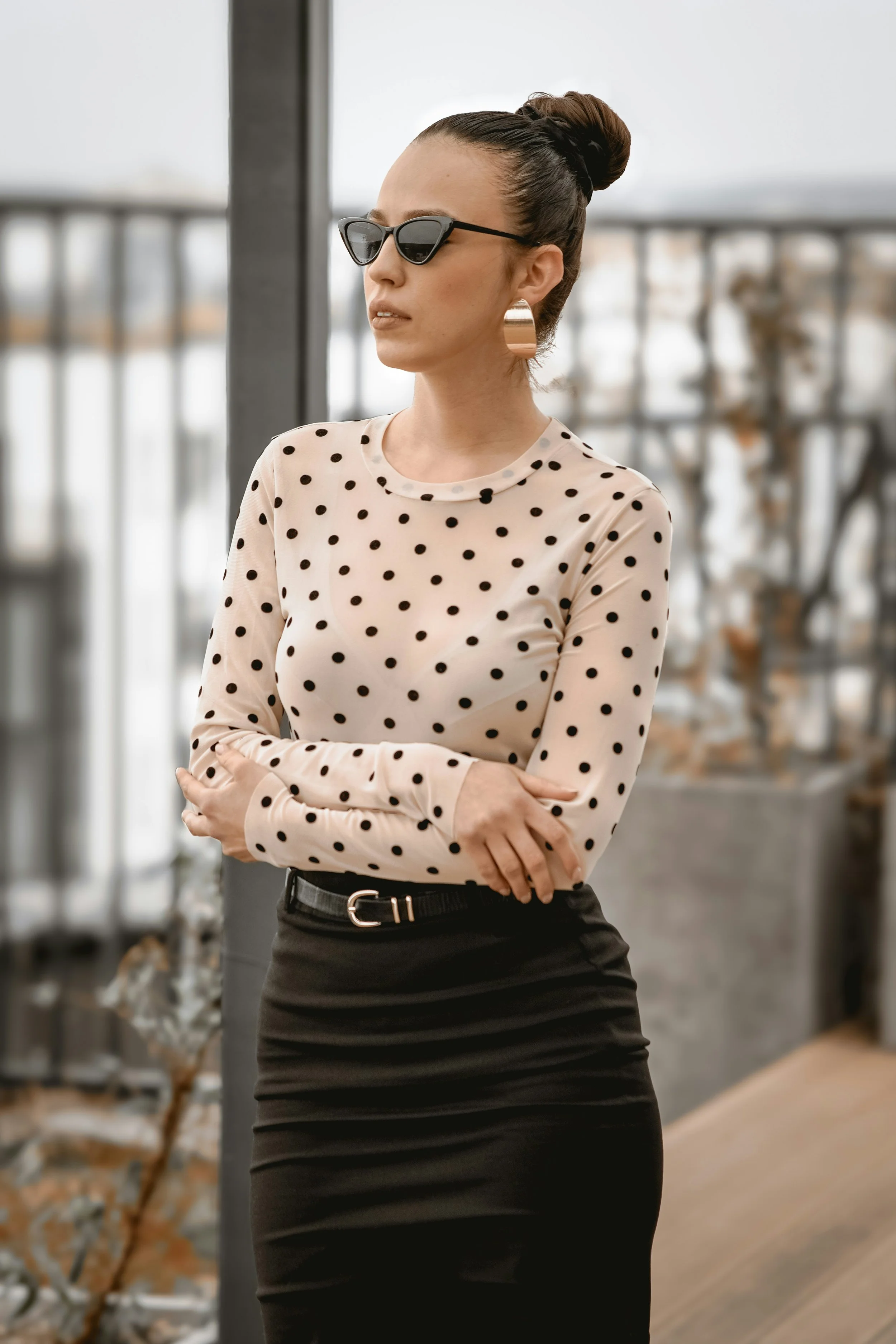
Polka dots—especially high-contrast, colorful, or medium- to large-scale
Bullseye prints
Concentric circles
Smiley faces
6) Novelty prints
Small repeated prints, either realistic or cartoon, such as small cats or moons
Colorful cartoon characters, comic book prints, or other fun graphics
7) …and more!
This is kind of a lot of prints!
But believe it or not, it’s not an exhaustive list of the ones that work for Gamine!
This essence has ecstatic, effervescent energy.
And prints often have a detailed, “busy” nature that mirrors that energy.
This means that other playful, humorous, or cheerful designs can also suit the essence.
Prints to Avoid?
There’s exceptions, but Gamine generally eschews:
Diffuse-edged prints
Abstract curving prints
Florals
Large geometrics
Additionally, even though prints like stripes and plaids are iconically Gamine, certain versions of them are better suited to other essences.
Here are examples of prints that, despite having conceptual similarity to Gamine, you’ll typically want to avoid:
Stripes to Avoid
Vertical stripes, specifically neutral pinstripes, are often Classic, especially when thin and uniform.
Long, thick vertical stripes, especially in neutrals or very dark colors, can have Dramatic.
Stripes that feel relaxed (such as because they’re low-contrast, irregular, and diffuse-edged) are often Natural, whether horizontal or vertical.
Plaids to Avoid
Moderate-scale, mostly neutral, simple, timeless, basic plaids are typically Classic.
Large-scale, relaxed-feeling plaids are often Natural.
Geometrics to Avoid
Large geometrics, especially with dark, neutral, or serious-feeling colors, are often Dramatic—powerful and sophisticated.
Graphics and Lettering to Avoid
Tees with laidback nature graphics, like forests or beaches, commonly have Natural.
Edgy graphic tees (like band tees with dark colors and intense graphics) commonly have Dramatic.
Minimalist graphic tees or ones with designer logos can suit Classic.
Curvy cursive lettering can sometimes communicate the curving essences—Romantic, Ingenue, or Ethereal.
Especially if the lettering is in the context of a print that overall reads as glam, sweet, or dreamy, it might not have much, if any, Gamine.
Polka-dots to Avoid
Very small-scale polka dots (sometimes called micro dots) commonly suit Ingenue.
The same is true of very low-contrast polka dots or dots with iconic Ingenue colors (e.g., light pink and a light neutral).
Blended Prints?
Most people aren’t a pure type. But even if you only have a little Gamine in your blend, you can still look great in fully Gamine prints.
You can also wear prints that combine two or more of your essences:
Gamine Classic
Look for prints that appear on the border between Classic and Gamine, such as houndstooth, or plaids and pinstripes that are mostly neutral but have a little color.
Neutral black and white houndstooth can be a perfect print for a Classic Gamine. It’s timeless enough where it technically works for a pure Classic. But the small, angular, repeating shape suits Gamines, too.
Gamine Dramatic
Look for prints that combine large and small geometrics, or large geometrics (Dramatic) in lively colors (Gamine)
Gamine Natural
Look for faire isle prints that feature small, playful Gamine geometrics paired with Natural nature motifs, like trees.
These designs sometimes have dreamy detail, like intricate snowflakes, that can suit Ethereal, too.
Gamine Ethereal
Look for prints described as swirl, spiral, psychedelic, trippy, or groovy.
Sometimes these are purely Ethereal. But often they have a whimsy that’s great for both Ethereal and Gamine.
Gamine Ingenue
Moderate-contrast small polka dots can be a good compromise for both Gamine and Ingenue (e.g., polka-dots in white and medium blue).
You can also look for Ingenue prints like dainty flowers, hearts, or cherries in very vibrant colors (e.g., the closest your color season gets to neon!) or that appear as oversized graphics on a top, which adds Gamine playfulness.
Gamine Romantic
Look for Romantic prints like roses or leopard in fun Gamine colors (e.g., an orange and yellow rose; a purple and green leopard print).
Choosing a cartoon version of an iconic Romantic print, like a cartoon rose, can also suit Gamine Romantic.
How to Wear Gamine Prints
Especially if you have a lot of Gamine, you can wear your prints just about anywhere—as a shirt, a skirt, a dress, a jacket, etc.
Even in shoes, purses, jewelry, scarves, headbands, or other accessories.
Obviously the safest way to wear a print is by pairing it with an otherwise solid-color outfit, and this does flatter Gamine.
Printed tees look cool matched with Gamine slim-fit and skinny jeans. Or denim skirts, shorts, skirts, overalls, vests, etc!
They can also look cool layered under jackets—or under dresses or rompers.
Layers in general are awesome for Gamines (layering for the essences may be a future series!)
Mix and Match (Mostly Mix)
Gamine is also flattered by fashion that feels eclectic rather than matchy-matchy.
So while it can be a good strategy to match the colors in your print to the colors in the rest of your outfit, you can also choose prints that differ markedly in color from the rest of your outfit.
If you want to wear prints in an even more adventurous way, try:
Print-Mixing!
Maybe more than any other essence, print-mixing embodies Gamine beauty.
Mixing prints can easily feel creative, daring, and playful.
But the technique can also be intimidating.
After all, Gamine prints are bold and eye-catching enough on their own. So it might seem risky to pair two (or more!) together.
Here’s different methods of Gamine print-mixing, including some that can be surprisingly subtle:
Print-mix with Jewelry or Accessories
Endless options here.
Pair a necklace with tiny triangular charms with a bracelet with tiny square charms.
Or stack bracelets with square, diamond, and triangular shapes:
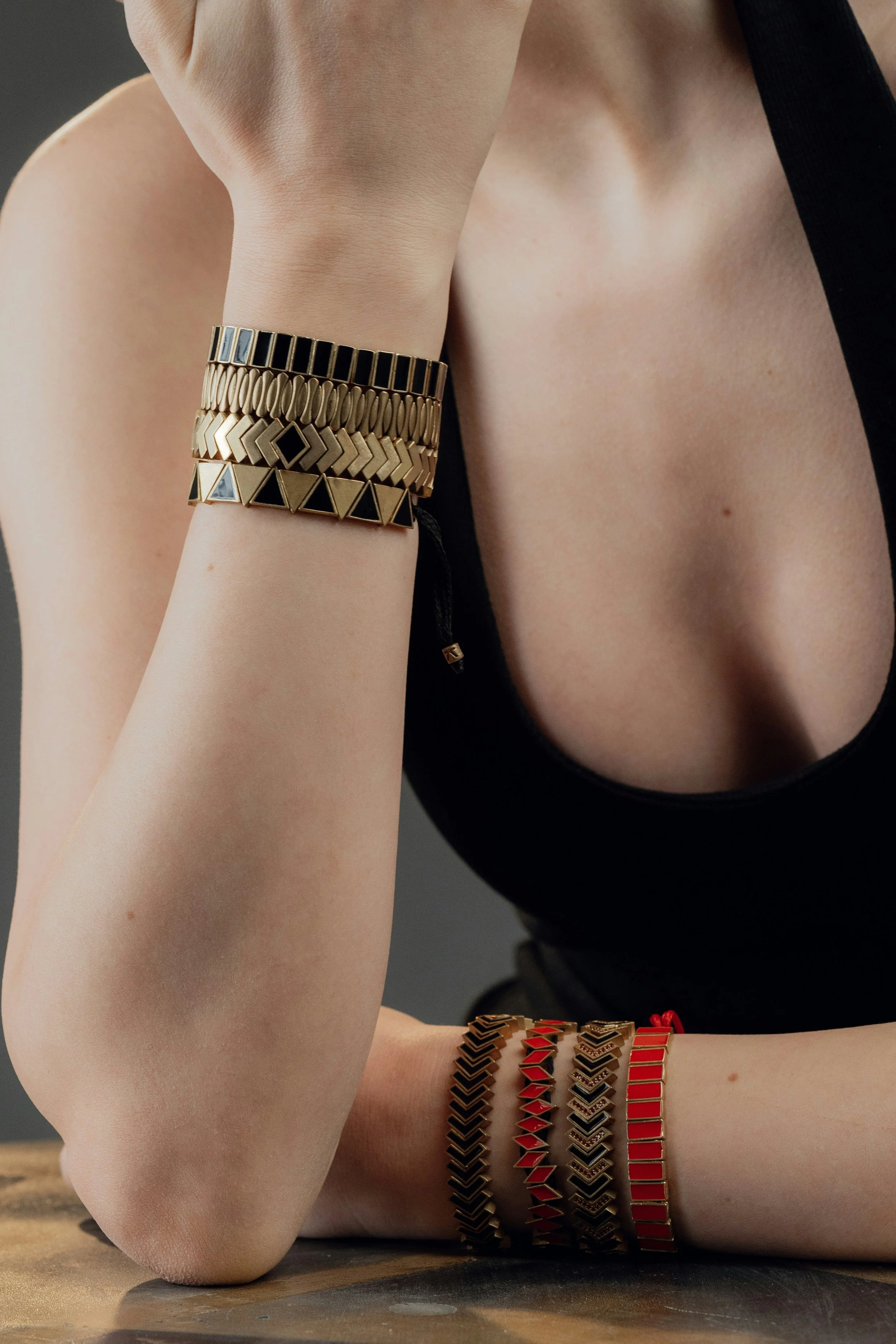
This might be bending the rules of what it means to “mix prints.” But Gamine likes rule-bending!
Wearing jewelry wirh small geometrics or other Gamine shapes accomplishes print-mixing in a subtle way.
You can even pair your jewelry with a completely solid-color, neutral outfit.
A related option is to pair a printed top with jewelry that has a “printed” quality, like this chain necklace with contrasting black and silver detail:
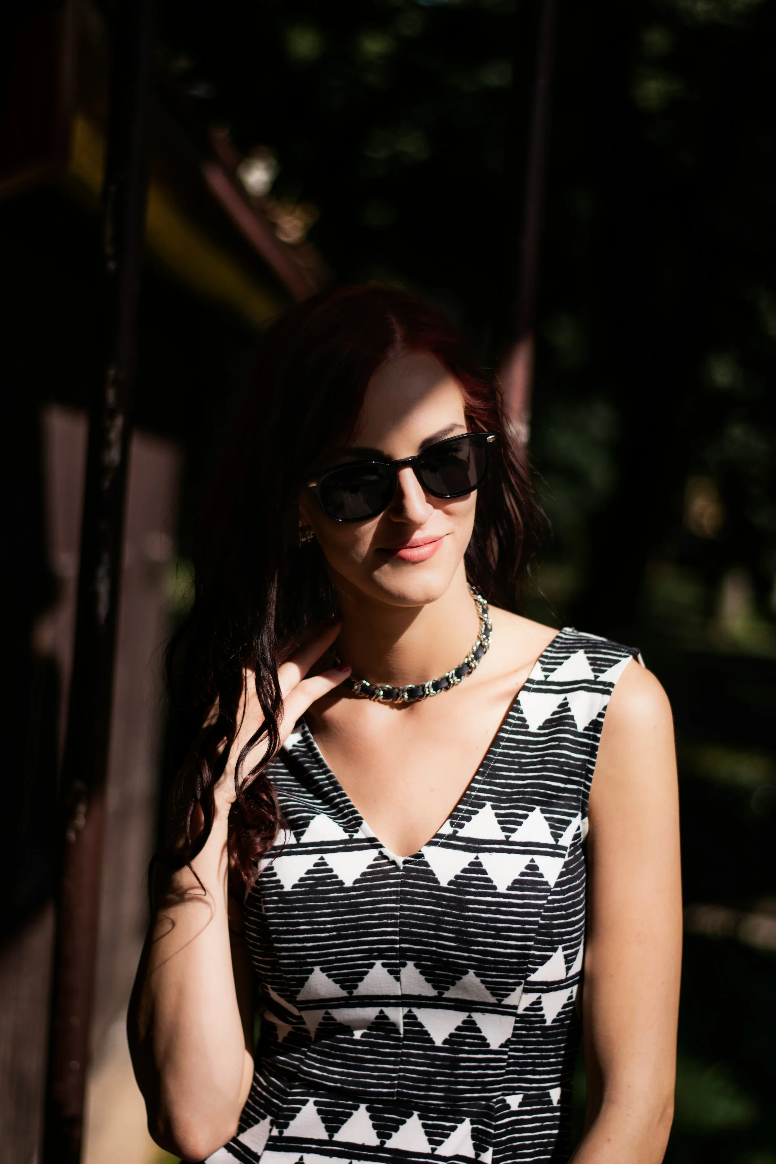
And yet another option is to choose a top that does your print-mixing for you, like this one featuring triangles and stripes.
Choosing entirely or mostly neutral colors can also make print-mixing more approachable.
Mix Statement with Subtle
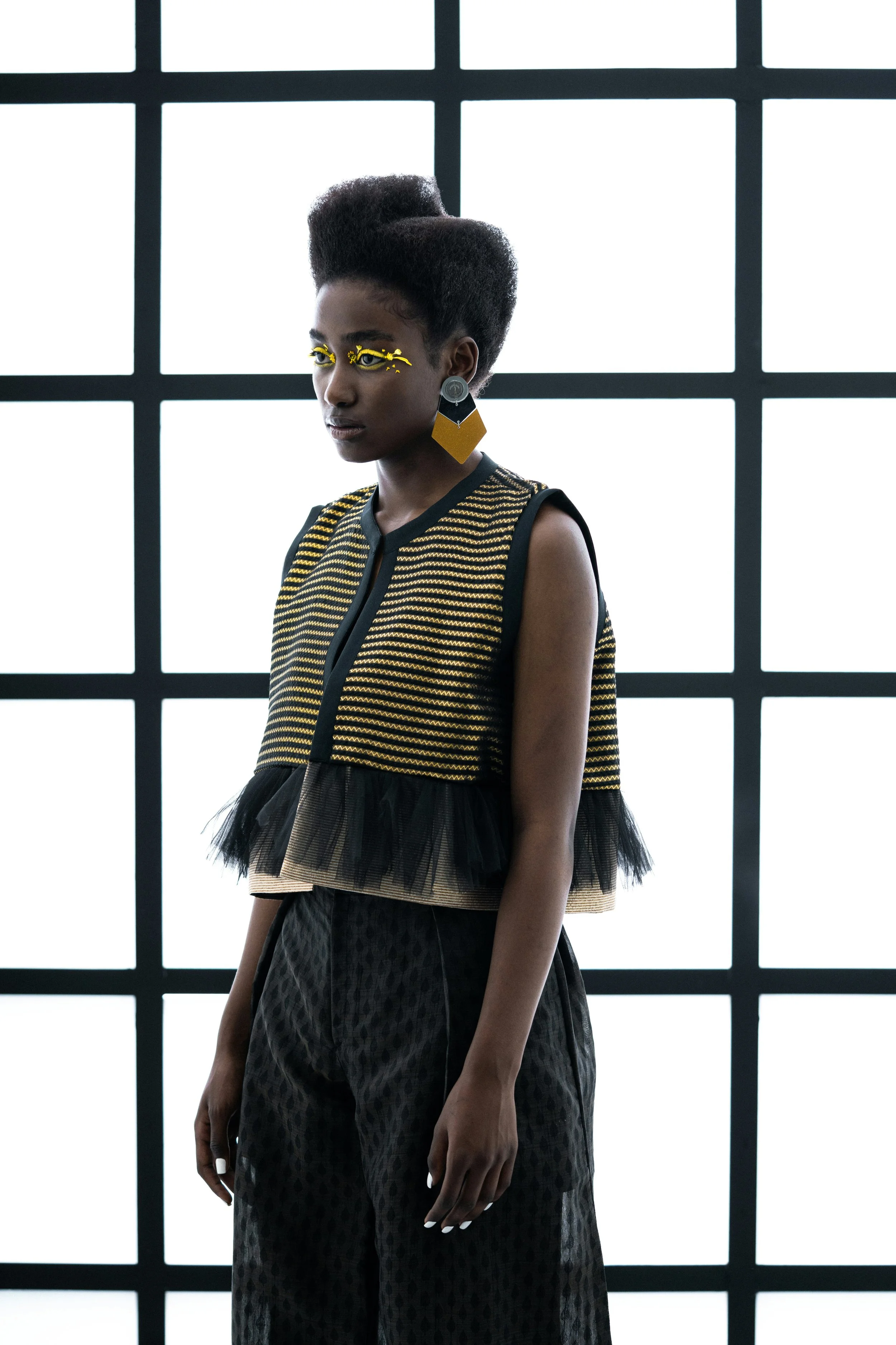
Such a cool look! We see a form of print-mixing between the geometric earrings and striped top.
And if you look closely, there’s print-mixing between the top and pants, too. The pants have a Gamine low-contrast mini diamond pattern. Mixing more obvious prints with subtler ones is a fantastic strategy.
So is coordinating the colors of your prints.
Go Feet First
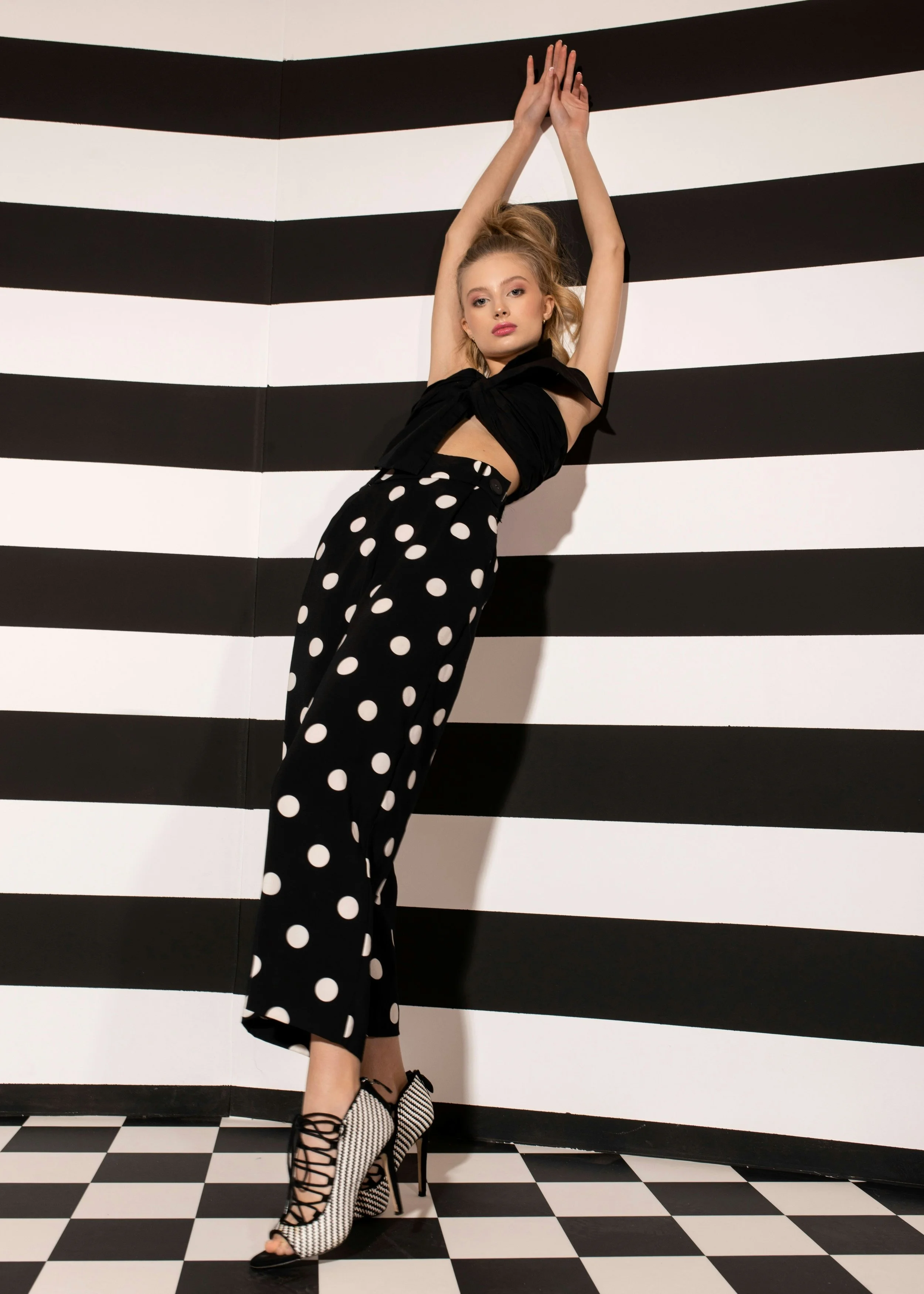
This isn’t a textbook definition of subtle.
But I love the idea of mixing chevron-printed shoes with printed pants—you could do polka dots or something more understated, like a pant featuring a Gamine windowpane or grid.
Print-Mixing for Gamine Blends
The examples above mostly depict Gamine prints mixed with different Gamine prints.
But it can also produce amazing results to mix Gamine prints with other essences’ prints! Like:
Stripes and Florals
One of the most iconic examples of this is pairing stripes with florals, such as a black and white striped Gamine top paired with a rose-print skirt for Romantic Gamine.
Or layer a scoop-neck blouse with tiny Ingenue florals over a striped Gamine mock-neck top.
Or put a sheer top with swirling Ethereal floral lace over a striped Gamine dress.
Or pair a Natural paisley dress with a Gamine striped shrug.
Infinite possibilities!
You can also mix florals with other Gamine prints, like plaids.
The curvy and linear shapes tend to pair extremely well.
Geometrics and Geometrics?
Dramatic and Gamine is the ultimate bold, experimental pair.
You could wear a Gamine star-print top with large Dramatic geometric jewelry.
Or go even bolder and wear a small-scale geometric Gamine top with a Dramatic skirt with large geometrics.
Graphic Tees, Plaids, and Pinstripes
Classic and Gamine is also an amazingly cool match.
It reads as a fun juxtaposition to mix a formal Classic piece with a playful Gamine one, like a basic neutral Classic plaid paired with a Gamine block letter graphic tee.
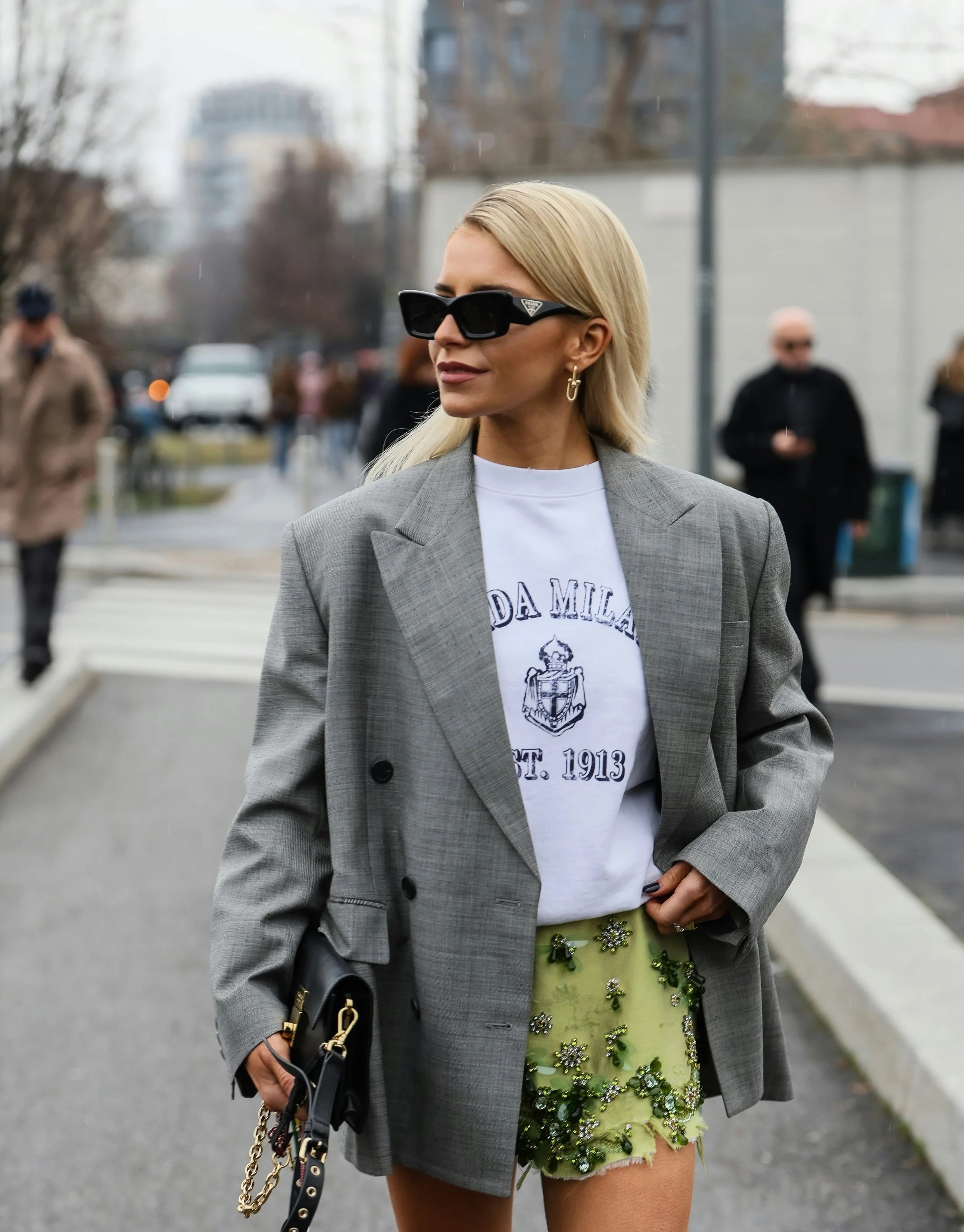
This maybe isn’t even technically a plaid but I thought the outfit was cool and I could get away with it in the spirit of Gamine rule-breaking.
What about Colors and Color Season?
Gamine’s most stereotypical hues are bright, cheerful, and bold—Spring or Winter.
But those colors aren’t essential to a great Gamine print (or a great Gamine outfit in general).
In fact, prints can be a fantastic way to express this essence even if you have a muted season.
For instance, Soft Summer geometrics or chevron can still feel quite bold, despite the gentle colors.
Of course, this doesn’t mean that people with Soft seasons can only express Gamine by wearing prints.
Even if your season has Soft colors, wearing your season’s version of Gamine’s most iconic hues (yellow, orange, red) in Gamine silhouettes will still typically feel Gamine on you.
Print-Mixing Tips
Here’s a summary of general print-mixing strategies.
These are definitely guidelines, not rules—all can sometimes be broken with success:
Pair a subtler print with a louder one
Mix a simpler print with a more complex one
Mix a more well-known and recognizable print (like basic horizontal stripes or pinstripes) with a more unusual one
Pair larger scale with smaller scale
Pair a printed garment with printed shoes, accessories, or jewelry
Have one or more of your prints be mostly neutral
Mix prints in the same or similar color schemes
Keep color season mostly consistent—if the print mostly suits your season while also incorporating some colors that are outside your season, it may still work for you. But in general, if you like to dress by your season, then you’ll want the majority of the print’s colors to match that
More Art than Science?
One thing I love most about print-mixing is when a person puts together an ensemble that “shouldn’t” work in theory but ends up really working in reality.
Like if you saw those two prints individually in a store, many people might think, “Those would never work worn together”—and then somehow they look amazing together.
There definitely seems to be an art to print-mixing. Guidelines can be helpful, but it’s not a perfect science that you can master just by learning rules and formulas.
Practice, experimenting, and willingness to explore all seem key.
And that’s something I love about fashion—it can simultaneously be formulaic and innovative.
Future Prints
Future posts might show even more adventurous print-mixing options!
For now it seemed more helpful to show at least some “safe” options that might work well in contexts even when you don’t want to wear an ultra-unique look.
Plus, Gamine’s version of “safe” can already feel pretty daring!
More prints next time! : )