Dramatic’s Surprising Best Colors

Dramatic’s best colors are sophisticated, striking, and show-stopping.
They can even be literally pulse-racing.
Below we explore:
Dramatic’s ideal and less ideal colors
How Dramatic can harmonize with any season
How to combine your colors for stunning results
Part 1. Best Colors
Dramatic’s absolute best color?
Red.

Essentially whatever your palette’s deepest version is.
Medium or vivid reds are great, too (although light reds, a.k.a. pinks, don’t work so well).
This is the color of intensity, dominance, passion, and unbridled emotion.
Even in colloquial terms, red tends to be deemed the most “dramatic” color.
Dramatic’s runner-up best color?
Orange.
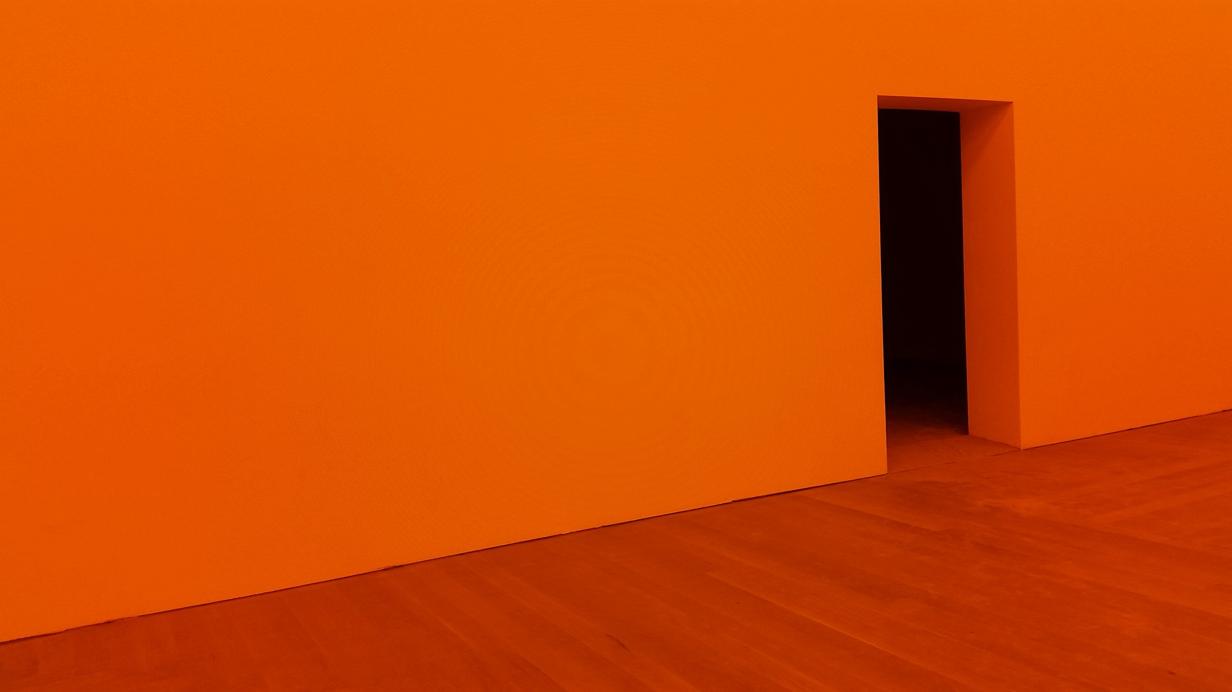
Especially dark orange, but also medium and vivid versions.
This is surprising, since orange doesn’t have an obvious connection to Dramatic’s formal, sophisticated, serious side.
But what orange does connect to is Dramatic’s bold, intense, eye-catching side.
Like red, orange is frequently used for signs, ads, and brand logos designed to harness our attention.
Other flattering hues?
Deep or medium purples and blues.
Like Dramatic, these “jewel tones” can feel rich and powerful—even royal.
You may have noticed that Dramatic shares several of its best colors with Romantic.
This makes sense, since the two essences have strong conceptual overlap—if we’re choosing the essences that simultaneously feel most formal and intense, it’s Dramatic and Romantic.
But a key difference emerges between them when we explore:
Colors that aren’t Dramatic’s ideal?
Pink, plus light hues in general (yellow, light blue, light purple, etc).
While pink is one of Romantic’s best colors, it’s typically one of Dramatic’s worst—too delicate and gentle.
This is also true of very light colors in general.
But Dramatics are also known for their versatility and ability to pull off a huge range of styles. So even very light colors can potentially work for Dramatic in the right silhouette.
What about green? It’s not the essence’s most iconic hue, but very dark versions can definitely work.
Green is also a great complement to other Dramatic colors like red, orange, and purple.
Dramatic’s best neutral?
Black, dark gray, or whatever your palette’s darkest neutral is.
White or your palette’s lightest neutral is also great, since the essence likes extremes.
Light neutrals are particularly useful for creating light-dark contrast in an outfit.
Medium neutrals are good, too, easily feeling serious and sophisticated.
Is Dramatic best in color or neutrals?
Color.
But since neutrals easily feel formal, they have a strong Dramatic connection, too—especially the extremes, like black and white.
Ultimately, though, your darker and medium palette reds, oranges, purples, and blues will tend to flatter Dramatic more than any neutral.
Do Dramatic’s best colors differ based on color season?
Nope—regardless of season, Dramatic prefers your palette’s dark and medium reds, oranges, purples, and blues.
Part 2. Color Season and Dramatic
At first glance, Dramatic’s intense vibe can seem to clash with certain seasons.
But ultimately, the essence is highly versatile and can typically work with any seasonal palette. Here’s how:
Dramatic and Autumn: Deep Dramatic
Pros:
Dramatic and Autumn have a natural connection through Autumn’s many deep reds and oranges.
Plus, Autumn colors lean deep in general—especially True and Dark Autumn.
Cons:
Some Autumns (especially Soft) may wonder if their palette feels too gentle for Dramatic.
But this isn’t usually an issue, since every Autumn subseason has colors that get quite dark, as well as medium hues.
If you prefer to wear your lightest palette colors, you could potentially use color to primarily express one of your other essences.
Here are some of Dramatic’s best colors for each Autumn:
Soft Autumn

True Autumn

Dark Autumn

***
Dramatic and Winter: Pure Dramatic
Pros:
Of all the seasons, Winter colors are most stereotypically Dramatic—deep, formal, sophisticated, and intense.
High-contrast color schemes also tend to be amazing for both Dramatic and Winter.
Cons:
No major ones. Even Winters who prefer to focus on their medium rather than darkest colors will likely find it’s easy to create a Dramatic color impression, since Dramatic likes medium shades.
Some of the best Dramatic colors for every Winter:
Bright Winter

True Winter

Dark Winter

***
Dramatic and Spring: Daring Dramatic
Pros:
Your colors’ inherent boldness connects to Dramatic’s intensity. This is especially true for Bright Spring, with its Winter influence.
Cons:
While all the Spring subseasons have colors and neutrals that can appear dark (especially in the context of your personal coloring), not all of your palette colors are necessarily ideal for you.
So, some Springs may feel best in their lighter palette colors, avoiding the ones that Dramatic most prefers.
But this isn’t automatically an issue, because Dramatic is quite flattered by your palette’s medium reds, oranges, blues, and purples, too. So, you might be able to avoid your deepest shades and still create a Dramatic impression.
If you prefer to wear your absolute lightest colors, then you may find that it works well to simply use color to primarily express one of your other essences—even if you have a lot of Dramatic.
This might make your overall vibe feel a bit gentler than the stereotypical Dramatic one, which isn’t a bad thing! Especially if your personal color palette is extreme in some way, such as extremely light, then it’s appropriate for it to have some influence on your vibe. It doesn’t diminish your beauty as a Dramatic. Plus, Dramatic enjoys juxtaposition. So a Dramatic with very delicate coloring can paradoxically be a perfect match!
Some of your best Dramatic colors for each Spring:
Bright Spring

True Spring

Light Spring

***
Dramatic and Summer: Elegant Dramatic
Pros:
Summer’s cool, muted hues echo Dramatic’s sophisticated, dignified, formal side.
Wearing high amounts of your darker palette colors will tend to feel intense and bold on you.
Cons:
While this doesn’t apply to all or necessarily most Summers, it is true that some Summers have very delicate personal coloring, and may find that they are most flattered by their lighter palette colors.
But that’s ok! One option is to compromise by wearing at least some medium colors, which can emphasize Dramatic.
You can also use your lightest colors to express one of your other essences.
If you have very delicate personal coloring and highly Dramatic facial geometry, your vibe might be a bit more gentle than the stereotypical Dramatic—and that’s a great thing! It gives you a uniqueness that’s actually very consistent with Dramatic’s original-feeling beauty.
Here’s some of the best Dramatic colors for each Summer:
Soft Summer

True Summer

Light Summer

Part 3. Color Combining
Some of the best color combining options for Dramatics:
Colors or neutrals?
Dramatic can do completely colorful, completely neutral, or a mix.
Highly colorful outfits will tend to emphasize Dramatic’s bold, attention-grabbing, experimental side.
Highly neutral outfits will tend to express Dramatic’s dignified, commanding, sophisticated side.
How to combine colors?
Like Gamine, Dramatic is great in color-blocking, especially pairing non-adjacent colors, like a dark red top and dark green pant.
You can also pair colors that are next to each other on the color wheel, like purple with red:

Or pair a color or colors with a dark neutral.
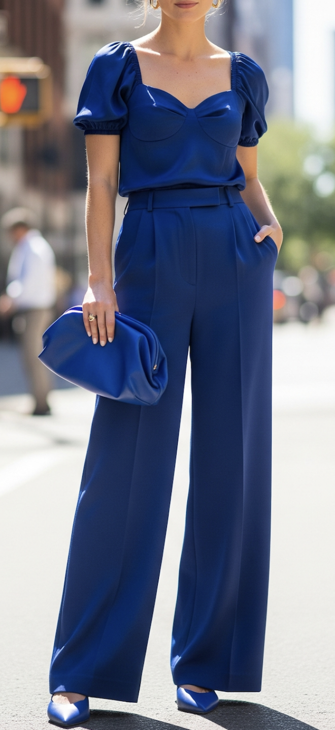
Of all the essences, Dramatics tends to be most flattered by monochromatic color schemes, especially in one of its best colors (e.g., red, orange, purple, blue):
A striking look for a Dramatic with Ingenue and Romantic.
If you have Dramatic and an essence that’s great in denim, you could also do a version of this with dark-wash blue jeans, for a more casual but still intense feel.
You can also wear head-to-toe dark neutrals.
Dramatics also tend to be amazing when wearing high amounts of three colors at once, like dark red, purple, and green:

Dramatic has an interesting relationship to contrast level:
As a lover of extremes, Dramatic can do very low contrast. This works especially well when the color scheme is dark or light and monochromatic.
Monochromatic can also be a good option if your personal coloring is most flattered by light colors.
Dramatic can also do medium contrast, especially pairing dark colors with medium ones.
High contrast is great for Dramatic, since it tends to feel intense.
Though interestingly, Dramatic doesn’t tend to be best in very light colors. However, light colors can work as part of a high-contrast outfit, especially if you include notable amounts of dark colors.
Another good options is to pair dark or medium colors with very light neutrals, like white or cream. This creates a high-contrast look while avoiding hues that could feel too “pastel-like” for Dramatic.
Dramatic is flattered by the avant-garde and original, and Dramatic likes breaking rules. So, you should feel free to experiment with a range of color combinations, even and especially ones that feel unusual.
As in fashion, Dramatics tend to be able to pull off some of the boldest colors of all the essences for eyeliner, eyeshadow, and lipstick. Makeup specifics will be a separate post! : )