Natural Essence Prints
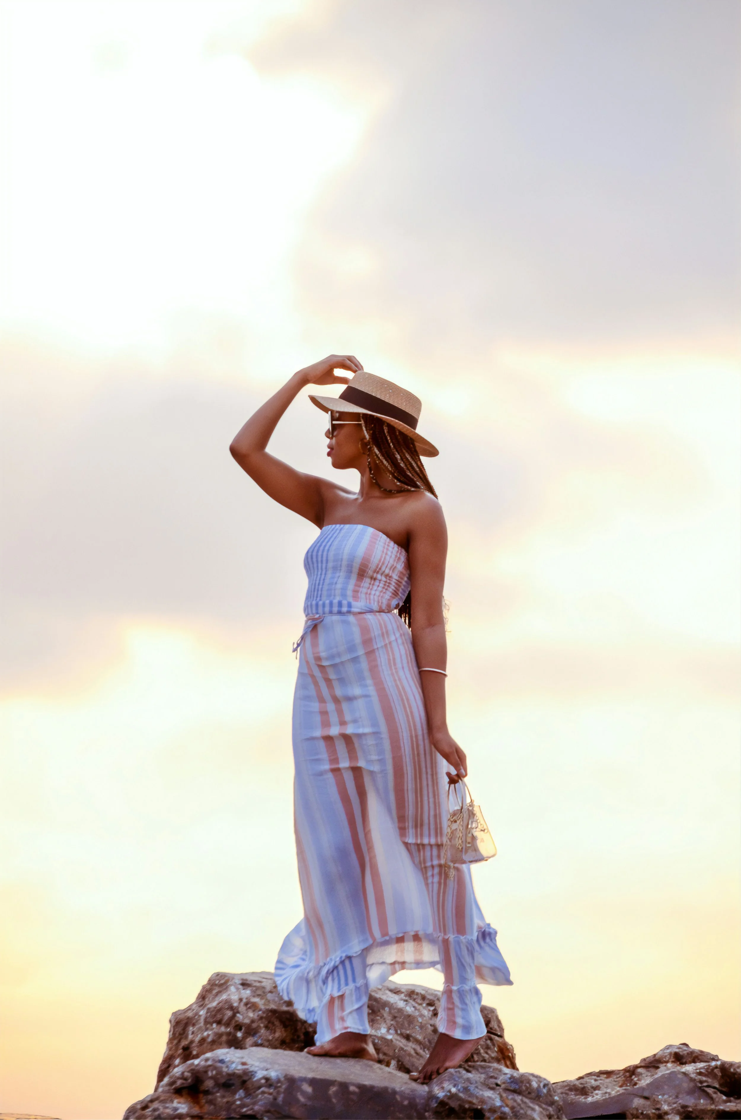
Natural prints are somehow relaxed and busy, calm and lively—all at once.
Is that really possible?
Let’s find out!
Key Natural Prints Qualities
Natural prints are often:
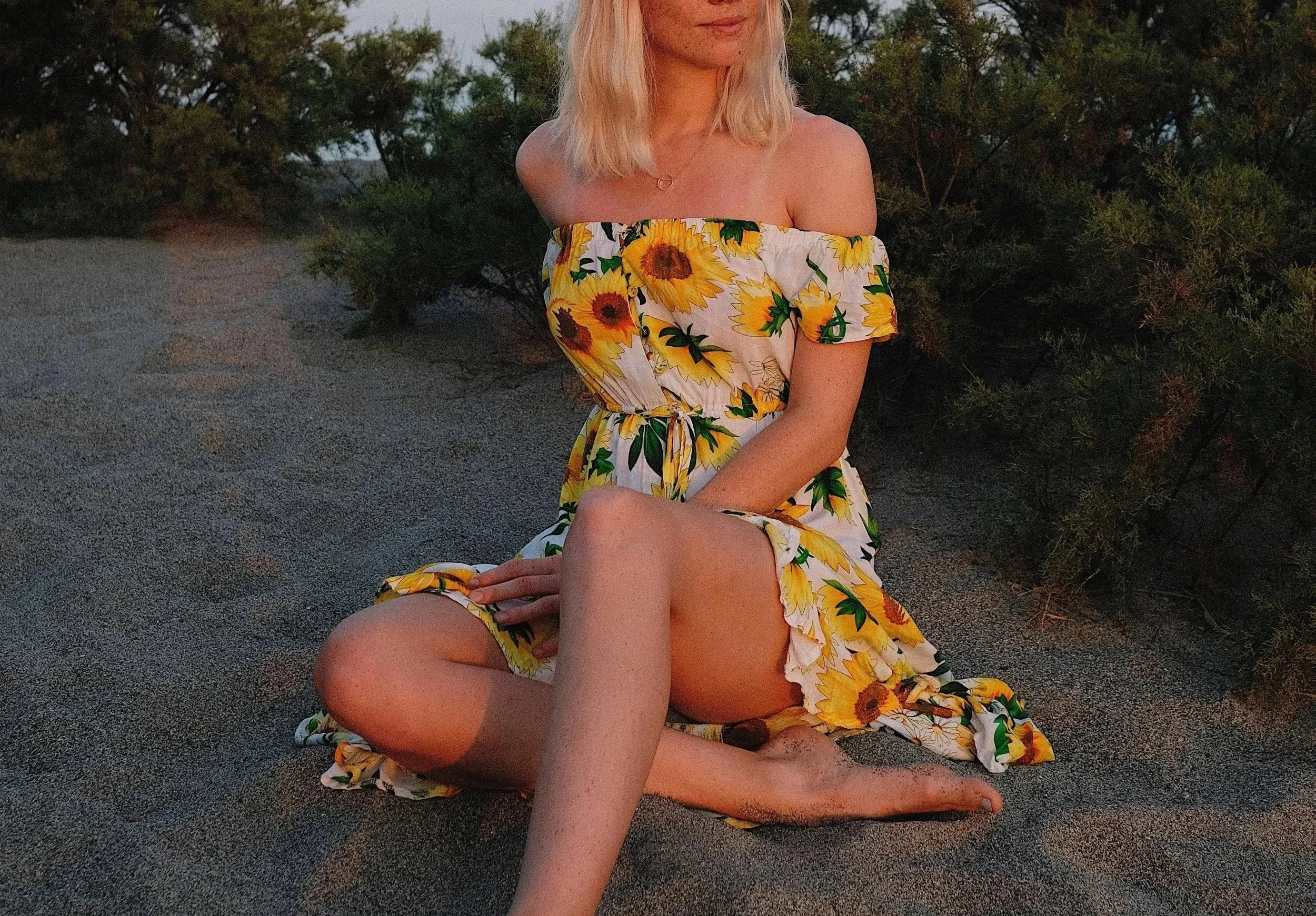
Large-scale
Blunt-edged
Asymmetrical
Nature-based
Beachy
You’re looking for designs that feel carefree, relaxed, and down-to-earth.
Natural’s Best Prints
Here’s some of your best options:
1) Pinstripes
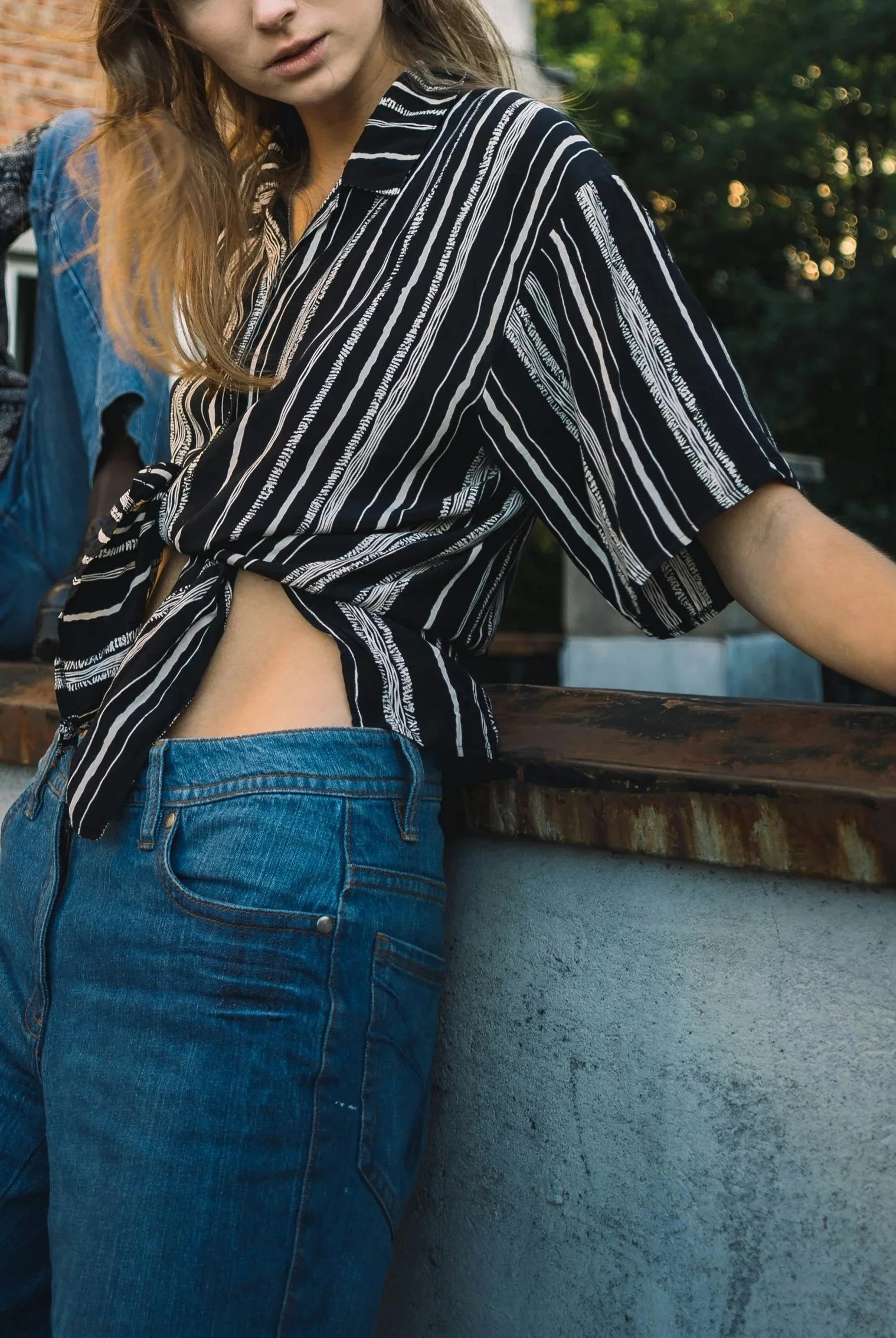
Pinstripes with a slight blend (rather than being perfectly straight)
Pinstripes with varied types of lines
Pinstripes with varied thicknesses and spacings
2) Plaids
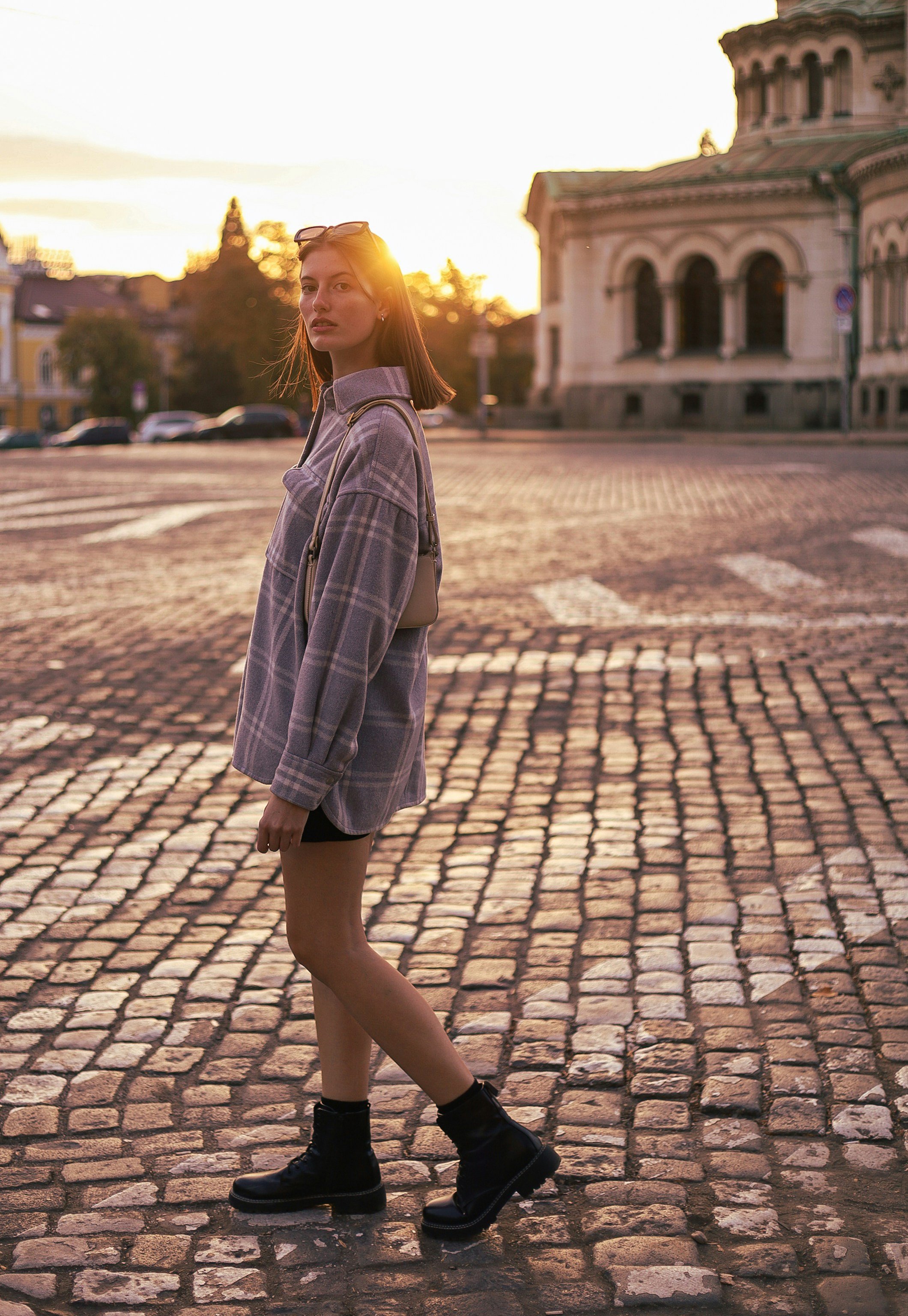
Oversized plaids (especially the kind often found on flannel shirts)
3) Florals
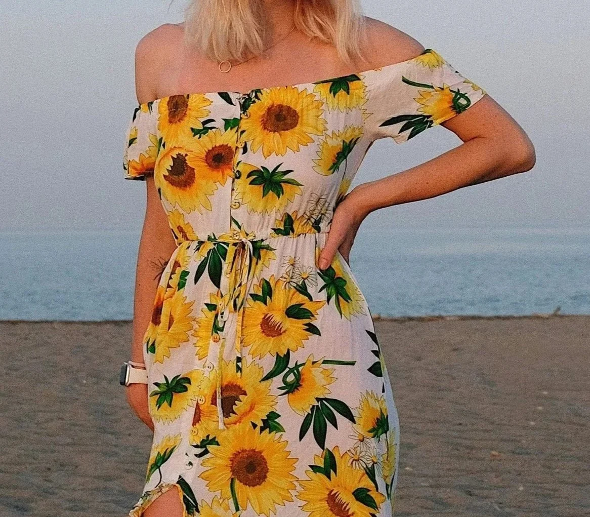
Sunflowers
Wildflowers
Flowers with large pointy petals
4) Nature Motifs
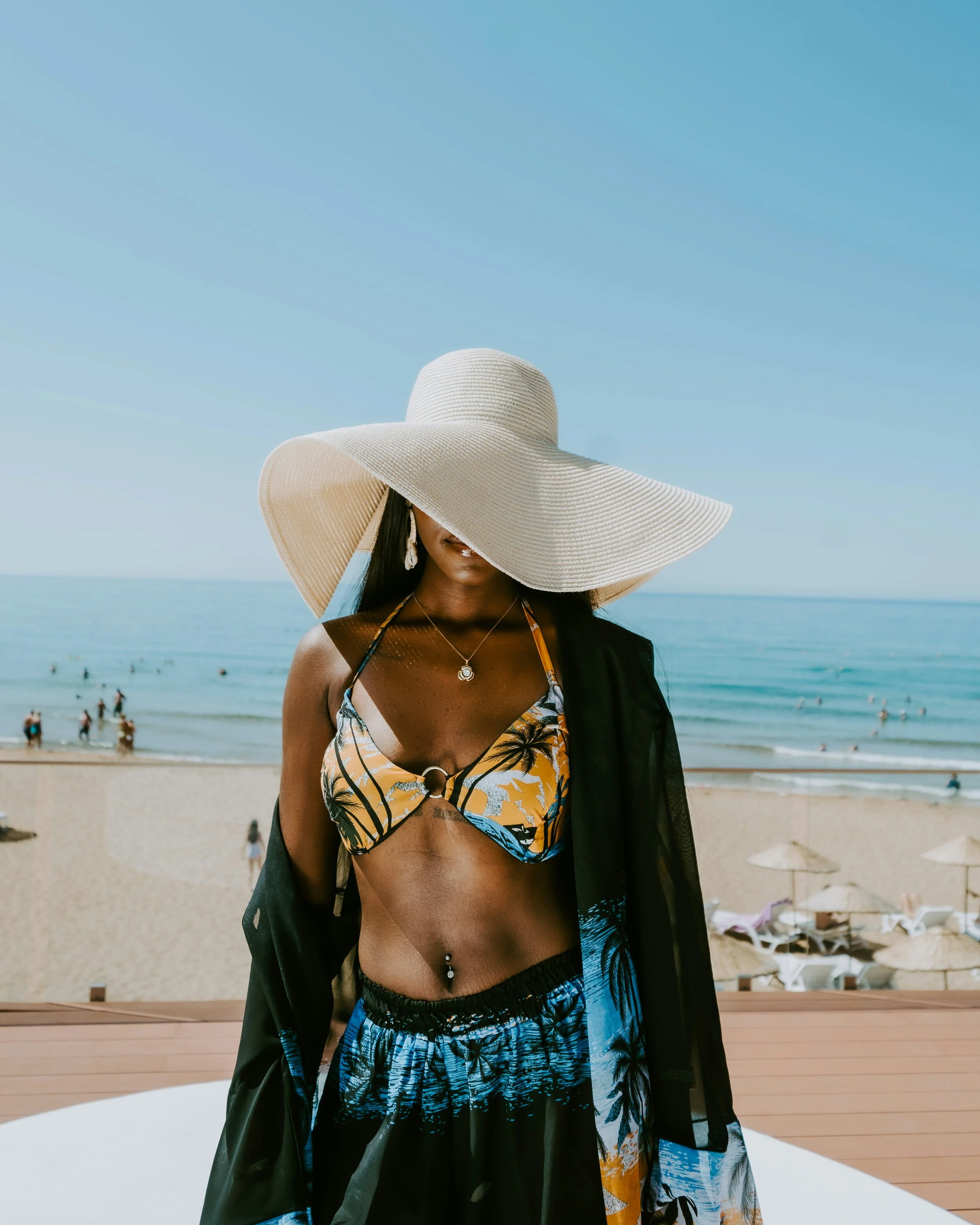
Palm trees
Other trees
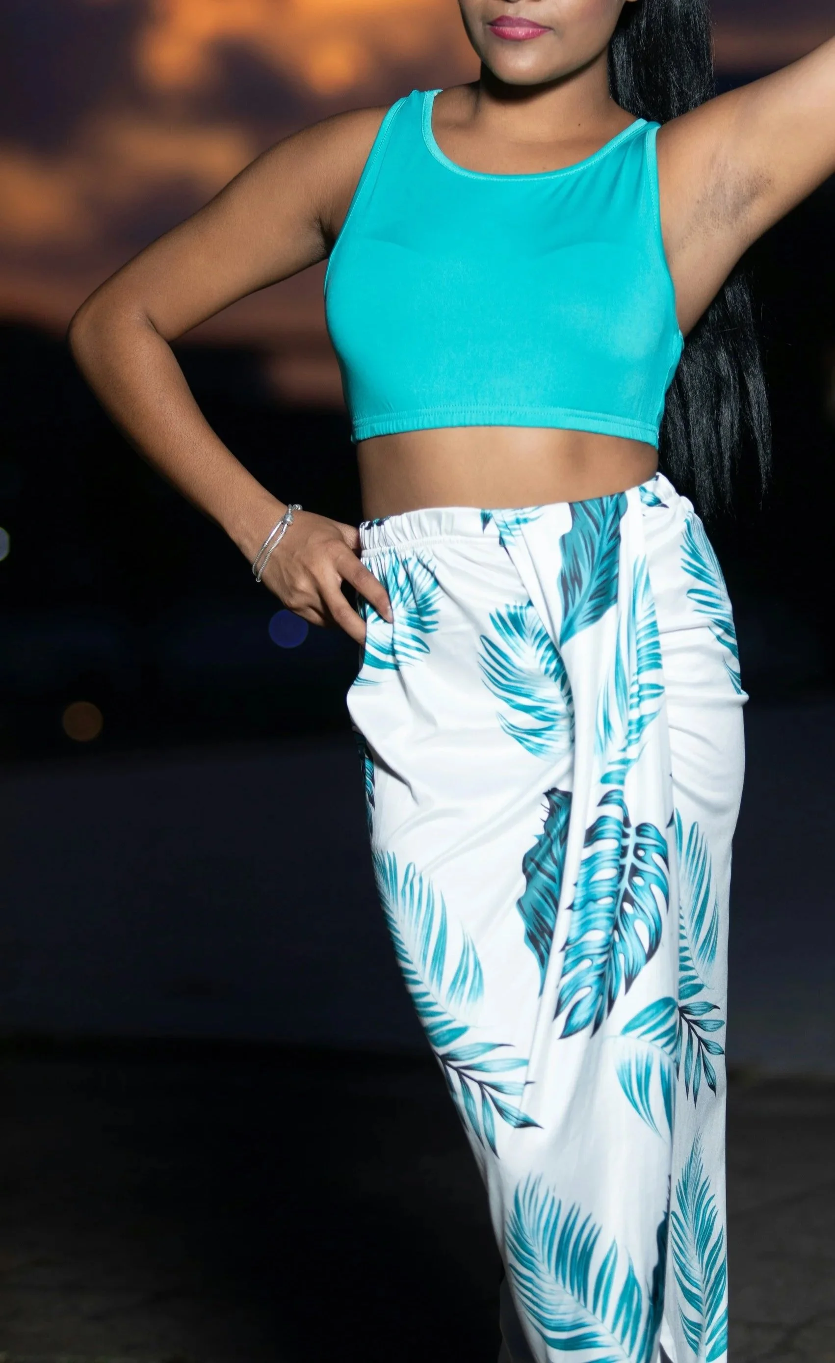
Leaves
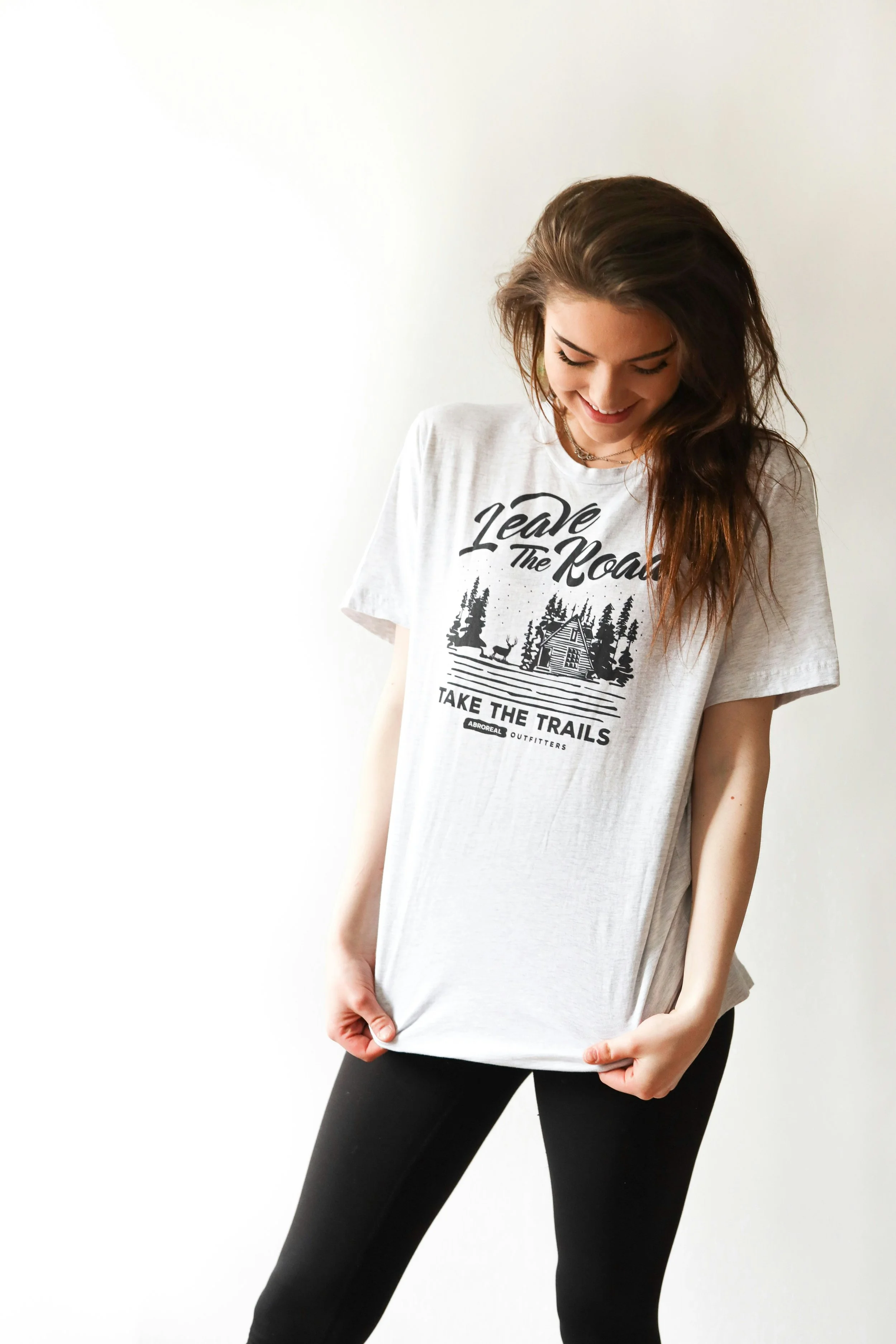
Graphic tees with nature scenes
5) Camo
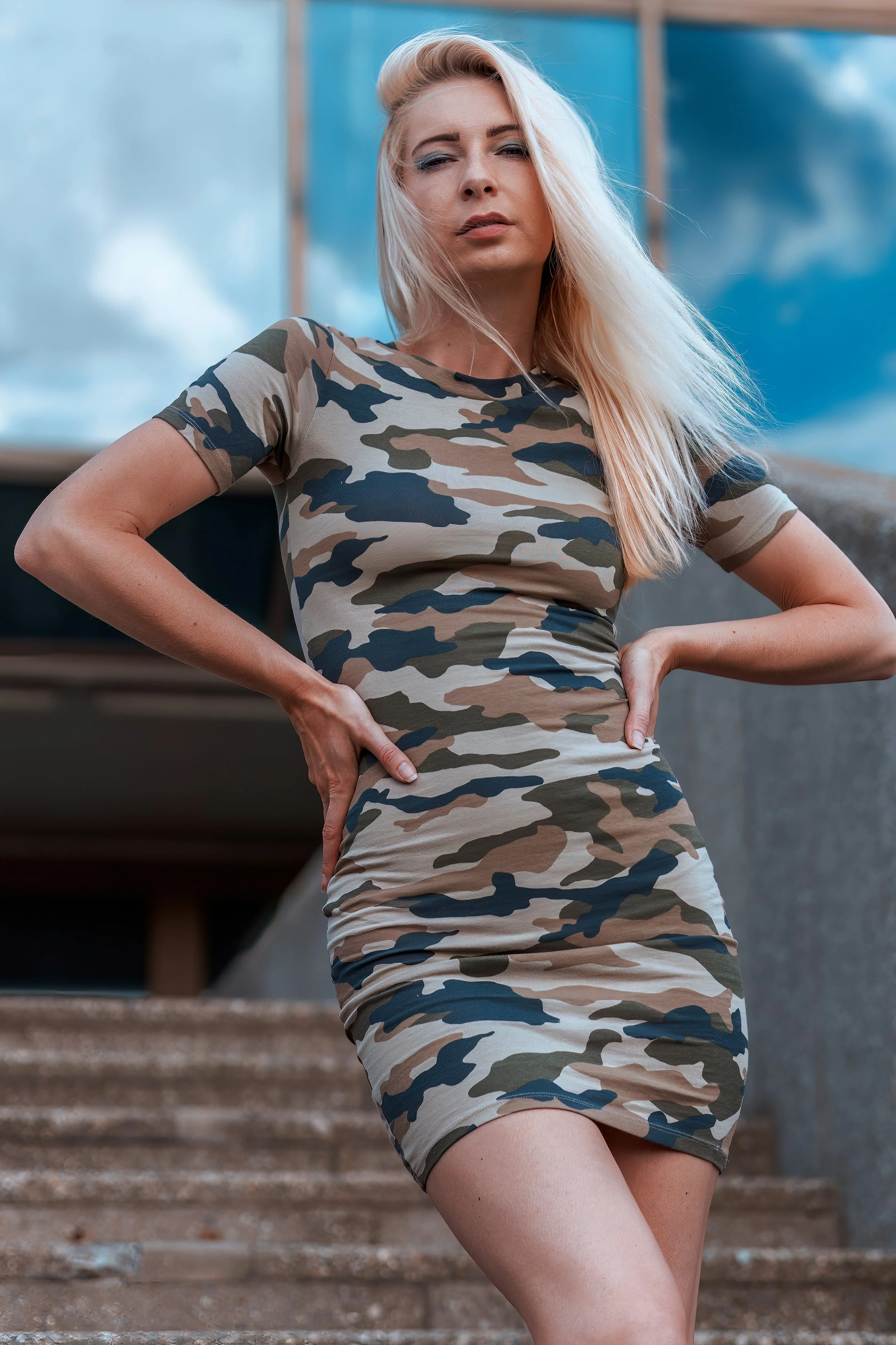
Traditional earth-toned camo
Camo with various colors
6) Paisley
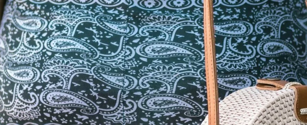
Moderate- to large-scale paisley
7) And More!
Other designs that feel carefree, blunt-edged, or evoke the beauty of nature
Lively yet Calm?
Looking at the above prints, you may get a sense of what I mean by saying that Natural prints are simultaneously lively and calm, busy and relaxed.
Natural prints often have a lot of detail, which reflects the intricate reality of the natural world.
These prints can be colorful, large, sprawling, and overlapping—they can feel busy and, like nature, very much alive.
And yet Natural designs seldom, if ever, feel aggressive or emotionally overpowering. There’s still a peacefulness to them, even when they’re lively.
Maybe this is because viewing images of nature tends to produce a calming effect on humans.
A dress covered in large, overlapping, vibrant yellow sunflowers can still feel relaxing, because it evokes nature’s serenity-inducing beauty.
Prints to Avoid
There can be exceptions, but Natural generally doesn’t prefer:
Uniform stripes and pinstripes (the kind that are evenly spaced, straight, and have lines that are all the same thickness)
Polka-dots
Geometrics with very sharp, angular shapes
Dainty, small-scale florals
Florals that feel elaborate and extravagant (like roses or other flowers that would feature in a traditional Valentine’s Day bouquet)
Animal prints (even though they evoke nature! Patterns like leopard, snakeskin, zebra, etc. feel too emotionally passionate and intense)
But you can likely still wear some of these if you have other essences in your blend.
Natural Blended Prints
Most people aren’t a pure type. But even if you only have a little Natural, you can still be flattered by fully Natural prints.
You can also choose designs that combine two or more of your essences, like:
Natural Ethereal
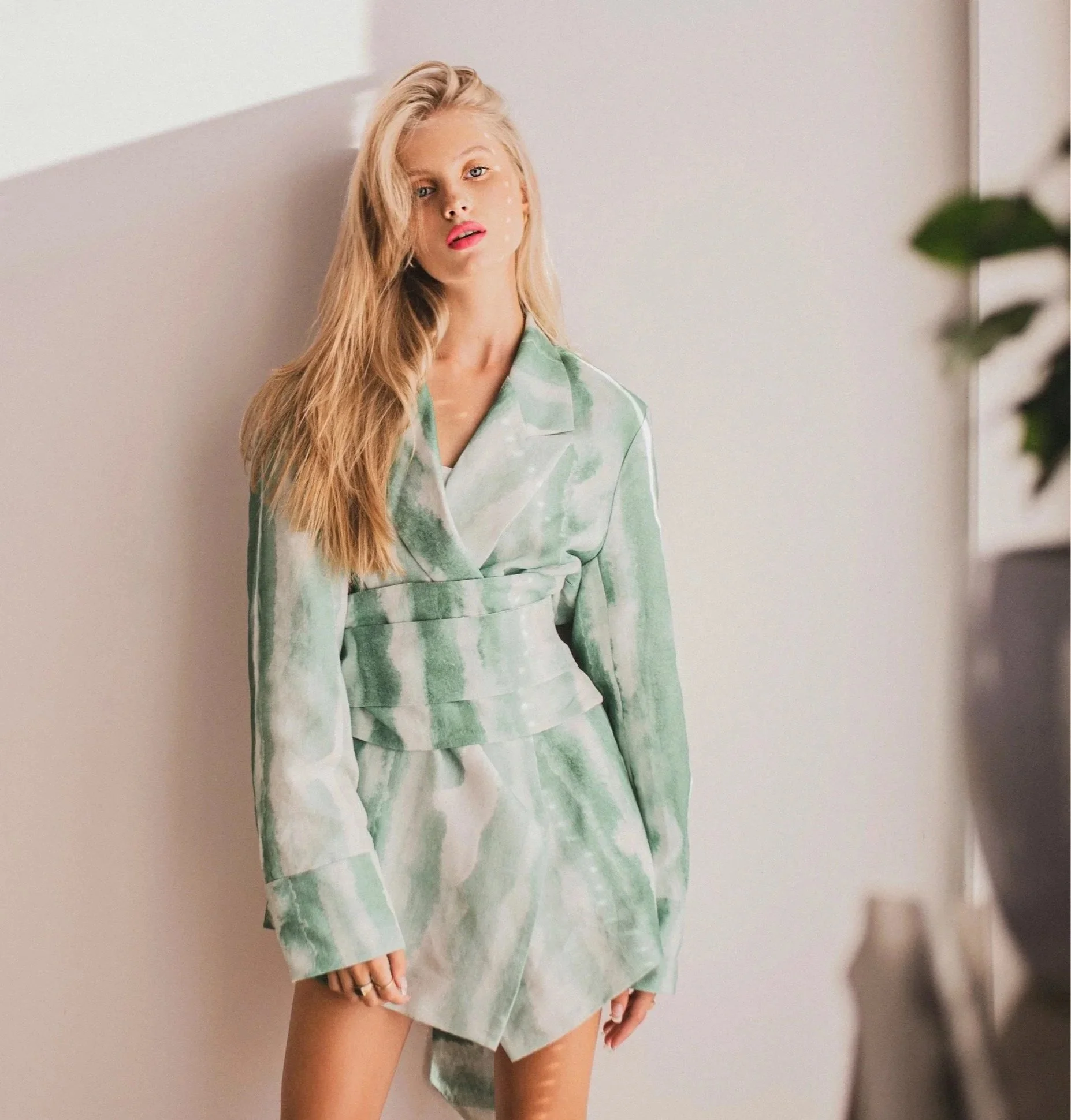
Look for tie-dye that feels random or roughly linear—this can be the perfect print for the Natural Ethereal boho aesthetic.
Natural Classic
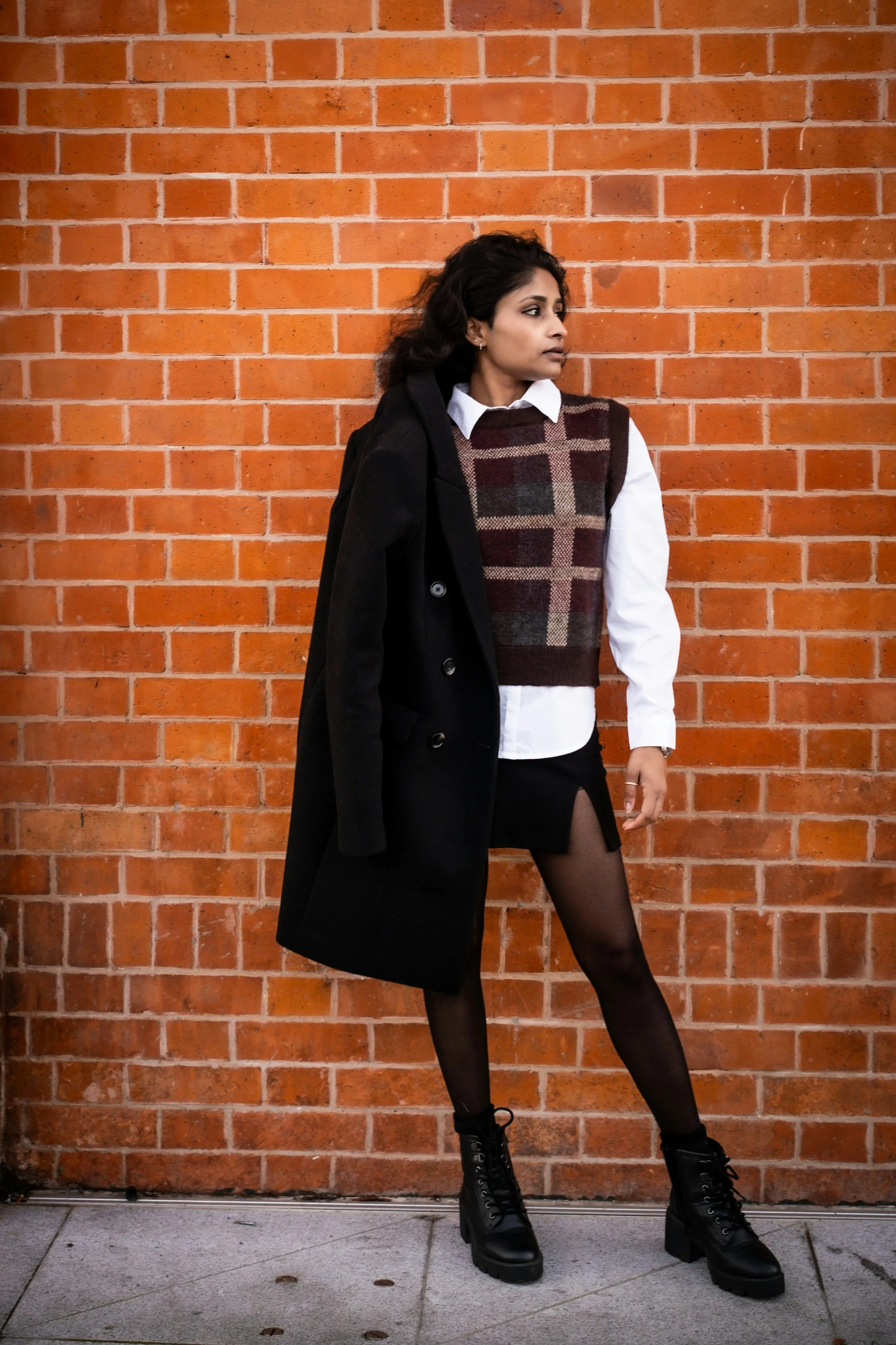
Look for simple plaids that are close to being moderate in size (Classic) but lean oversized (Natural).
Natural Gamine
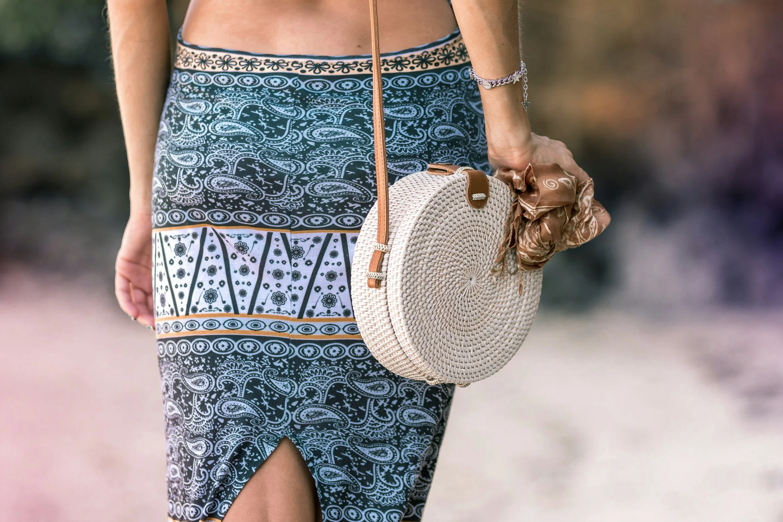
Look for paisley that incorporates stripe-like detail, especially if also accompanied by polka-dots or small geometrics.
Natural Dramatic
Look for pinstripes of varied sizes and spacings (Natural) arranged diagonally (Dramatic).
Long, straight diagonal lines, especially convergent lines, feel intense—they mimic the kinds of shapes seen in Dramatic facial features and bone structure.
Natural Ingenue
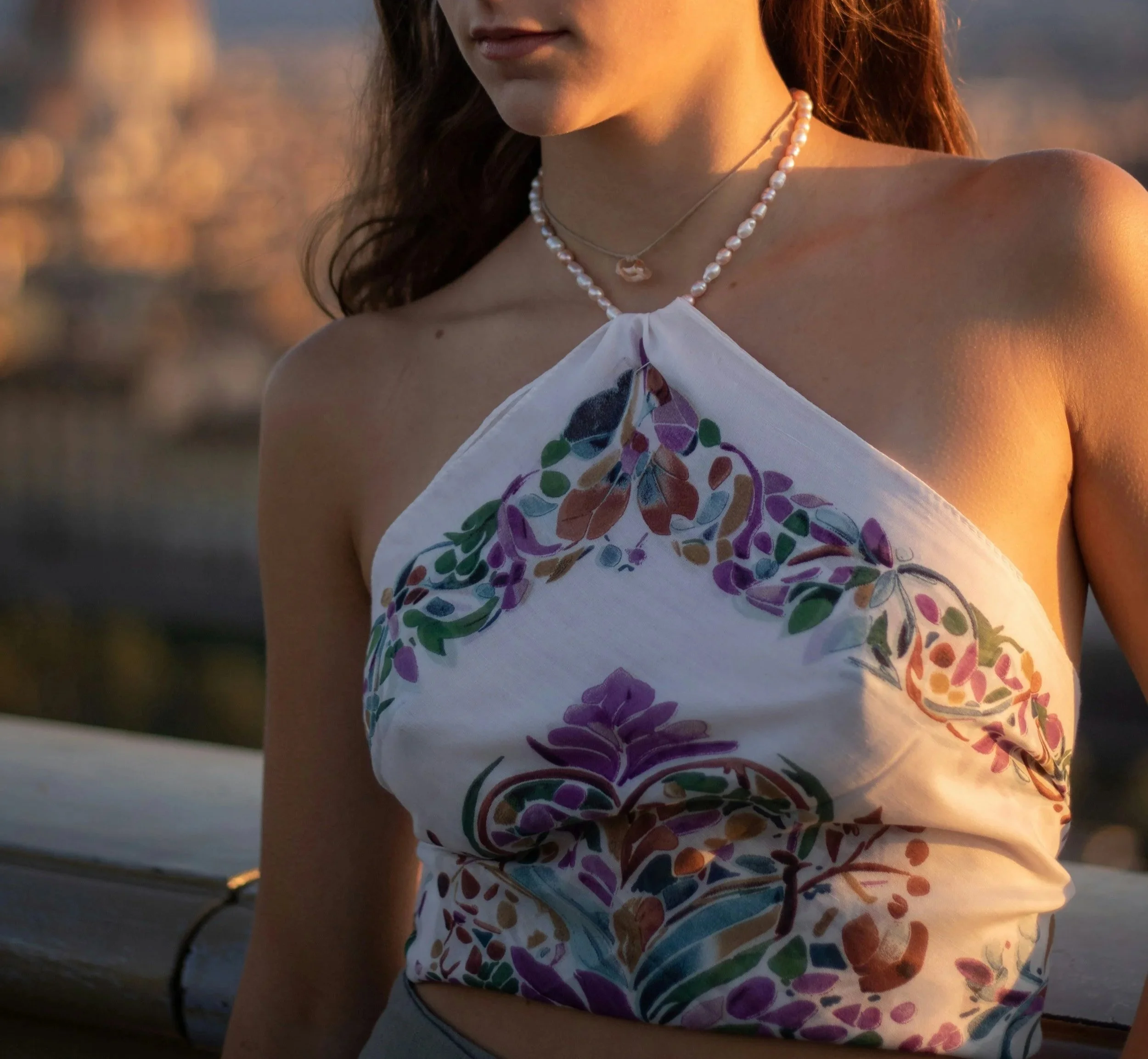
Look for florals that have leaf or vine-like shapes (Natural), along with small, delicate petal-like shapes (Ingenue).
Natural Romantic
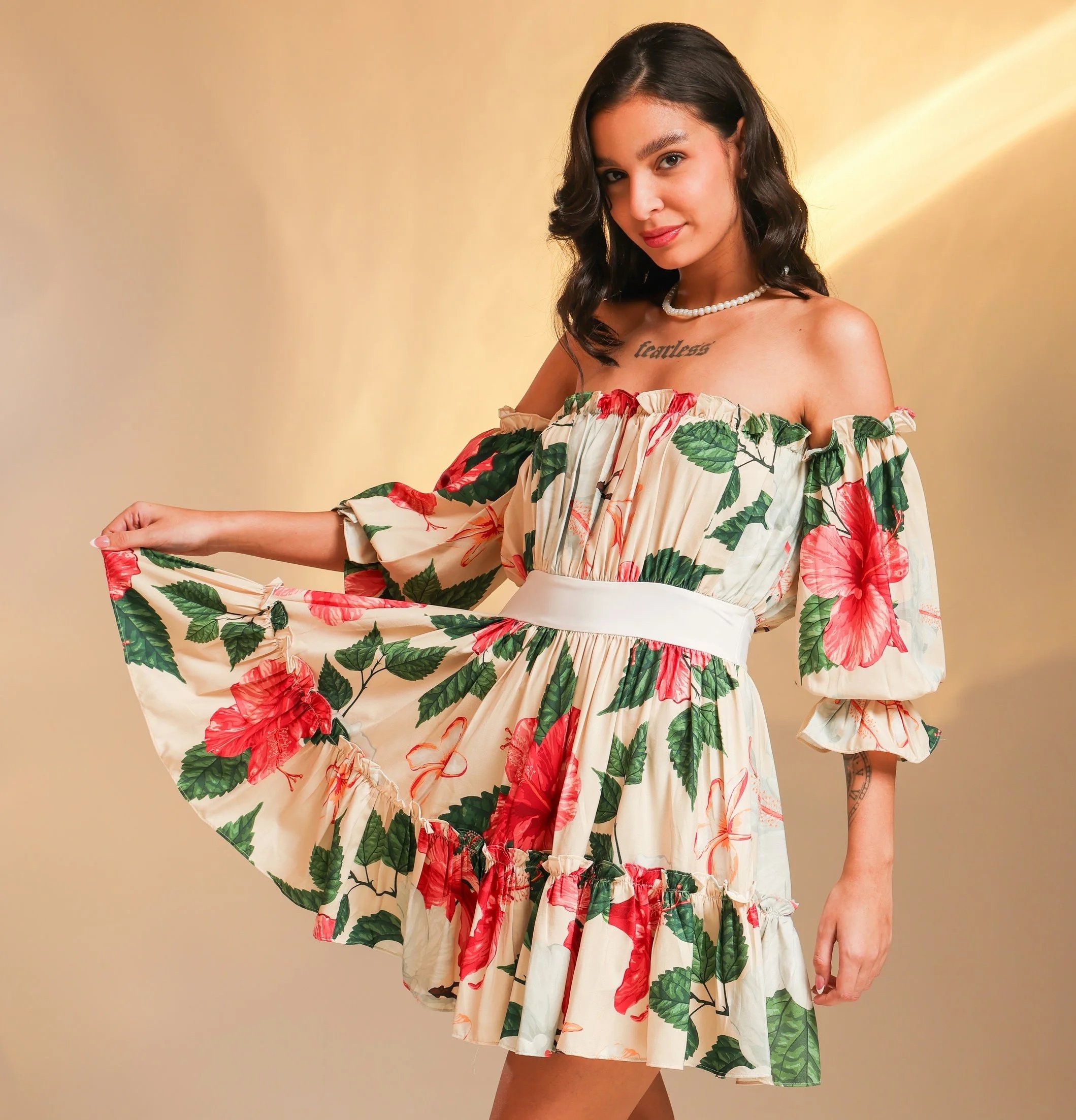
Look for prints that feature florals with moderate or large, very curvy shapes (Romantic) along with notable foliage or leaves (Natural).
Distinguishing Natural and Romantic Florals
Natural and Romantic flowers can be hard to tell apart—both can appear large and asymmetrically-spaced.
Here’s some tips for distinguishing them:
1) Consider shape
As a rough rule, Romantic florals tend to feel curvier, whereas Natural florals tend to feel pointier.
2) Consider formality
Romantic florals generally feel more dressed-up—they wouldn’t look out of place on a cocktail dress or other formal attire.
In contrast, Natural florals feel more casual—it would be more expected to see them on a beachy sundress than a cocktail dress.
3) Look at the leaf-to-flower ratio
Fully Romantic floral prints can have some leaves, but the leaves are usually less prevalent than the flowers—the flowers will take up more space.
In contrast, if the leaves on a print appear prominent and take up as much space (or more space) than the flowers, then that’s likely a Natural print, or a Natural Romantic one.
4) Consider size
If the individual flowers appear very oversized, they’ll often have some Natural, regardless of the type of flower.
Oversized florals can blend Natural and Romantic if they’re very curvy and elaborate.
5) When in doubt
If in doubt, you may be looking at a print that’s overall best for a Natural Romantic blend.
Print-Mixing
Print-mixing can be perfect for Natural’s relaxed, carefree beauty.
Mixing different patterns can help create the impression that you didn’t try super hard to be matchy-matchy. This flatters Natural’s cool, casual aesthetic.
Here’s some examples of making the technique work:
Phone It In
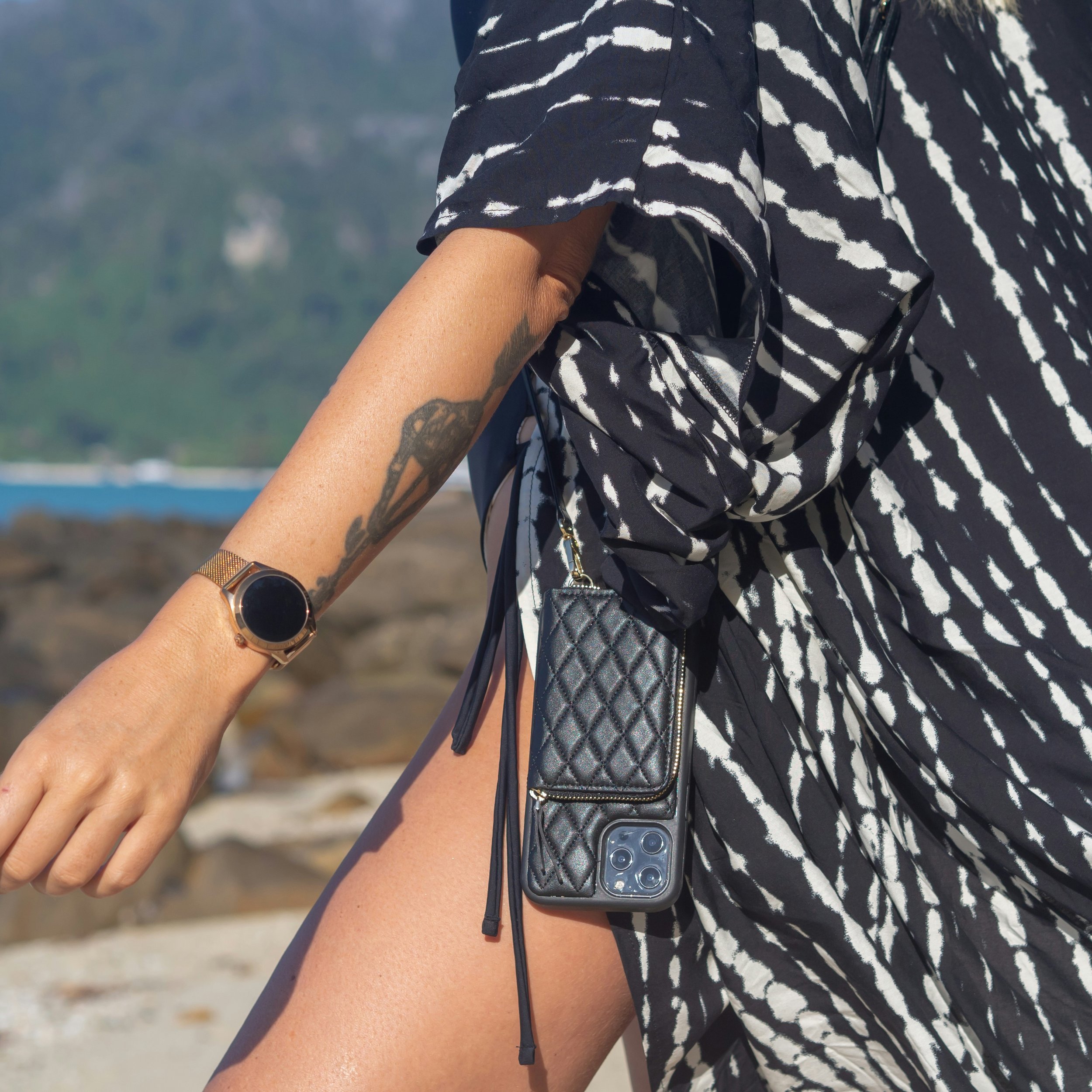
This may be a very loose interpretation of a print, but why not?
Natural uneven “pinstripes” plus a quilted phone case. Cool look for a Natural Gamine blend.
Edge It Up
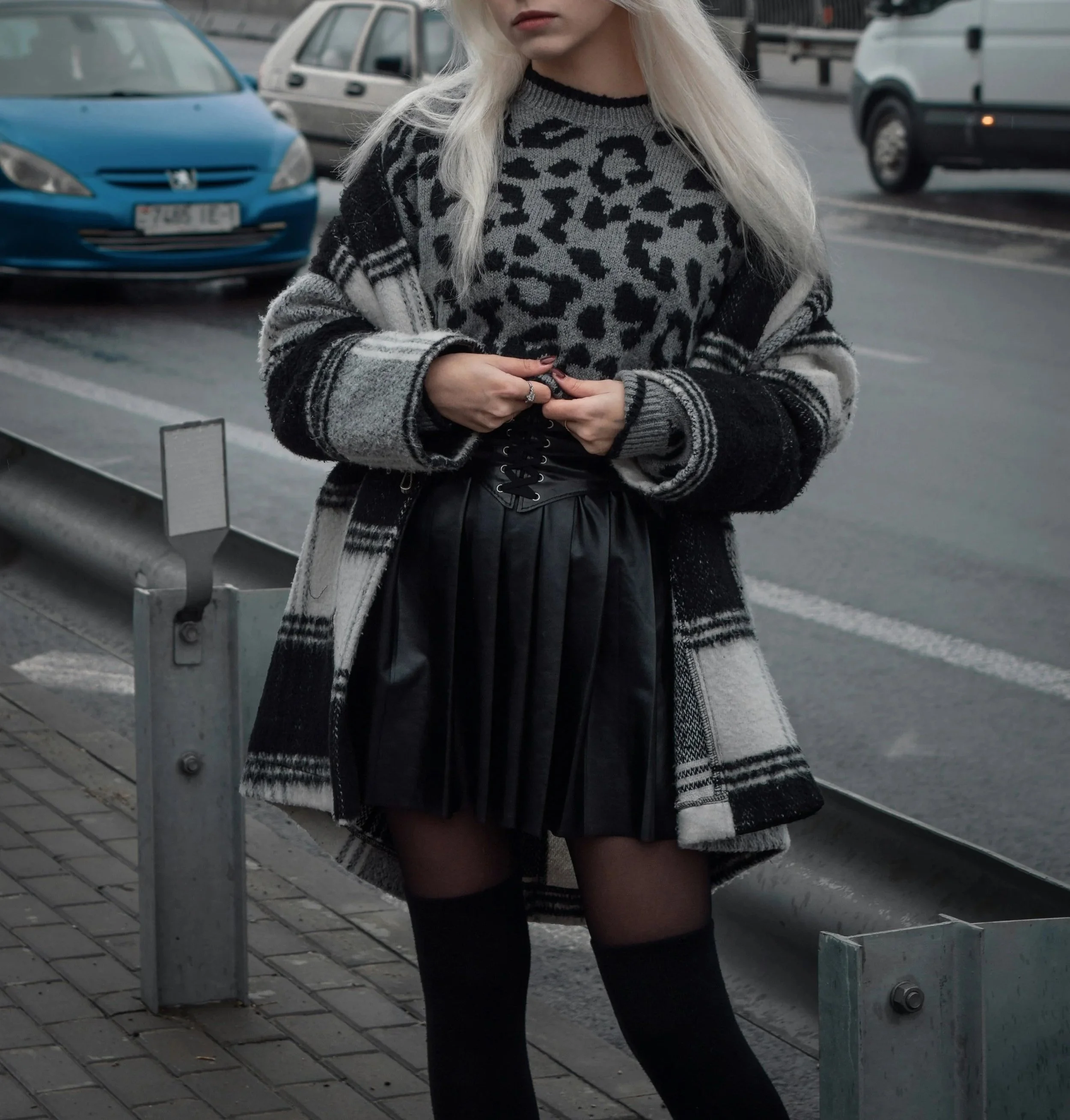
Pairing a plaid jacket with a leopard print sweater and leather sharply-pleated skirt makes a neat look for a Romantic Dramatic Natural Gamine.
Handbag It
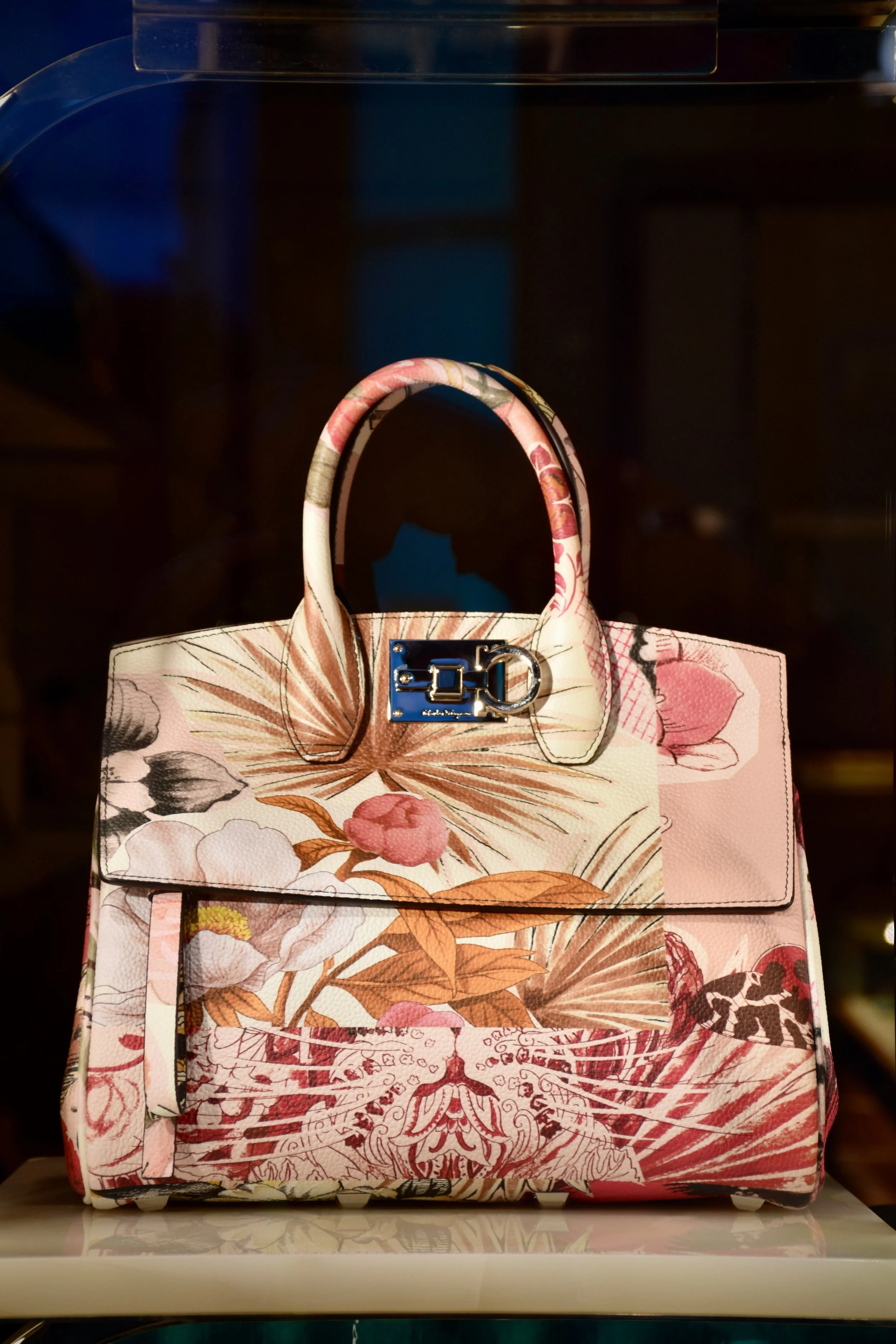
You can also find elaborate prints that already have a “mixed” quality.
This print would suit a Natural with Romantic and Ethereal, since the florals have notably curvy shapes and a dreamy, watercolor feel.
The basic minimalist square bag silhouette adds Classic.
Be Graphic
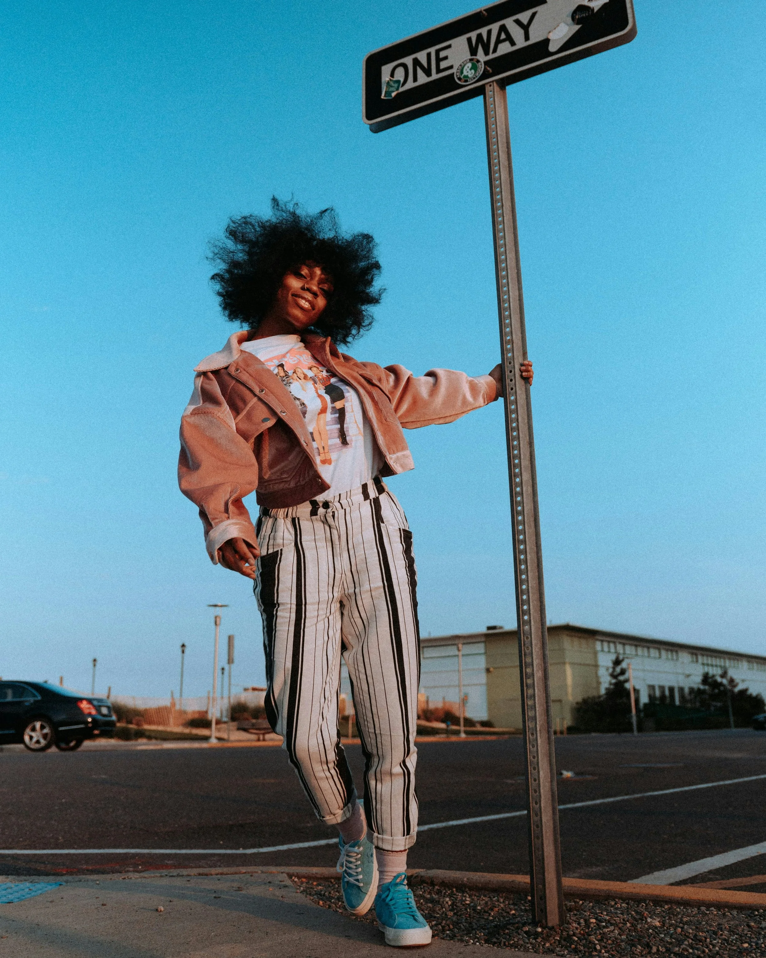
Pinstripes of varied thicknesses plus a cropped slouchy jacket and graphic tee—great Natural Gamine look.
The tee itself also appears to add a Romantic feel, since it features characters in glam outfits from the iconic film Clueless.
And More!
These are just a few examples of the infinite kinds of outfits you can create.
The great thing about having a lot of Natural is that pieces that don’t look “matchy-matchy” can paradoxically appear coordinated on you.
They fit your chill, carefree vibes.
Colors and Color Season
Any season can create an earthy or beachy feel by combining colors like green, blue, orange, brown, and/or beige, etc.
So Natural works well with any seasonal palette.
And as we saw above, the neat thing about wearing prints is that they can sometimes strongly express your style type, even if the colors aren’t stereotypical for your essences.
Specifically, we saw several fully Natural prints that combined large amounts of black with white.
Often black and white together reads as intense and Dramatic, or conventionally formal and Classic.
But in a Natural print like uneven pinstripes or a nature scene, the high-contrast color scheme still has a relaxed Natural feel.
So especially if you have a season that lacks stereotypically “earthy” colors (some of the Winters, and arguably Springs and Summers, too), wearing prints can be a great way to express your essence.
General Print-Mixing Tips
Here’s a summary of general print-mixing strategies (we also covered all these previously when discussing the other essences’ best prints!)
These are absolutely guidelines, not rules—all can sometimes be broken with success:
Pair a subtler print with a louder one
Mix a simpler print with a more complex one
Mix a more well-known and recognizable print (like plaids) with a more unusual one
Pair larger scale with smaller scale
Pair a printed garment with printed shoes, accessories, or jewelry
Have one or more of your prints be mostly neutral
Mix prints in the same or similar color schemes
Keep color season mostly consistent—if the print mostly suits your season while also incorporating some colors that are outside your season, it may still work for you. But in general, if you like to dress by your color season, then you’ll want the majority of the print’s colors to match that
Natural or Classic?
Like Natural fashion in general, Natural prints exude a cool, casual, somewhat spontaneous feel.
In this way, they’re basically the opposite of Classic prints (like basic uniform pinstripes), which often have symmetry and evenly-spaced lines.
Interestingly, these two essences are easy to confuse in faces, since both sometimes read as being defined by moderate-length, blunt-edged features.
So if you’ve been unsure about whether you have Natural or Classic, you might consider which essence’s prints most flatter you.
Natural Beauty: Lively yet Calm
One amazing aspect of Natural prints is that they tend to have a calm, relaxing aura—yet there can still be a lot going on.
Certain Natural designs, like florals or paisley, can actually feel quite “busy” and detailed. Yet thanks to blunt-edged shapes, nature motifs, and other Natural qualities, these prints still feel peaceful, rather than intense or aggressive.
And I think that’s something to love about Natural in both fashion and faces.
Natural beauty embodies the complexity, character, and variety of the natural world. People with the Natural essence often have gorgeously standout features, whether that’s very chiseled bone structure or notably thick brows.
But even with their strong features, Naturals tend to look friendly and open, rather than extremely intense or intimidating.
Natural beauty feels peaceful, and yet Naturals are also harmonious with big smiles that are full of emotion and life. They’re able to embody both: tranquility and lively happiness.
That’s a special combination of qualities.
Next Time
Next time we’ll look at Ethereal’s dreamy prints! : )