Classic Essence Prints
More than any other essence, Classics reveal the beauty of simplicity.
The power of clean lines, timeless basics, and solid-color clothing.
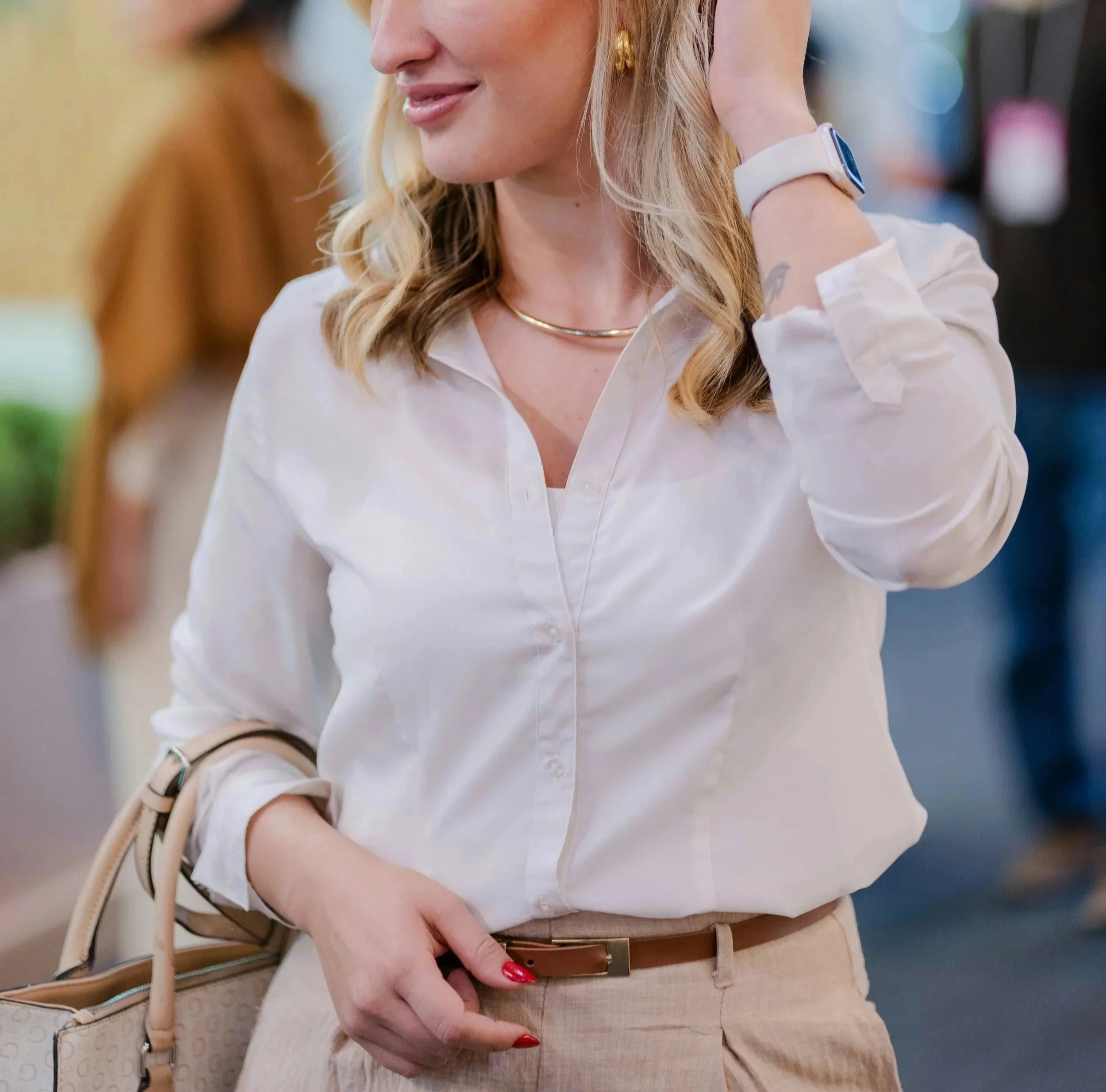
But that doesn’t mean Classics can’t wear prints, because they absolutely can. They can even explore print-mixing.
We’ll reveal how below:
Classic Prints Qualities
Classic prints are often:

Neutral
Symmetrical
Minimalist
Small- or Moderate-Scale
But it’s also possible for them to have color, asymmetry, or a larger size.
Ultimately, what you’re looking for in a Classic print is a timeless, chic, sophisticated feel.
Classic’s Best Prints
Some of your best options:
1) Pinstripes
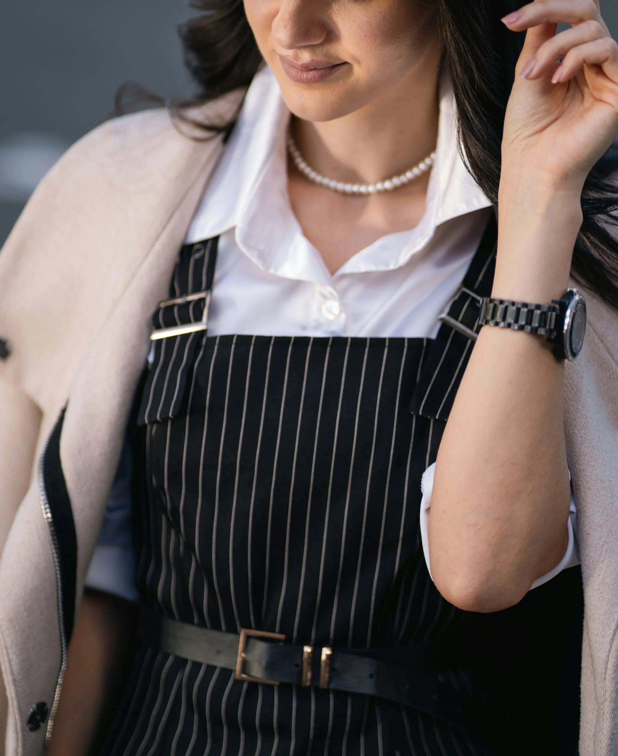
Neutral thin pinstripes

Neutral medium pinstripes
2) Plaids
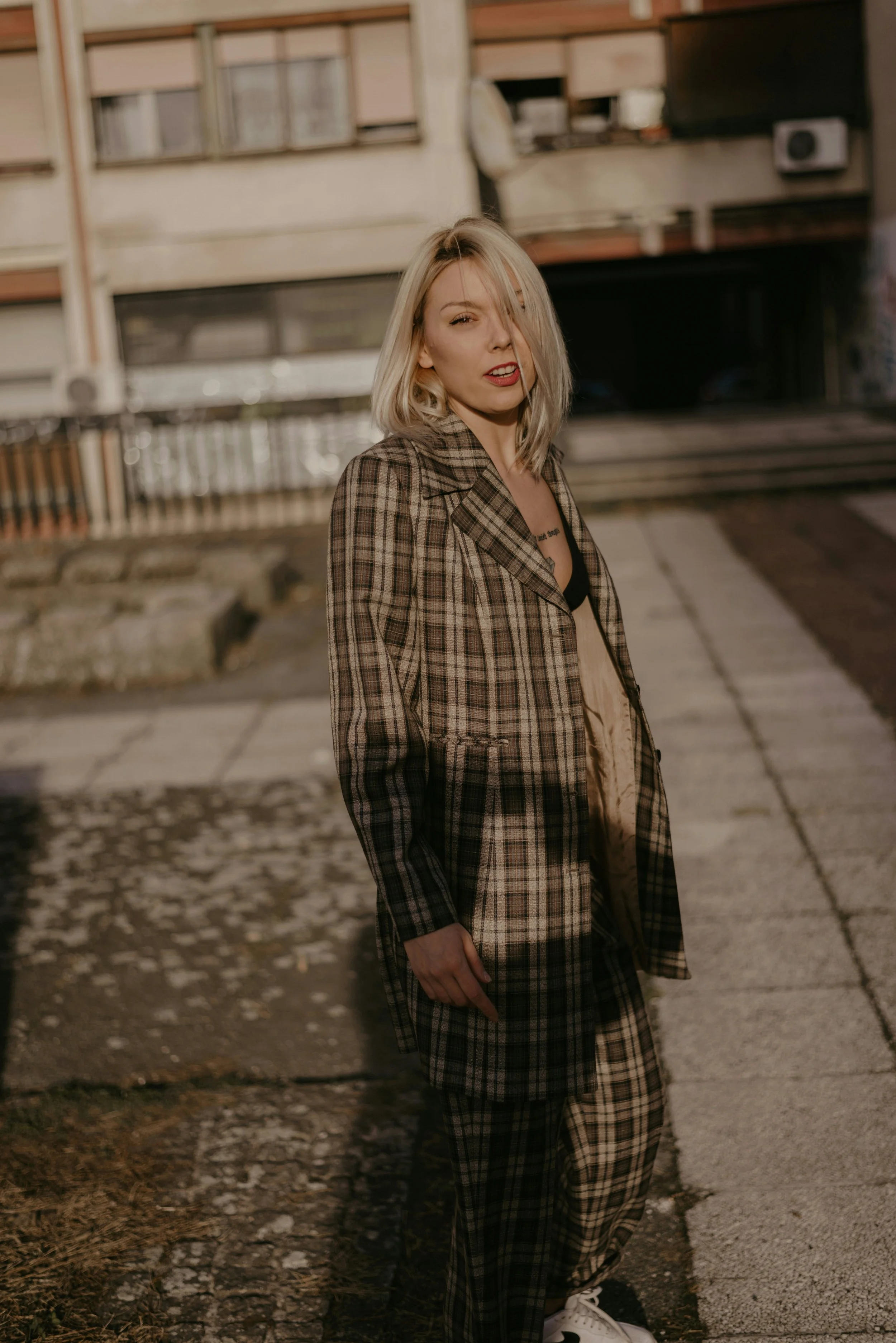
Simple, moderate-scale, neutral (or mostly neutral) plaids
It’s easy to confuse Gamine and Classic plaids. Classic plaids will tend to feel more neutral, serious, and timeless—one test of whether a plaid is Classic is to ask, “Could this plaid work as a jacket and matching pants worn in a workplace with a formal dress code?”
Gamine plaids will feel bolder and more playful, such as because they have a lot of color or are very high-contrast.
Certain types of plaids, like checkerboard, tend to suit Gamine more than Classic, because they feel modern rather than timeless, and energetic rather than understated.
Low-contrast, subtle plaids
Very low-contrast, subtle windowpane or grid
3) Herringbone
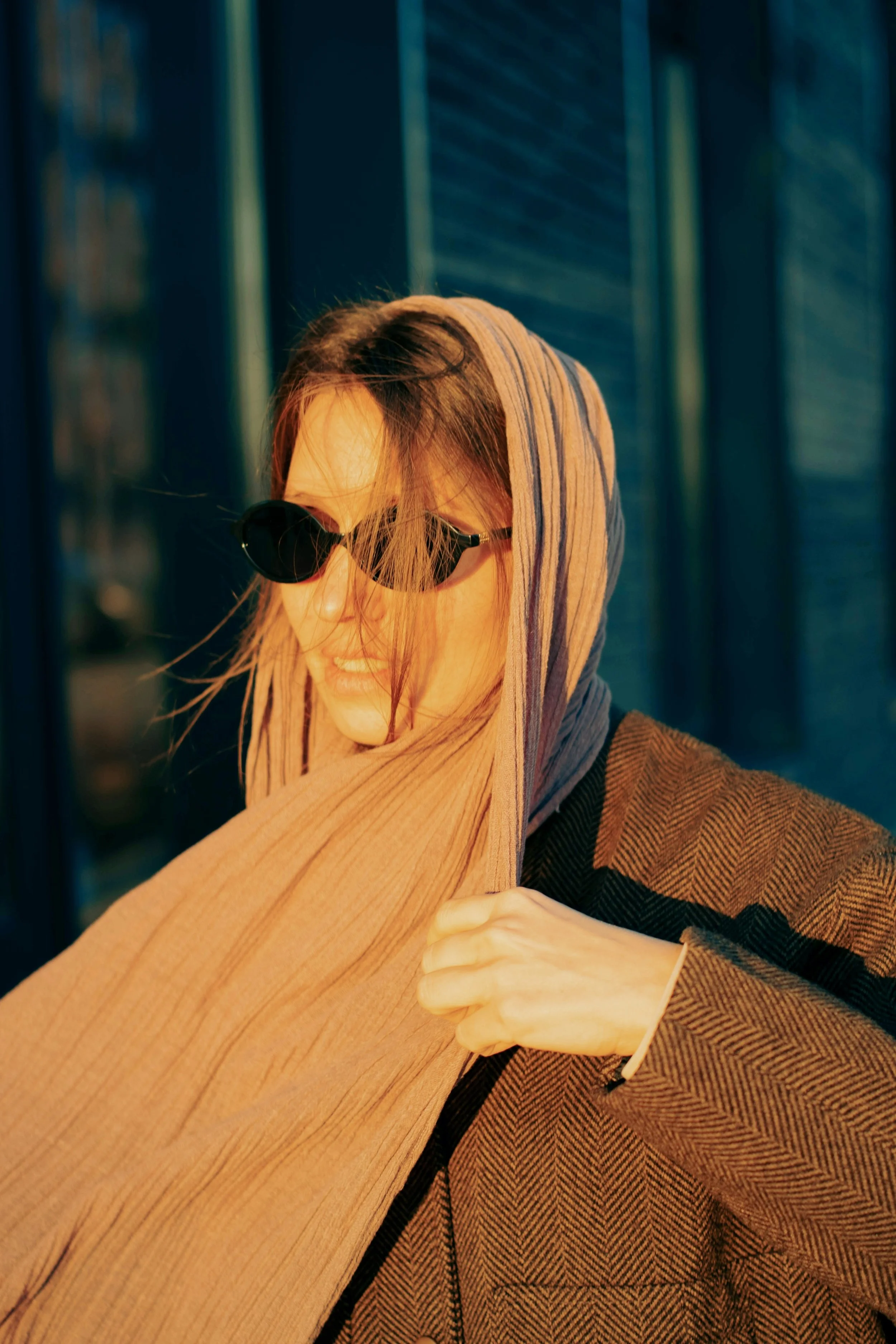
Neutral herringbone
Small or medium-scale herringbone
4) Tortoiseshell
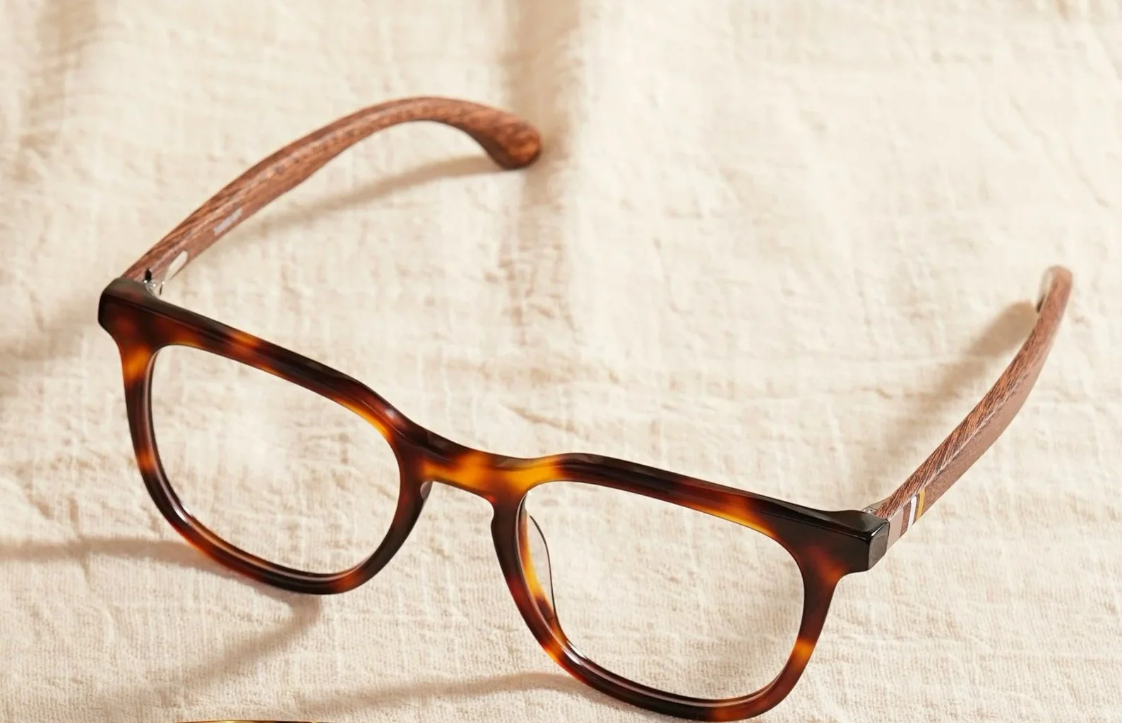
Traditional tortoiseshell (in brown and amber hues)
Tortoiseshell is a popular, timeless Classic glasses pattern.
Classic is best in small- to moderate-size tortoiseshell, such as on glasses or other accessories (like shoes or purses). You might be able to make a larger-scale tortoiseshell print work, like on a shirt or a dress, although large-scale tortoiseshell can strongly resemble curvy animal prints (like leopard) and so is sometimes better for Romantic.
5) Houndstooth
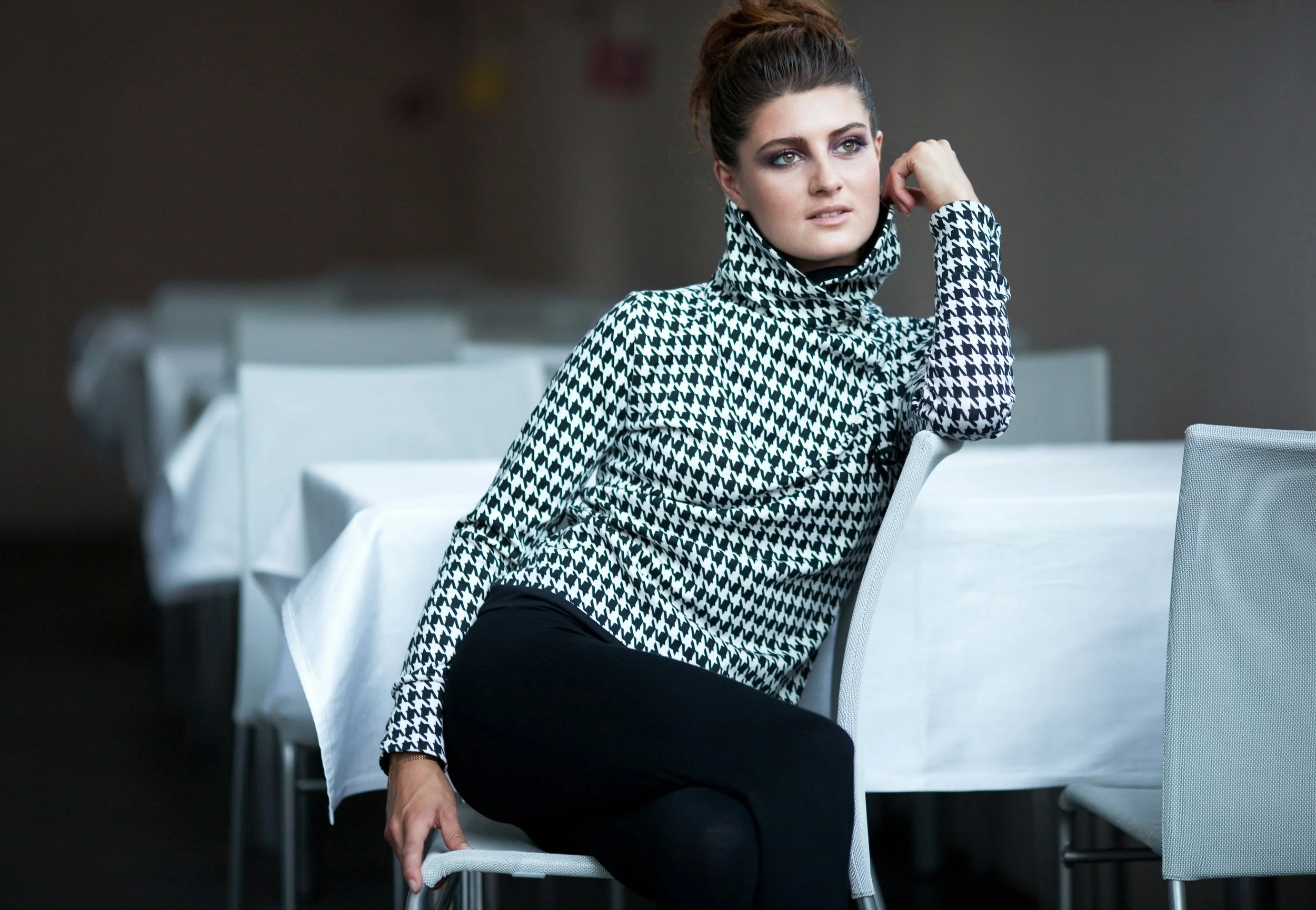
Neutral, standard-size houndstooth
Colorful houndstooth tends to be Gamine, whereas oversized houndstooth tends to be Dramatic. This top would suit a Classic Dramatic with the unique high neckline.
6) Designer Prints
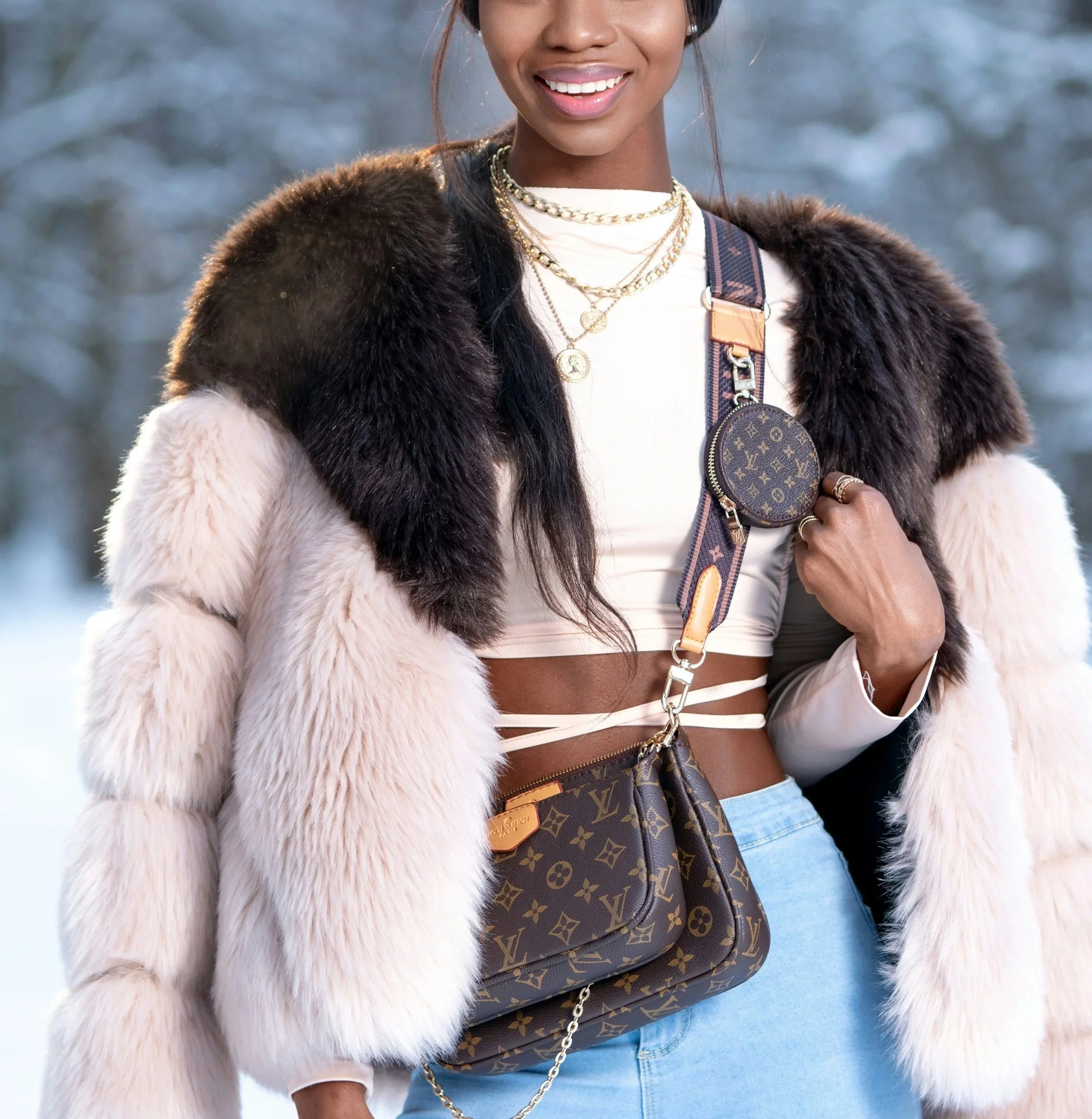
Very recognizable designer prints, like Louis Vuitton’s iconic monogram pattern
Neutral, simple designer prints and logos
7) And More!
Other designs that feel timeless, luxe, and chic
Prints to Avoid
Classic has a long list of prints to avoid, including:
Horizontal stripes, thick vertical stripes, or any playful-feeling stripes
Oversized plaids
Colorful plaids
Busy or asymmetrical geometrics
Animal prints (besides tortoiseshell)
Tie-dye
Watercolor
Paisley
Polka-dots (unless very small, minimalist, neutral, and symmetrically spaced)
Camo
But you can likely still wear some of these if you have other essences in your blend.
Classic Blended Prints
Most people aren’t a pure type. But even if you only have a little Classic, you can still be flattered by fully Classic prints.
You can also choose designs that combine two or more of your essences, like:
Classic Ingenue
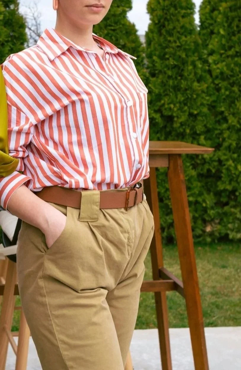
Look for Classic prints in Ingenue colors, like light pink or salmon pinstripes.
Classic Ethereal
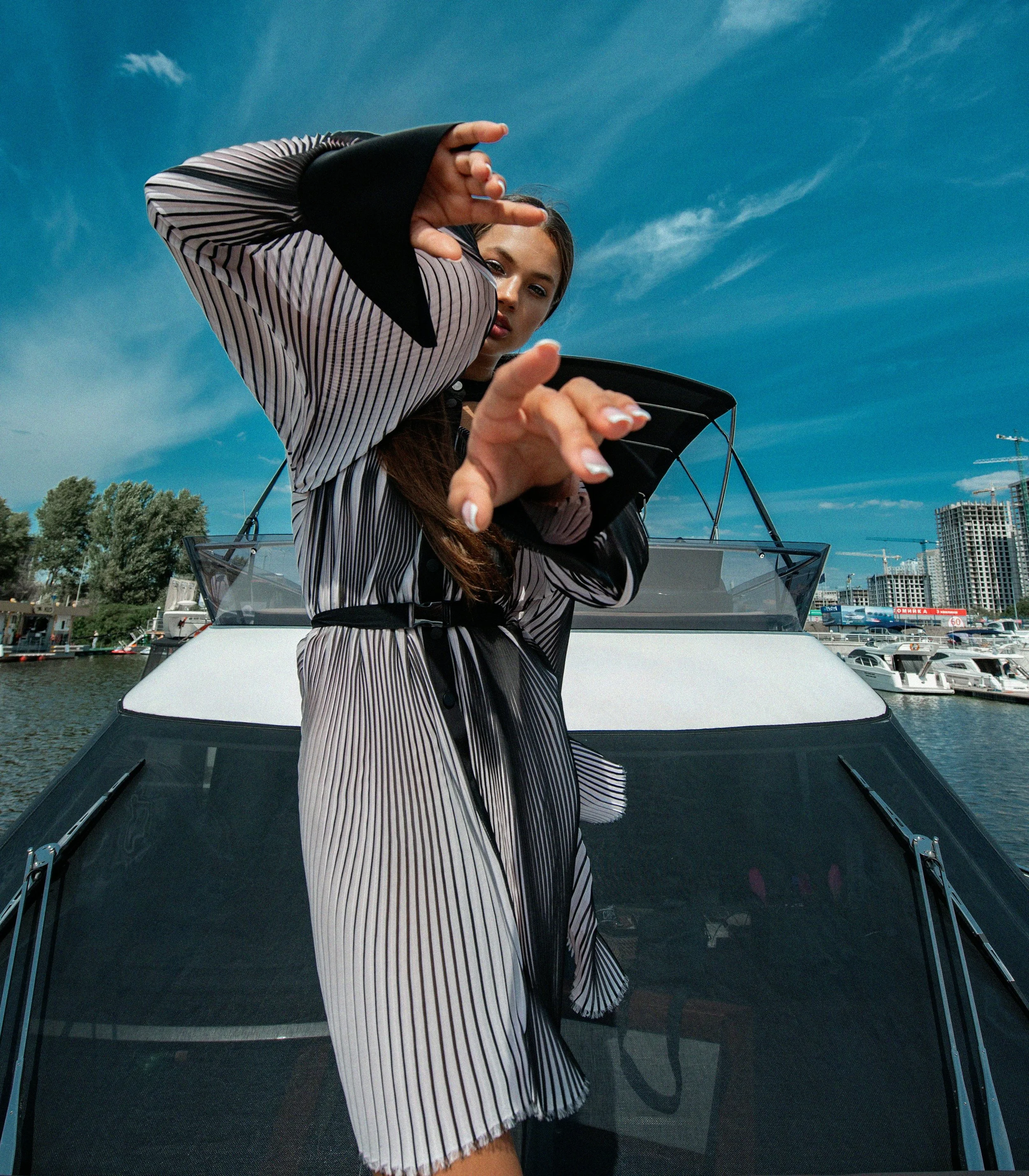
Look for thin Classic pinstripes that are convergent, either because of the print’s design itself or because the print is on an accordion pleat garment, as seen here.
This dress still has a lot of Classic, but the way the lines converge creates a “trippy” or dreamy effect, adding Ethereal.
Classic Gamine
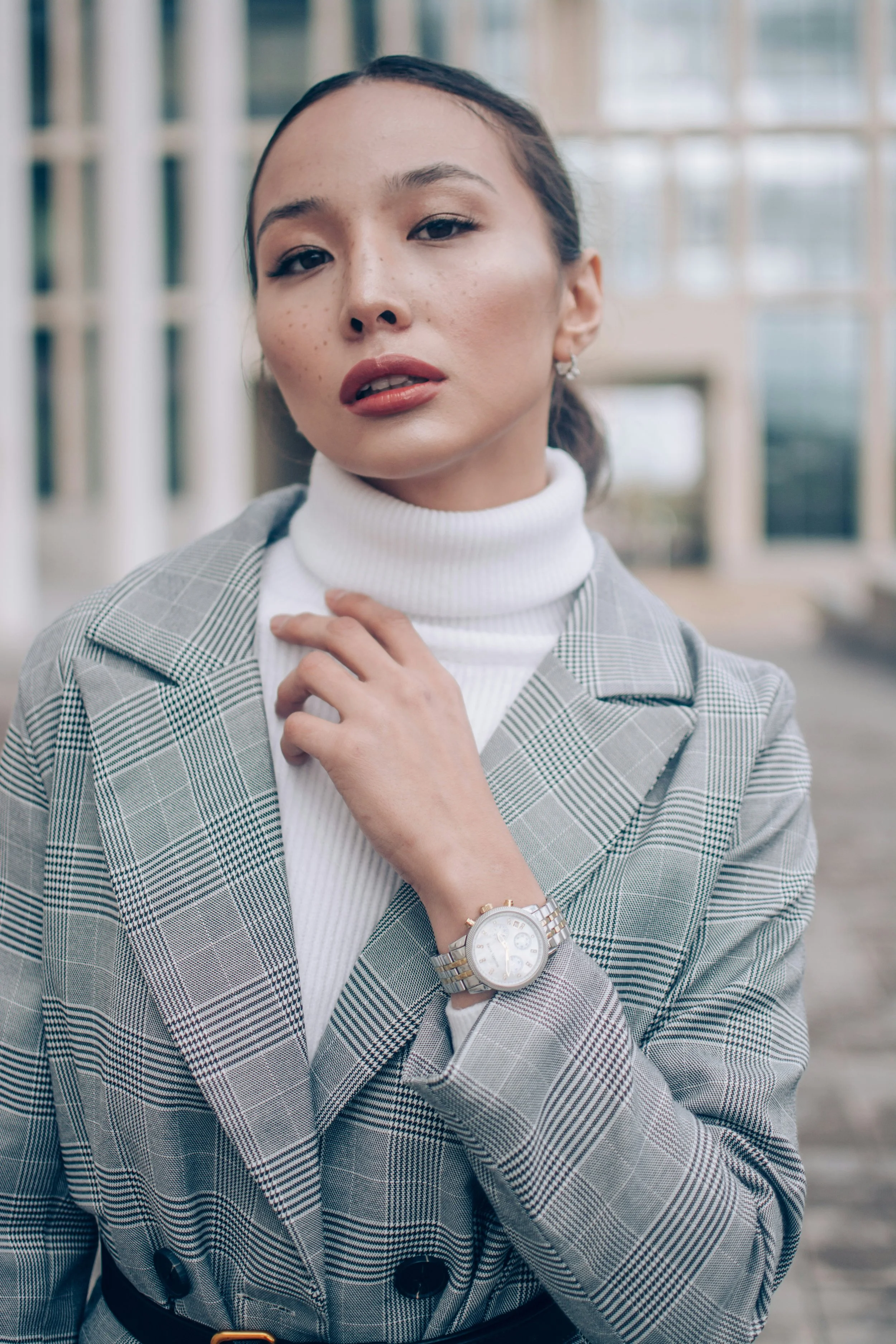
Look for glen plaids or glen checks that feature a subtle checkerboard pattern, sometimes with subtle chevron or houndstooth, too.
From far away, this could work for a pure Classic, but ultimately it’s best for a Classic Gamine blend.
Neutral houndstooth is another a good print for Classic Gamine blends. Its timelessness and neutrality makes it work for pure Classics, too, but compared to other Classic prints, it has a busyness that makes it adjacent to Gamine’s lively nature.
Classic Dramatic
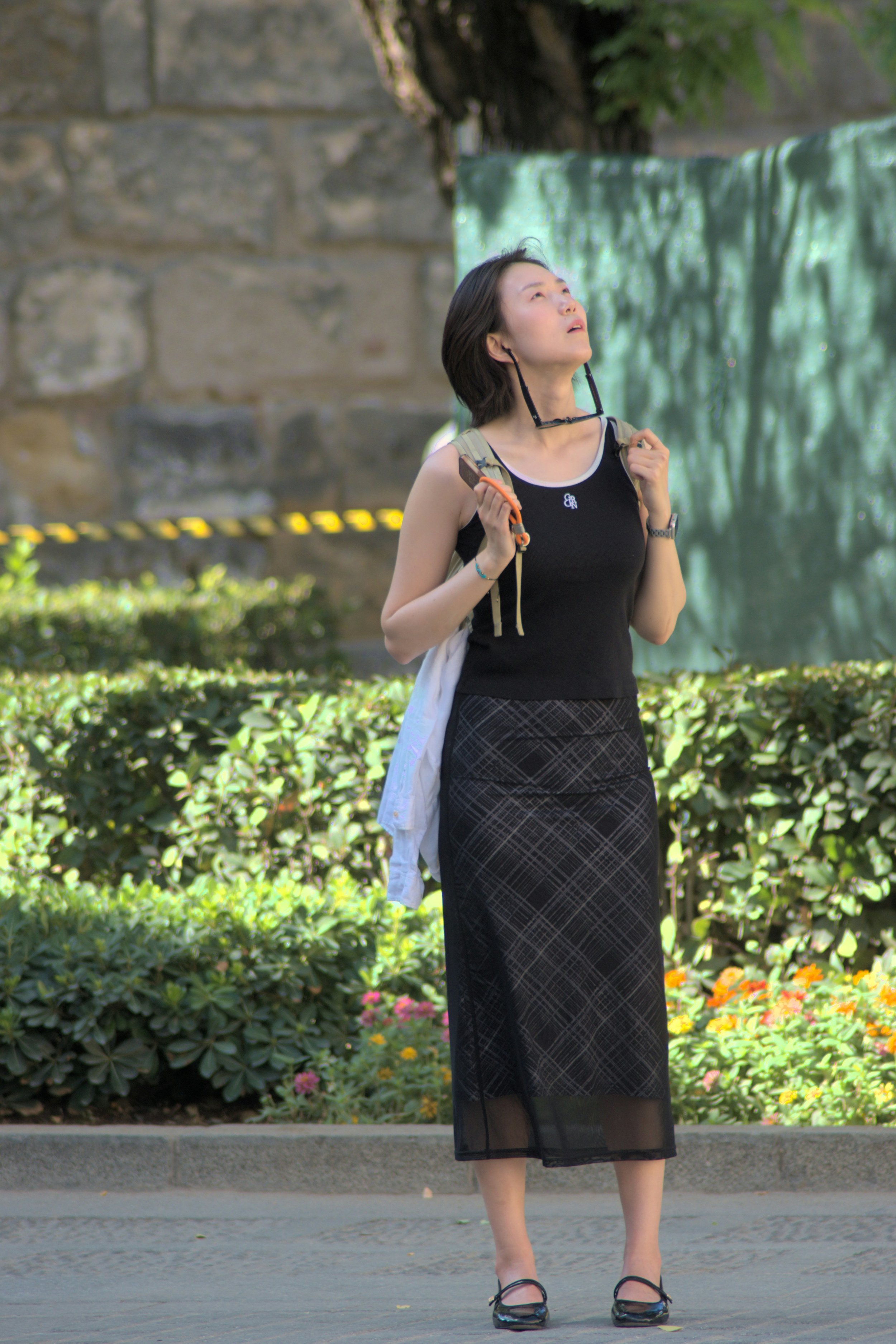
Look for basic minimalist Classic plaids positioned diagonally, which ties in Dramatic.
Classic Natural

Look for Classic evenly-spaced pinstripes on Natural textured fabric, like denim or chambray, as seen here.
The stripes themselves work for a pure Classic, while the texture adds Natural.
Pinstripes with “variation in the weight of the line” (meaning the stripes have different thicknesses) can be a good option for Classic Natural blends, because they tend to feel a little more casual and relaxed than pinstripes that are all the same thickness.
Classic Romantic
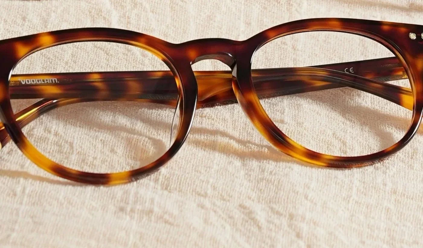
Tortoiseshell can flatter Classic Romantic blends, because even though it’s technically a fully Classic print, it can resemble iconic Romantic prints like cheetah and leopard.
Roses, especially moderate-size or minimalist floral designs, can also suit Classic Romantic blends. Technically this print is purely Romantic, but a rose is such a recognizable print, its conventionality makes it adjacent to Classic.
Cheetah and leopard in standard colors are also good options, for similar reasons: these prints are highly recognizable, and some versions mimic the look of tortoiseshell.
Print-Mixing
Print-mixing stereotypically feels busy and playful.
So at first glance, print-mixing has no connection to Classic.
But Classics can make the technique work.
Done strategically, print-mixing can feel chic and understated, especially if you pair timeless prints, like wearing a pinstripe blazer with a designer print handbag.
In fact, in such an instance, print-mixing can even enhance your Classic vibe. By incorporating two strongly Classic prints in a single outfit, you hammer down that you’re communicating a posh Classic feel.
It is true that if you’re highly Classic and are print-mixing with very colorful, complicated patterns, that probably won’t work too well (unless you have another essence that thrives on that, like Dramatic or Gamine).
But most people are a blended type.
And even if you’re highly Classic, you can still look great in print-mixing.
Here’s some strategies for making it work:
Be Neutral
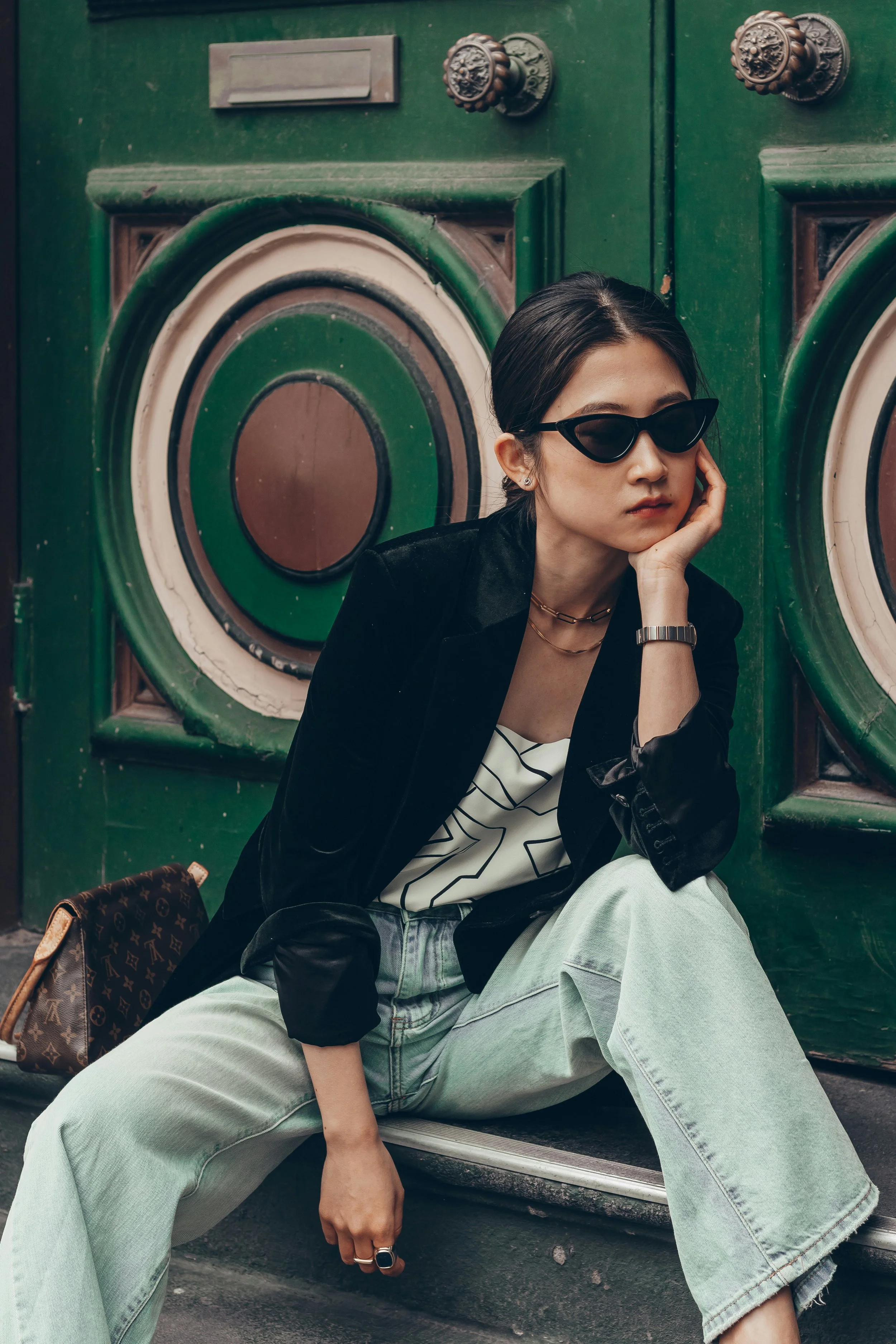
Louis Vuitton’s iconic monogram print purse doesn’t feel like too much paired with a neutral top with blunt-edged Natural geometrics.
With the velvety blazer, faded denim, timeless purse, and playful sunglasses, this look suits a Romantic Natural Classic Gamine.
Be Subtly Dramatic
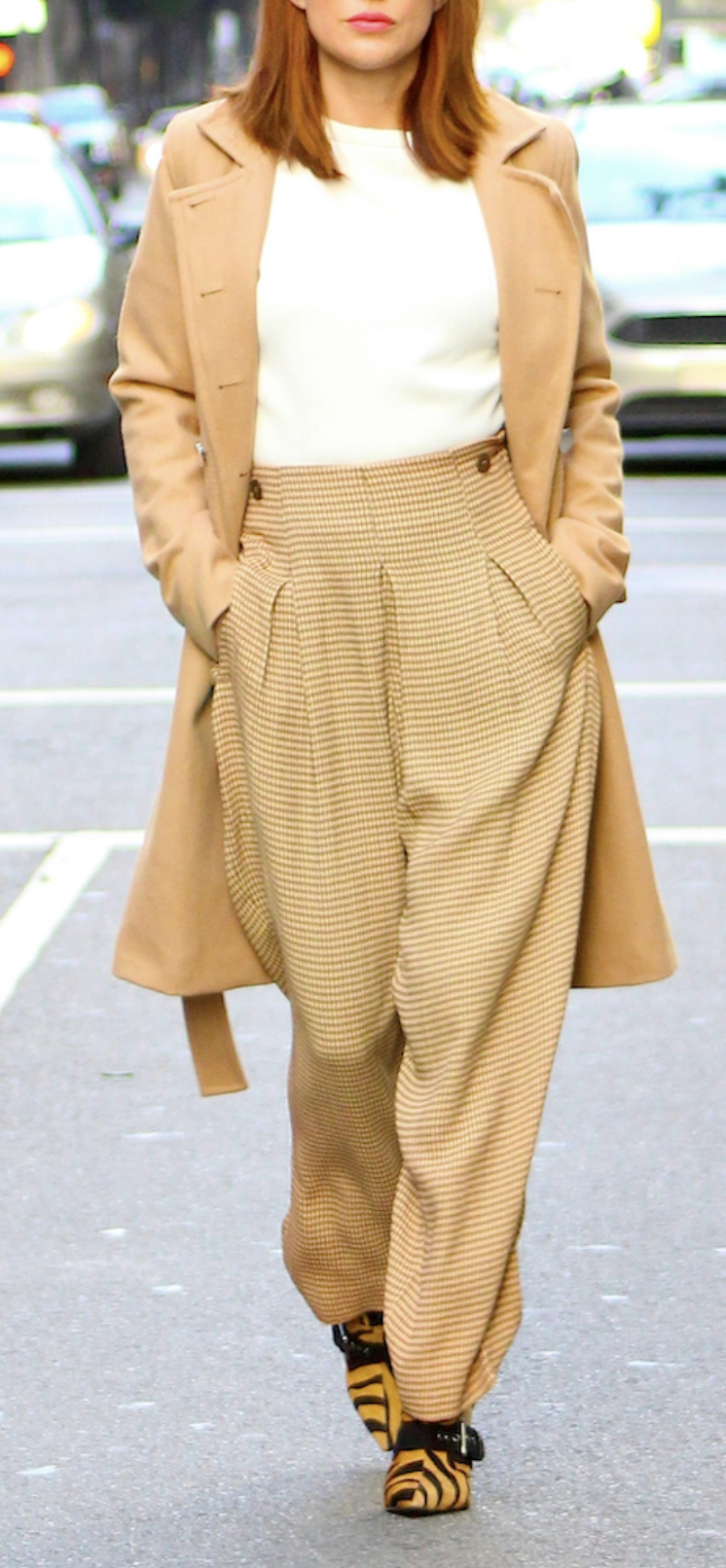
Here the pants feature a Classic micro-plaid or micro-houndstooth in mustard and cream.
Then you can pair with something Dramatic, like tigerprint footwear with thick buckles.
Choosing similar colors, like pairing mustard pants with yellow footwear and a beige jacket, helps make the look feel cohesive.
This outfit would suit Dramatic Classic blends.
Use Pinstripes
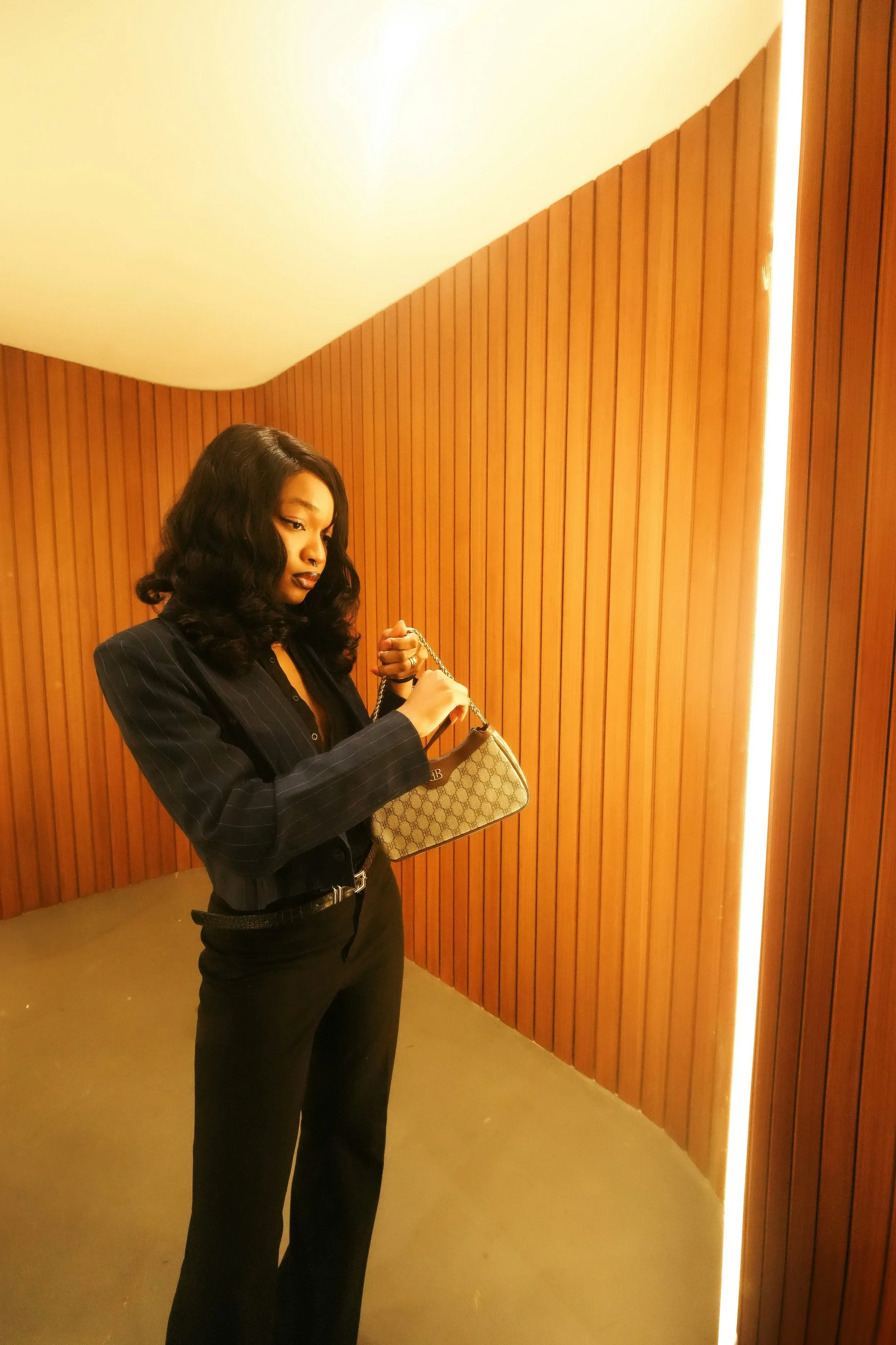
Especially super subtle pinstripes—from far away, this cropped blazer could pass for being solid-color.
Again we have the Classic technique of using a bag with a neutral designer pattern as your print.
This overall look could work for a Classic Gamine blend.
Be Recognizable
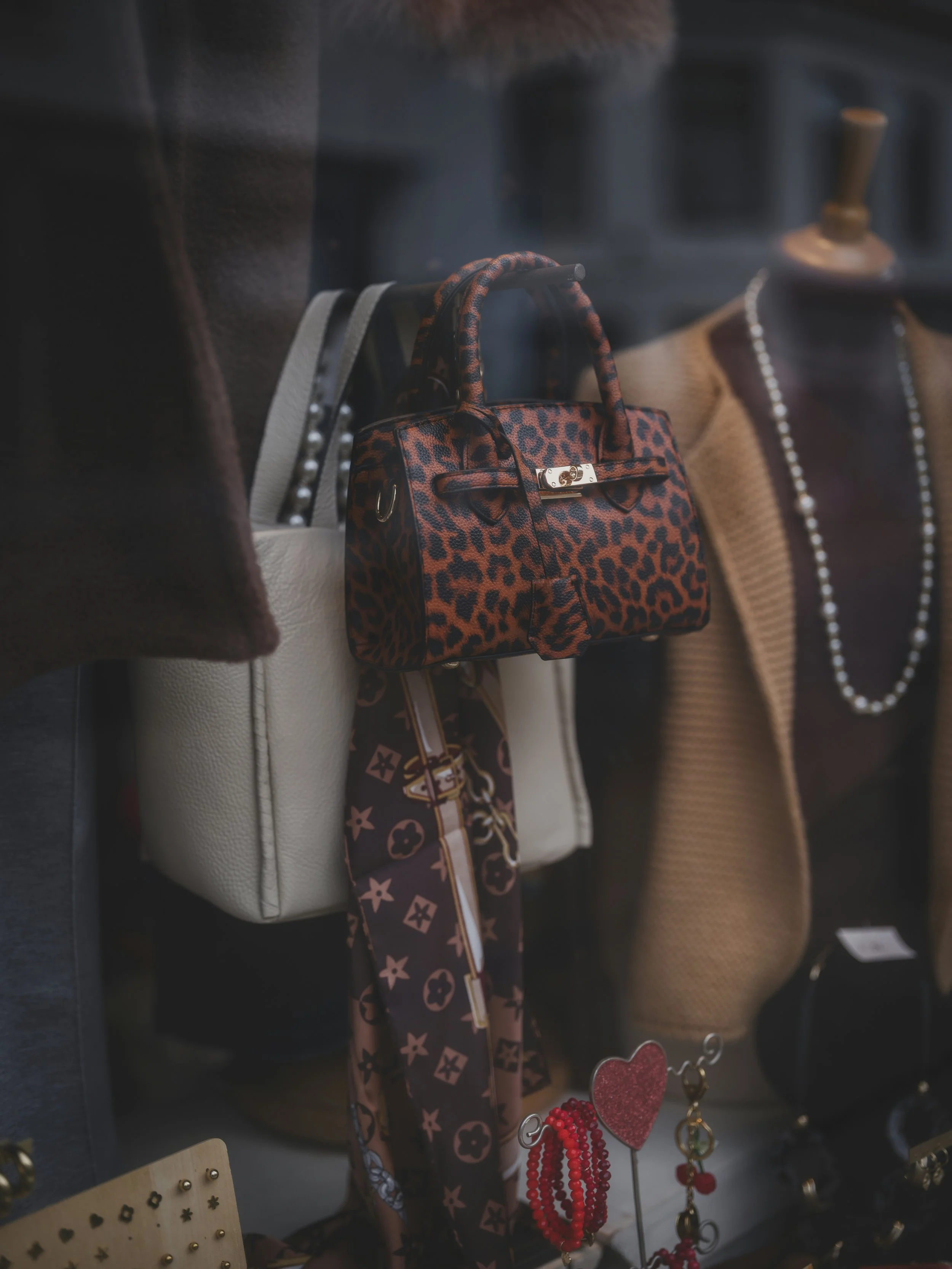
A Louis Vuitton scarf (or similar knock-off design) and leopard print purse. These would work if worn together in the same outfit, because they’re neutral and have similar colors (they might even go well with the brown turtleneck and beige blazer pictured in the image!)
These prints are also both highly recognizable, which helps them feel less complicated.
Great for a Romantic Classic blend.
Does Print-mixing Really Flatter Classic?
Is print-mixing essential to Classic’s aesthetic? Definitely not.
And does Classic generally have a harder time than the other essences combining different prints and patterns, especially when colorful or complicated? Yes.
But as we saw above, there are subtle ways that mixing prints can enhance a Classic look.
Plus, most people aren’t a pure Classic, and based on my observations, the majority of people don’t have Classic as a primary essence.
So especially if you’re a blended type, there’s a good chance you can use print-mixing to express your style ID.
Colors and Color Season?
Classic works well with any color season, since every season has lots of neutrals (and blues) to choose from.
It’s true that certain seasons, Springs in particular, are stereotypically best in a lot of color.
This relates to the debate of whether you should dress based on your seasonal palette or essences.
My view is both: for best results, choose your season’s version of your essences’ best colors.
For Classic, that means wearing a lot of blue, neutrals, mint greens, and maroons or dark reds. Every color season has versions of these hues.
When it comes to prints, things do get a little more complicated, because Classic is wary of complication.
This essence likes clean lines and simple silhouettes.
And since prints are inherently more complicated than solid-color clothing, wearing prints can already bring you close to Classic’s complication-tolerance threshold.
Especially if the print is colorful.
This doesn’t mean that you have to only wear neutral prints, though that will tend to be easiest.
If you’re going to wear prints with color, it will be safest if the color is:
Subtle (such as very light or very muted)
A color mixed with a neutral (like a yellow-brown or mustard)
One of Classic’s most iconic hues (blue, mint, maroon)
But you can also be bold and explore Classic prints with more color. This can be ideal for blended types, particularly Gamine blends, since adding a lot color to a Classic print will sometimes change it into a Gamine print, or a Classic Gamine print.
General Print-Mixing Tips
Here’s a summary of general print-mixing strategies (we also covered all these previously when discussing the other essences’ best prints!)
These are absolutely guidelines, not rules—all can sometimes be broken with success:
Pair a subtler print with a louder one
Mix a simpler print with a more complex one
Mix a more well-known and recognizable print (like pinstripes) with a more unusual one
Pair larger scale with smaller scale
Pair a printed garment with printed shoes, accessories, or jewelry
Have one or more of your prints be mostly neutral
Mix prints in the same or similar color schemes
Keep color season mostly consistent—if the print mostly suits your season while also incorporating some colors that are outside your season, it may still work for you. But in general, if you like to dress by your color season, then you’ll want the majority of the print’s colors to match that
Classic’s Popular and Timeless Beauty
Classics reveal the powerful beauty of minimalism.
Somehow, Classic’s simple, basic style is deeply attractive and eye-catching.

A basic white top, black pants, and gray blazer.
Yet to me, this outfit feels beautiful, even striking, rather than boring.
What’s the secret to Classic’s simple-yet-captivating feel?
It’s that Classic fashion is strongly harmonious in a minimalist context.
Straight, standard-length lines; neutral and conventional color schemes; recognizable silhouettes—these Classic clothing elements feel inherently simple and minimal.
And so when you style Classic pieces in a minimalist way, instead of feeling boring, the effect is the opposite: appealing and even enchanting, because the result is so intensely harmonious.
It used to puzzle me why I was so enthralled by basic Classic fashion, especially because I’m also someone who really loves complex style and maximalism.
And I would say I genuinely love both: complicated, busy style and aesthetics that make me feel centered and calm. Aesthetics that visually embody the notion of harmony itself.
And that’s in many ways what highly Classic clothing styles, and highly Classic faces, do: they reveal the timeless beauty of simplicity, minimalism, and peace. They show that beauty doesn’t always need to be complicated or avant-garde.
Complication is beautiful, too. But Classics help reveal that there’s beauty in both: the simple and complex, minimal and detailed, timeless and modern.
Next Time
See you next time for more prints! : )