Ingenue’s Best Colors
Ingenues have “resting nice face.”
Their soft, round, pretty, and youthful features naturally project a sense of gentleness, caring, optimism, and warmth.
So, Ingenues visually embody some of the most desirable qualities in existence, like kindness and contentment.
Their vibe is calm-yet-upbeat. Peace meets joy.
That’s how Ingenue’s best colors feel, too. And as an Ingenue, wearing those colors will enhance your already magnetic beauty.
Below we explore:
Ingenue’s ideal and less ideal colors
How these colors can harmonize with any season
How to combine your colors for mesmerizing results
Part 1. Your Best Colors
Ingenue’s absolute best color?
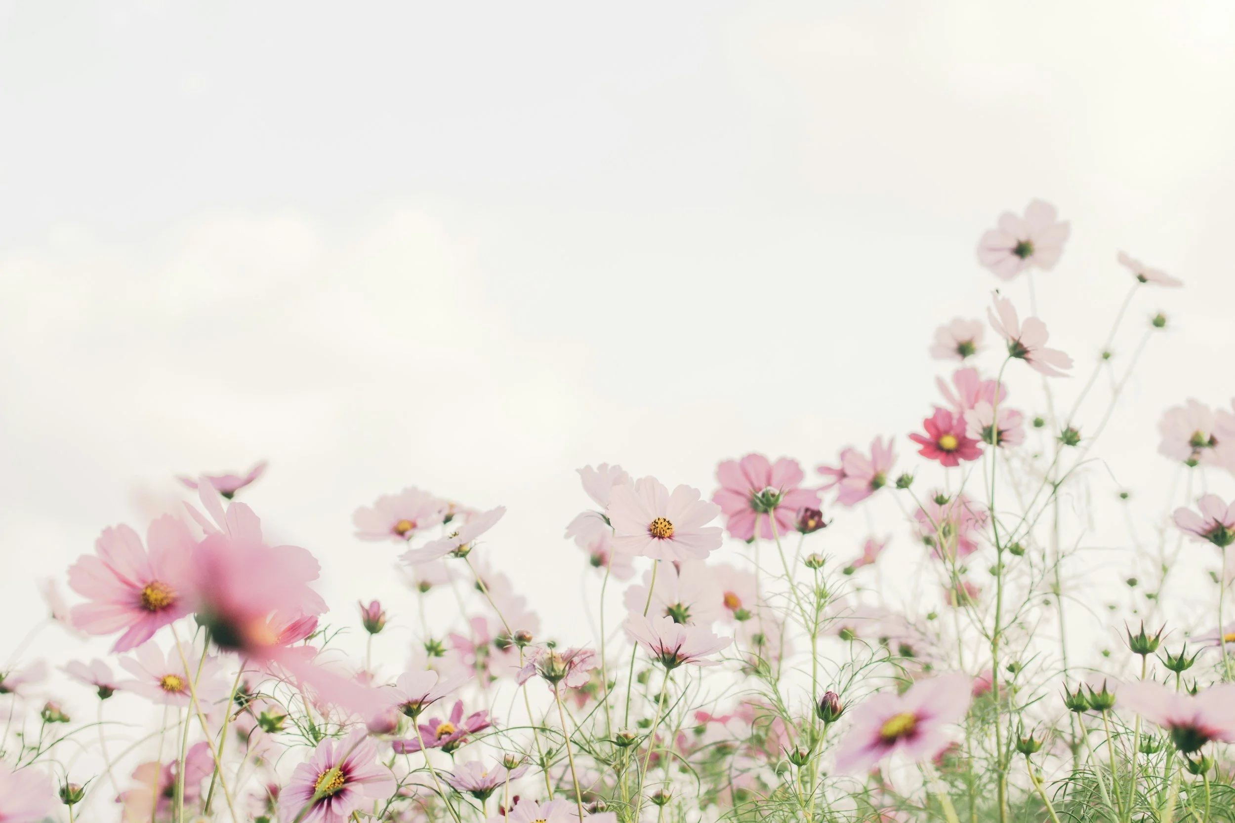
Light pink.
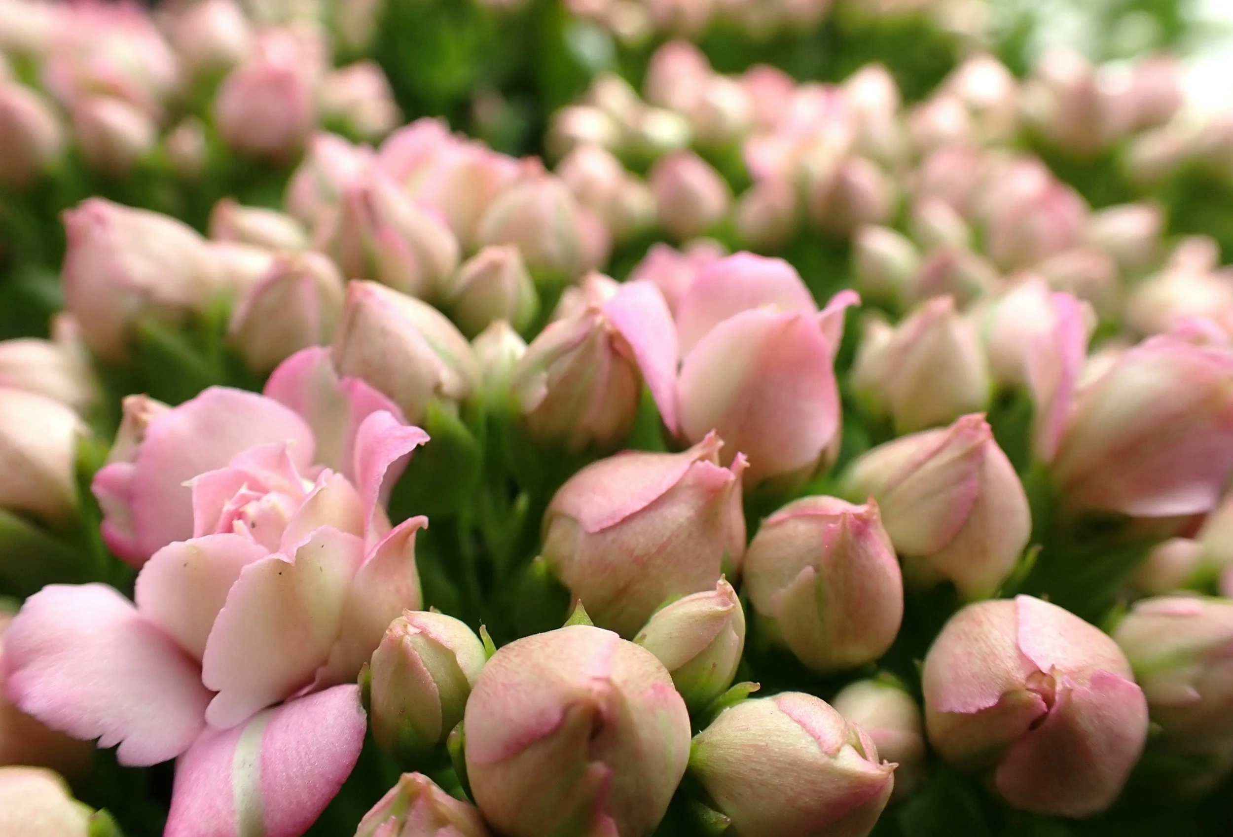
Pink feels soft, pretty, and feminine.
Light pink is also a gentler version of red. So, while red embodies passionate, laser-focused love for someone specific, pink can embody care and kindness that’s extended broadly—perfect for Ingenue’s caring, welcoming vibe.
Ingenue’s runner-up best colors?
Light blues, light greens, and light purples.
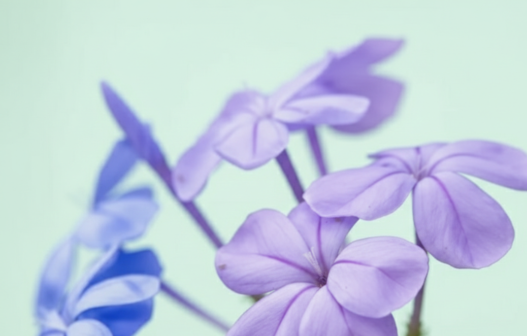
These stereotypically cool colors are soothing, calm, and subtly upbeat.
Ingenue colors feel like dainty flowers, delicate embroidery, Easter eggs, and soft sunrises.
Other flattering hues?
Medium pinks, medium blues, and medium purples.
These colors still feel “gentle yet upbeat,” especially in Ingenue silhouettes.
Medium greens can also work but sometimes feel a bit “earthy” for Ingenue, particularly warm greens.
What about in-between hues?
Ingenue is amazing in blue-purples and purple-pinks.
Essentially, look for in-between colors that blend two of your best colors.
Ingenue’s best neutral?
White, ivory, or whatever your season’s lightest neutral is.
What other neutrals work?
Light neutrals like light beige, light gray, and light brown.
Medium versions of these work, too.
You can even explore your season’s darkest neutrals. They aren’t stereotypically Ingenue, but since neutrals tend to be less emotionally intense than colors, it’s easy for neutrals to suit any essence’s vibe.
For instance, a little black dress can be fully Ingenue in an Ingenue silhouette.
Is Ingenue best in color or neutrals?
Color!
Pinks, blues, greens, and purples evoke Ingenue more strongly than any neutral hue.
What colors aren’t ideal?
Your darkest shades, especially your palette’s deeper reds, oranges, and yellows—these can feel too intense!
But lighter versions of those hues work well, especially as accents.
Those colors may also suit you if in addition to Ingenue, you have an essence that is flattered by them.
Do Ingenue’s best colors differ based on season?
Regardless of color season, Ingenue’s best colors are your palette’s lighter pinks, blues, greens, and purples.
I’ve confirmed this through observation, as well as testing (comparing different color swatches from the different color seasons to Ingenue fashion, to see which colors were most harmonious, and studying Ingenue fashion in different color palettes).
Through this, I’m confident that Ingenue can work with any season!
Part 2. Color Season and Ingenue
Here’s how Ingenue can harmonize with the four core seasons and subseasons:
Ingenue and Autumn: Nature Princess
In a figurative sense, Autumn and Ingenue are a natural match—both the season and essence feel cozy, welcoming, and gently warm.
Autumn’s rich softness evokes Ingenue’s friendly, down-to-earth side.
But, Autumn’s literal colors aren’t obviously Ingenue. This leads to questions like:
Can Autumns wear pink?
Yes! This is Ingenue’s winning color, including for Autumn.
Compared to stereotypical pinks, Autumn versions can look a bit different, sometimes reading more as “orange-pink” or “salmon” (thanks to the warm undertones).
But, that’s not a problem! In the context of your warm, muted coloring, Autumn pinks communicate Ingenue’s soft, soothing feel—even if they’re orange-y.
Does Autumn “earthiness” clash with Ingenue?
No!
First, if in addition to Ingenue, you have Natural, then earthy colors are inherently great for you.
If you don’t have Natural, then you can just avoid creating earthy color schemes—essentially, avoid wearing notable amounts of colors like brown, orange-brown, green, and/or blue together in the same outfit.
Finally, you can also simply wear the earthy color schemes that flatter your season. While some people might see this as clashing with Ingenue (since arguably it adds Natural), others might see it as a way to embody both your season and your essence. Choose what makes sense to you!
***
Now let’s explore how each Autumn pairs with Ingenue:
Soft Autumn
Pros: Your gentle palette has many light and medium shades, including neutrals, pinks, blues, and purples:

And thanks to Summer’s influence, Soft Autumn has light greens that feel “minty”—excellent for Ingenue.
Cons: Some of your greens, especially those mixed with brown, feel stereotypically “earthy” (or Natural). So, you may want to skip those and favor your mintier greens (the ones that look more similar to Summer greens).
True Autumn
Pros: Many of Ingenue’s best colors are present in your palette, including light and medium pinks, blues, and purples:

Your season’s warmth also emphasizes Ingenue’s kind, caring nature.
Cons: Compared to Soft Autumn, True Autumn’s vibe is less textbook Ingenue. You still have many options that work, but it might be an adjustment if you’re used to wearing high amounts of deep reds and oranges.
And with their purely warm undertones, True Autumn greens and browns often feel stereotypically earthy.
So, you can either embrace your season’s earthiness and wear all those colors; avoid them entirely; or wear them strategically, by pairing them with colors that don’t feel earthy (like pairing brown with purple or pink).
Dark Autumn
Pros: Dark Autumn combined with Ingenue makes me think of the “Dark Academia” aesthetic, which incorporates sweet silhouettes like flared skirts in an overall deep, moody color palette. It’s a great juxtaposition!
Additionally, some Dark Autumn shades have a surprisingly delicate feel:

Cons: Dark Autumns are amazing in deep color.
But that’s not necessarily a conflict!
First, even if many Dark Autumn blues and purples don’t appear stereotypically “light,” your lighter versions of these colors generally do look light or medium on you in the context of your season. So, they still suit Ingenue.
Additionally, since the color blue is so understated, even dark blues can feel calm enough for Ingenue. This can also be true of purples.
Finally, since neutrals tend to feel somewhat “emotionally neutral,” they can typically adapt to any essence’s vibe.
So, deep palette neutrals can work well for Dark Autumn, especially paired with Ingenue’s best colors.
***
Ingenue and Winter: Ice Princess
Ingenue and Winter is a captivating match.
Winter’s intensity emphasizes the regal, noble aspects of Ingenue’s princess-like vibe.
And in a literal sense, every Winter palette contains true white and icy pinks, blues, greens, and purples.
These shades are bright, but they’re subtle enough to be fantastic for Ingenue.
Now for the qualms:
Can Ingenue do high contrast?
Winter tends to favor high contrast color schemes—pairing very light with very dark.
But Ingenue’s best contrast level tends to be low-medium to medium. (Very low contrast also works though can feel somewhat sleepy for Ingenue, while high contrast can be overpowering.)
So, if you’re a Winter, should you do medium contrast to suit Ingenue, or high contrast to flatter your season?
There’s not one right answer, because different Winters have different contrast levels.
For Winters with more moderate contrast, you could pair Ingenue light colors with Ingenue medium colors. This contrast can match both your essence and season.
But, many Winters do look their best in high contrast outfits.
In this case, there still isn’t necessarily a conflict, because you might have another essence that is flattered by high contrast (like Dramatic, Gamine, or Romantic). In that case, high contrast color schemes can still connect to your overall beauty.
If you have only essences that prefer low to medium contrast, you can experiment with both medium and high contrast (and medium-high!) to see which is the best compromise between your season and essences.
Now we’ll explore how Ingenue interacts with the individual Winters:
Bright Winter
Pros: Bright Winters are stunning in their lighter, icy palette colors and neutrals:

Cons: Contrast is a big one, as discussed above.
Additionally, Bright Winter’s iconic hues include vibrant, deep pinks and reds, which can overpower Ingenue.
A potential compromise can be sticking with Bright Winter’s medium and light pinks.
You might also have an essence that is great in the intensity of deeper reds and pinks.
Finally, as always, if you love a color, then of course you can embrace wearing it, even if it doesn’t fit your essences’ vibe. In this case, your vibe might become “Striking Ice Princess” or “Passionate Ice Princess.”
True Winter
Pros: As a purely cool season, True Winter is filled with pinks, blues, and purples:

And as with all Winters, True Winter stuns in light colors and neutrals, including true white.
Cons: True Winter is one of the only seasons that’s given license to wear very high amounts of black. That can be a hard gift to relinquish, since black is practical, looks chic, and is easy to find in stores.
But as noted, very dark neutrals can suit Ingenue, since neutrals are more emotionally adaptable than colors.
So, True Winters might find that it works well to pair black with large amounts of medium or light, iconically Ingenue colors—especially if you wear the color near your face.
Dark Winter
Pros: Like the other Winters, Dark Winters are flattered by their lighter palette shades:

Cons: Depth of color tends to be critical to Dark Winter.
But importantly, Dark Winters can harmoniously wear deeper colors than the typical Ingenue. This is because their season leans deeper overall. So, what would read as “dark” on another season can read as more “medium” on a Dark Winter.
This means that if you prefer wearing high amounts of your medium and darker shades, you can do so while still creating a gentle Ingenue impression—as long as you choose iconically Ingenue hues.
Dark blue and dark purple are especially good options, since they can feel calmer than other colors.
And of course, ultimately you should wear what you like! If you wear mostly deep, bold hues in Ingenue fashion, your vibe might end up being “Edgy Ice Princess”—very cool!
***
Ingenue and Spring: Peppy Princess
Spring colors emphasize Ingenue’s positive, pleasant vibes.
And since Spring stays relatively light, you can wear nearly your entire palette (avoiding what Ingenue typically eschews, like bold reds and oranges).
The big exception: Bright Spring does get quite deep. Still, most of the palette ranges from light to medium.
Does Spring feel Gamine?
In some ways, yes. Like Gamine, and unlike Ingenue, Spring’s vibe is high-energy.
But this isn’t really an issue if you stick to wearing quintessential Ingenue colors (light or medium pinks, blues, greens, and purples).
In Ingenue silhouettes, those colors won’t feel overly energetic.
The bigger issue: Spring’s many vivid oranges and yellows are some of Ingenue’s less flattering hues.
The good news is that since your season family leans light, your lightest palette versions of these colors do suit Ingenue.
And as always, if you love your most pigmented yellows, oranges, and reds, then of course feel free to wear them!
***
Besides those considerations, there really aren’t major roadblocks to creating harmony between Spring and Ingenue.
So here’s some of the best Ingenue colors for the Springs:
Bright Spring

True Spring

Light Spring

***
Ingenue and Summer: Pure Ingenue
Just like Ingenue, this section will be short and sweet, because Summer is Ingenue’s inherent match!
Summer colors are gentle, soothing, and positive-yet-calm. And since they’re muted and don’t get especially deep, you’ll likely find that even your darkest palette hues feel gentle enough for you.
So, Ingenue Summers can wear nearly all their colors harmoniously (besides those that aren’t ideal for Ingenue in general, like very dark red).
Some of the best colors for each Summer:
Soft Summer

True Summer

Light Summer

Part 3. Color Combining
Here’s how to combine colors in outfits for a mesmerizing effect.
Importantly, these really are guidelines, not absolute rules. Your optimal color combinations are, of course, the ones you feel best in.
That said, the following guidelines can be a great starting point:
Colors or neutrals?
Since Ingenue is more flattered by color than neutrals, you may want at least a little more than 50% of your outfit to be color.
But you can also look amazing in mostly neutral outfits. If wearing primarily neutral fashion, simply try to add your color near your face, such as in a top, sweater, necklace, and/or earrings.
How to combine colors?
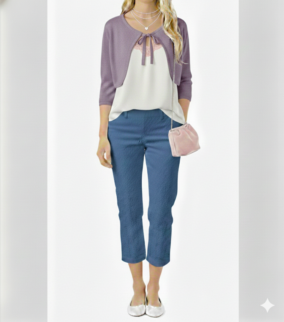
Ingenue is very flattered by combining notable amounts of two different colors in an outfit. For example, you could wear a purple top with blue pants, or a mint top with a pink skirt.
Ingenue is especially flattered by combining adjacent colors on the color wheel, like blue with purple.
If wearing three or more colors, you may want to stick to one or two large blocks of color, such as a purple sweater and blue pants. Then you can add additional colors as accents, such as some pink in a small purse or the trim of a neutral blouse:
You can also experiment with wearing three or more larger amounts of color (though this can sometimes create a lively Gamine impression, especially with brighter or more pigmented hues).
Since Ingenue has calm energy, adding neutrals to outfits can be helpful for grounding the outfit (and avoiding Gamine). For instance, you could wear a pink top and blue sweater paired with gray pants, and add accent colors like purple, yellow, etc., in shoes or accessories. Or you could wear a colorful dress and accessories with neutral shoes and purse. There’s infinite options!
Ingenue appears best in a low-moderate to moderate contrast level (very low can also work, though sometimes feels “sleepy” compared to Ingenue). You can achieve this by combining light colors with medium-light colors (or light colors with medium colors) in a single outfit.
You can also adjust your outfit’s contrast level to be more similar to your personal contrast level, since many people find that this increases harmony. (Contrast is a complicated topic and will likely be covered more extensively in the future!)
Makeup will also be a separate topic. As a probably obvious teaser, since Ingenue is so flattered by pink, this is a fantastic shade for your lips and cheeks!
***
Upcoming posts will explore the best colors and color combinations for the other essences! : )