Finding Your Exact Essence Amounts
Here’s a method that can determine your exact essence percentages!
First, you’ll want to complete these three steps from last week’s post:
Find your style type
Find your essence order
Estimate your essence amounts
Now, here’s how to do Step 4 to reveal your exact essence percentages:
For the sake of this example, let’s say we’ve completed Steps 1-3, and we’ve estimated that the person we’re analyzing has 80% Romantic and 20% Ethereal.
Now, we need to test our estimate! That means that we need a precise way to visually depict 80% Romantic and 20% Ethereal. We can do this by finding virtual fabric swatches for each significant essence:

Here’s a fully Romantic virtual fabric swatch

and here’s a fully Ethereal swatch.
Next, we’ll paste these swatches into Pages (or any other platform that permits basic image manipulation). We’ll resize the swatches to fit our estimated amounts of 80% Romantic and 20% Ethereal. We’ll call this combination of 80% Romantic and 20% Ethereal Image A:
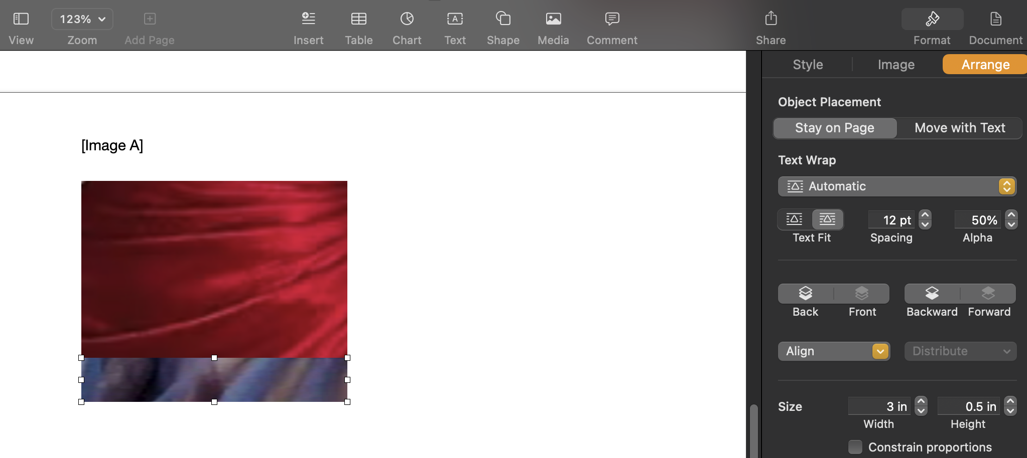
In Image A, I’ve resized the fabric swatches to fit our percentage estimates.
(The Romantic swatch is 3 inch width by 2 inch height = total area of 6. The Ethereal swatch is 3X.5 = total area of 1.5. So the Romantic swatch is 4 times bigger than the Ethereal swatch, which fits our estimated ratio of 80 Romantic to 20 Ethereal.)
(You can resize images in Pages by unchecking the “Constrain proportions” box and changing the “Width” and “Height” of each image. The “Constrain proportions”, “Width,” and “Height” options are located in the right panel of the document, as seen above).
So now, as we see in Image A, we have a precise visual representation of what 80% Romantic and 20% Ethereal looks like!
But importantly, we don’t know for sure that the person we’re analyzing has exactly 80% Romantic and 20% Ethereal. That was just our estimate. It’s entirely possible that this person actually has, say, a bit more than 20% Ethereal.
So, we need to test that!
So now I’m going to create a second image (Image B) that includes the same Romantic and Ethereal fabric swatches from Image A. The only change I’m going to make is that in Image B, I’m going to increase the size of the Ethereal fabric swatch a bit:
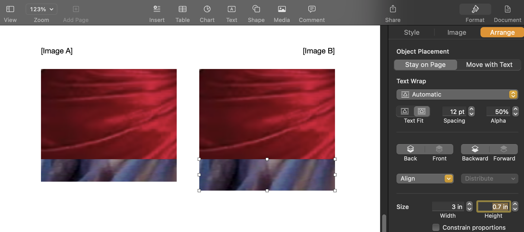
Image A is the same as it was before (with a 3X2 Romantic swatch and 3X.5 Ethereal swatch). But now we’ve added Image B, which has a 3X2 Romantic swatch paired with a 3X.7 Ethereal swatch. Compared to Image A, Image B has a higher percentage of Ethereal.
(The choice to make Image B’s Ethereal swatch exactly .7 in height is essentially arbitrary. I just wanted to choose an amount of Ethereal that was a bit larger than in Image A, so that I can test values that are close to but not identical to our initial estimate of 80% Romantic, 20% Ethereal.)
Next, I’ll simply compare a photo of the person’s face I’m analyzing to both Image A and Image B, and see whether Image A or B better harmonizes with the face photo. (You may want to use a black-and-white face photo, so you’re not distracted by color season.)
And let’s say that Image B (the image that includes .7 Ethereal) ends up being more harmonious than Image A (the image that includes .5 Ethereal).
I can make a note of that like this:
Ethereal: .7 > .5
Then I can explore making the “losing” Ethereal swatch (which is a part of Image A) even larger. So maybe I decide to change the Ethereal swatch in Image A to be .9 in height:
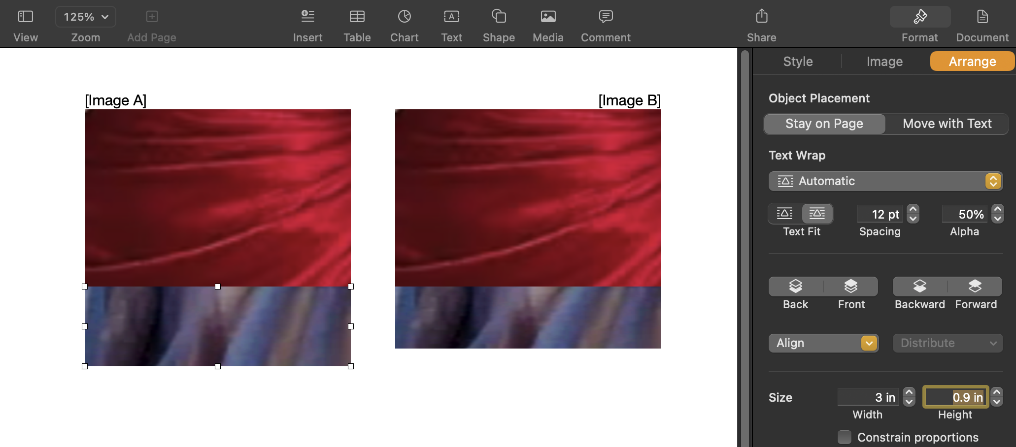
Image B (the “winning” image from our first comparison) remains exactly the same, with a 3X2 Romantic swatch and 3X.7 Ethereal swatch). But now it has a new challenger: Image A with a 3X.9 Ethereal swatch.
Now I’ll again compare Image A and B to the face photo. And let’s say that this time, Image B (.7 Ethereal height) is more harmonious with the face photo than Image A (.9 Ethereal height). We can continue our documentation from last time:
Ethereal: .7 > .5; .7 > .9
Now I can simply repeat this process with other values I haven’t yet tested—specifically, I can see if .7 Ethereal is more harmonious than .8 Ethereal and .6 Ethereal. And let’s say that, for the sake of this example, .7 Ethereal continues to be more harmonious than surrounding upper and lower values:
Ethereal: .7 > .5; .7 > .9; .7 > .8; .7 > .6
Now (likely to the relief of anyone still reading this) we can stop there! This is because .7 Ethereal is better than any values very close to it, both above and below (.8 and .6). So .7 is likely to be a good estimate of our Ethereal.
Alternately, we could be ultra-precise by, say, comparing our .7 Ethereal to .65 Ethereal. But this will be an extremely small, almost negligible difference:
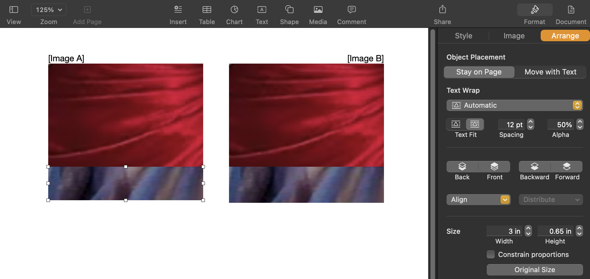
The difference between .65 Ethereal (Image A) and .7 Ethereal (Image B) is tiny! It’s so small, it will hardly make a difference for understanding your true essence percentages (more on why below). But if we enjoy perfectionism, we can make this comparison and see which is more harmonious with our face photo.
Let’s say that .7 Ethereal is better than .65 Ethereal (and .75 Ethereal). Now you’ll simply calculate the total height of the winning image (Image B, in our example). Then you’ll divide the height of each of your individual essence swatches by the total Image B height. This will give you each of your individual essence percentages.
So, in our example, the winning image (Image B above) has a Romantic height of 2, and an Ethereal height of .7.
2 + .7 = 2.7 (so 2.7 is our total height)
So our Romantic percentage is 2/2.7 = .740, or 74%
And our Ethereal percentage is .7/2.7 = .259, or 25.9%
So, we’ve determined that the person whose photo we’re analyzing has precisely 74% Romantic and 25.9% (basically, 26%) Ethereal.
We can also round this to 75% Romantic, 25% Ethereal, since those numbers are so close to 74 and 26 (and tend to be easier to remember and conceptualize).
(To see how using a .65 Ethereal height wouldn’t have made much of a difference, we can complete the calculations if we’d hypothetically chosen .65 Ethereal as the winner. This would make our total height for the winning image 2.65, and Romantic would be 2/2.65, or 75%. Our Ethereal would be .65/2.65, or 25%. This is essentially the same as the answer we got!)
What if you have more than two essences?
If you have more than two essences, you’ll first do the procedure described above with just your top two essences.
For example, if you have mostly Romantic and Ethereal, and a smaller amount of Classic, you’ll first complete the above process with only Romantic and Ethereal. Then, once you find the ratio of Romantic and Ethereal that most flatters your face photo, you’ll add in a Classic fabric swatch and repeat the process with that swatch. When you add in Classic, you’ll keep the Romantic and Ethereal swatches in both Image A and Image B constant in size:

If the person we’re analyzing also has Classic, we can add a Classic swatch to our Images. For both Image A and B, we’ll want to keep the Romantic swatch at a height of 2 and the Ethereal swatch at a height of .7 (since we already determined that this is the most harmonious proportion between Romantic and Ethereal). The only thing we’ll change is the height of the Classic swatch, to determine which amount of Classic is most harmonious.
So in the above, we’re comparing a Classic swatch with a height of .5 (Image A) to a Classic swatch with a height of .3 (Image B). We can continue to make comparisons with different amounts of Classic until we find the most harmonious one. (And if you have a fourth essence, you can then repeat the procedure with your fourth essence after solidifying how much of the third you have!)
Is it actually possible to make such small visual distinctions?
Yes! It’s not necessarily easy, but it’s possible.
For instance, here’s a test you can take that measures ability to perceive small distinctions in color, by sorting colors by their similarity.
If you take the test, you’ll see that some of the colors look almost identical to the naked eye. But, they are different from one another, and it is possible to perceive those differences.
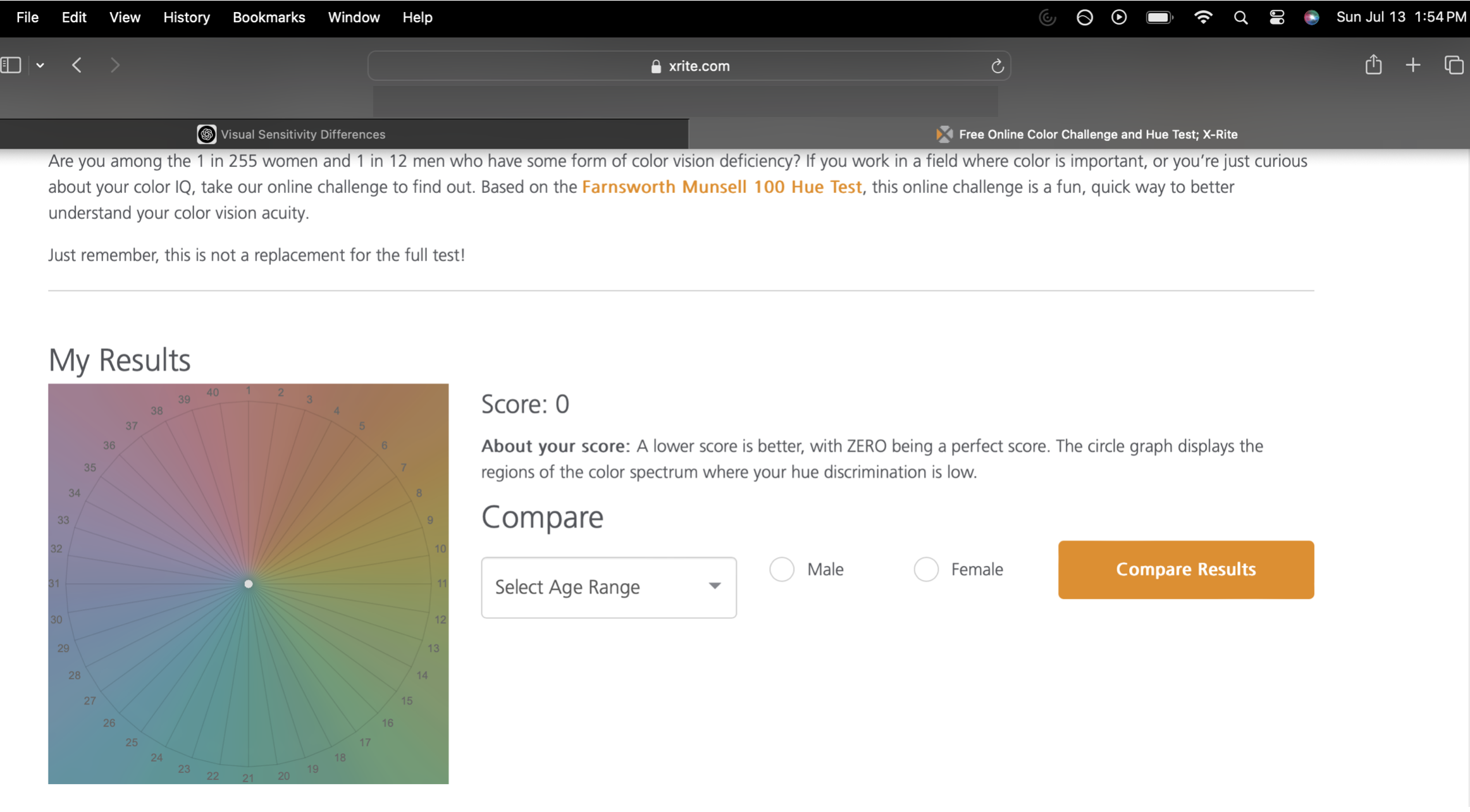
I got a score of 0, which sounds like a very bad score but is actually a perfect score—which makes sense, since I spend a lot of time working with color (and shape), so it’d be concerning if I didn’t score well! This test doesn’t exactly measure our capabilities at color and style analysis (since the test is more about detecting literal visual similarity, whereas color and style analysis are more about visual harmony. And of course, detecting color and detecting shape/line/essence are quite different). But the point is that it is possible to detect very small differences in visual stimuli.
Limitations of this Method
The main limitation I see of the “fabric swatch” method is that it’s not ideal to use angular fabric swatches for Ethereal, Romantic, and Ingenue (the curving, “yin”) essences.
But there seems to be a simple solution to this, which is to use image manipulation to round the corners of those fabric swatches, thus making them appear overall curving in shape.
This may not make a huge difference in the results, but going forward it’s something I’ll likely implement. I may also choose fabric swatches that are more similar in hue, to avoid creating a marked color-blocked effect (but not so similar as to create an ombre effect!)
What if all this is really confusing?
On paper, this method can seem baffling, and admittedly it can be tricky to do well.
The hardest part is almost definitely using your eye to detect differences in harmony between essence amounts that can appear extremely similar to each other.
So using this method may take a little or a lot of practice to feel confident in.
Importantly, I’ll always complete Steps 1-3 before using this method, since that will provide a good estimate of a person’s percentages, and will help determine whether the answer to Step 4 is reasonable or off track.
What if this gave me a headache?
If this post gave you a headache (I’m sorry!!) but you’re curious about your exact essence percentages, this is now a process I’m doing for all style analysis clients. So if you want to know your percentages but don’t feel like reliving anything detailed above, you might consider an analysis.
I promise my next post will have around one million times less math :)