Ethereal’s Surprising Best Colors

Ethereals have gorgeously tranquil, angelic beauty.
Given their calmness, Ethereals are stereotyped as being best in very light colors.
But, some of Ethereals’ favorite colors defy that stereotype!
Below we’ll uncover:
Ethereal’s ideal and less ideal colors
How these colors can harmonize with any season
How to combine your colors for enthralling results
Part 1. Your Best Colors
Ethereal’s absolute best color?
Purple.

Purple feels simultaneously dreamy, calm, and regal. This mirrors Ethereal’s peaceful yet powerful nature.
Light purples tend to be ideal, but medium and dark versions are fantastic, too.
This isn’t too surprising, since we’d expect Ethereal’s favorite color to feel tranquil and cool.
Blue and green are tranquil, but they’re also ubiquitous in nature—sky, sea, grass, trees, etc.
In the natural world, purple is much rarer, making it a better match for Ethereal’s supernatural aura.
What is surprising
Light purple is Ethereal’s absolute best color. But in my view, Ethereal’s next best colors are medium and dark purples.
This seems controversial, since Ethereal is stereotypically best in very light hues.
But as we’ll explore below, purple is so incredibly flattering for Ethereal, even very dark versions tend to suit the essence better than:
Ethereal’s runner-up best colors?
Light or medium-light blues, greens, and blue-greens.

These match Ethereal’s peaceful, dreamy nature.
Ethereal loves celestial and oceanic colors, since they feel removed from earthy, grounded reality.
But as noted, purple—even very dark purple—tends to flatter Ethereal more than blue or green.
This is because purple feels less earthy; more unique; and more powerful and regal.
Ethereal is defined by its angelic, supernatural-feeling nature. And the supernatural is associated with an incredible degree of power.
This all makes Ethereal appear not just gentle but also wise, deep, and even regal.
So, compared to blue and green, purple—including deep, dark purple—better conveys Ethereal’s rarity and royalty.
Other flattering hues?
Medium blues, greens, and blue-greens, plus sunset colors—light or medium yellows, oranges, pinks, and reds.
Ethereal can basically wear the entire rainbow!
Why is Ethereal flattered by energetic-seeming hues, like orange and yellow?
These colors represent sunlight. And Ethereals figuratively illuminate, appearing wise and knowing. So, the essence has a strong connection to anything light-related.
Sunsets also have a characteristic dreamy feel, echoing Ethereal’s surrealness.
What about in-between hues?
Ethereal is fantastic in blue-purples, blue-greens, and other blended hues.
Blended colors suit Ethereal’s gentle nature.
Ethereal’s best neutral?
White, ivory, or whatever your season’s lightest neutral is.
What other neutrals work?
Light neutrals, such as light gray. Medium and dark versions work, too.
As noted previously, neutrals are like an easy-going friend—they’ll assimilate into the vibe of whatever’s going on around them, or going on with your outfit.
So, any neutral can suit Ethereal. A flowing dark neutral gown can be fully Ethereal, and so can dark hair in long mermaid waves.
Is Ethereal best in color or neutrals?
Color!
Ethereal exudes complexity and originality. And in fashion, neutrals tend to feel more basic than colors.
What colors don’t work too well?
Extremely dark shades (with the exception of purple, blue, and neutrals).
Extremely dark colors can feel intense and weighty, conflicting with Ethereal’s peaceful, airy nature.
This seems especially true of very dark reds (an inherently intense color) and very dark greens.
Dark blues can work, often reading as neutral-ish (navy). And dark blue-greens can work, appearing mystical and oceanic. But pure dark greens tend to feel too earthy and grounded to embody angelic beauty.
Do Ethereal’s best colors differ based on season?
Nope—regardless of color season, Ethereal prefers purples, plus your palette’s lighter blues, greens, and blue-greens.
Part 2. Color Season and Ethereal
Thanks to its complexity, Ethereal combines amazingly with every season.
Ethereal and Autumn: Tranquil Ethereal
Ethereal and Autumn is a mesmerizing match—gentle, dreamy, deep, and simultaneously earthy and surreal.
What Autumn and Ethereal have in common is mutedness. So, Autumn emphasizes Ethereal tranquility.
But Autumn’s warmth and richness also subtly underscore Ethereal’s powerful, regal beauty.
The vibe here is kind of like a pleasant trance or dreamlike state that’s also grounded in reality. Like a realistic, blissful daydream.
The apparent conflict between this season and essence is that Autumn’s warmth isn’t stereotypically Ethereal.
But in reality, Ethereal is flattered by yellows, oranges, and reds—colors that emphasize the essence’s connection to sunlight.
So, you can wear high amounts of your iconic Autumn colors. For best results, you may want to choose your light or medium shades.
Avoiding your darkest palettes colors in general can also be helpful, although dark blues, purples, and neutrals can work well.
Finally, you may want to minimize or avoid your most stereotypically earthy colors, like orange-browns. Or you can include them, which will create a bit more of a grounded feel that the stereotypical Ethereal look.
Here’s examples of Ethereal colors for each Autumn—you can also use these as color combinations in your outfits!:
Soft Autumn

True Autumn

Dark Autumn

***
Ethereal and Winter: Lunar Ethereal
Winter and Ethereal is an enchanting, spellbinding match.
Ethereal combined with Winter’s deep, vivid palette feels like the sky at twilight—breathtaking and dreamy yet intense.
Ethereals are stereotypically best in muted and light color. But the Ethereal-Winter pairing really seems to challenge that.
Specifically, Winter Ethereals often appear extremely flattered by high-contrast color schemes.
This seems to be because Ethereal doesn’t merely have calm, understated energy—it also has powerful, supernatural energy.
So, there’s no insurmountable conflict in combining Winter with Ethereal.
The main challenge is that Winter colors do easily lend themselves to a color-blocked (non-Ethereal) feel.
But, when combined appropriately, even your brightest and deepest colors can work. Learn how to do this below in Part 3.
Some of the best Ethereal colors for every Winter—you can also use these two-color combinations for your outfits!:
Bright Winter

True Winter

Dark Winter

***
Ethereal and Spring: Solar Ethereal
Ethereal combined with Spring creates glowing, luminous beauty.
We could also call this pair “Sunshine Ethereal” or “Golden Ethereal.”
Spring’s lightness emphasizes Ethereal’s connection to figurative and literal illumination.
The discrepancy: while Spring colors are bright and warm, Ethereal’s best colors are stereotypically muted and cool.
But since Ethereal has so much range, this isn’t really a conflict—Springs simply end up communicating a slightly more upbeat, dynamic side of Ethereal.
One special consideration involves “sunset colors.” Just like Spring, Ethereal is flattered by colors that suggest sunlight—yellows, oranges, pinks, reds.
The issue is that wearing your brightest, medium versions of these colors can easily feel Gamine.
There’s many solutions, including choosing your lightest palette shades; wearing these colors mainly in iconic Ethereal silhouettes and fabrics; or creating subtle color transitions that feel tonal or ombre.
By choosing Ethereal colors (described above in Part 1) and color-combinations (described below in Part 3), you can easily create an angelic color impression as a Spring.
Here’s some of your best Ethereal colors—each two-color example also provides a good option for colors to combine in outfits!:
Bright Spring

True Spring

Light Spring

***
Ethereal and Summer: Pure Ethereal or Dreamy Ethereal
Ethereal and Summer is an ideal match. Both exude placid, dreamy beauty.
Summer emphasizes Ethereal at its most familiar—angelic, gentle, light-as-air.
This is the part where I’m supposed to talk about issues that arise with this essence/season pairing… but there kind of aren’t any!
Summers don’t have to worry much about creating an overly intense or playful impression with their palettes.
For best results, simply use the color-combining guidelines described below in Part 3.
Here’s some of your best Ethereal colors. Each two-color example also represents colors that work well together when combined in an outfit!:
Soft Summer

True Summer

Light Summer

Part 3. Color Combining
Ethereal has a wide range of options for color schemes.
The following guidelines can be a good starting point, but you should feel free to experiment with other combinations, too:
Colors or neutrals?
Ethereal’s unique, powerful nature generally favors colors.
But neutrals can also connect, emphasizing the essence’s serious, understated qualities.
So in outfits, you can really do either or both.
If you do a highly colorful outfit, you might find that adding a neutral helps communicate Ethereal’s serious nature.
If you wear a highly neutral outfit, you could optionally bring in color around your face (scarf or jewelry, etc.)
How to combine colors?
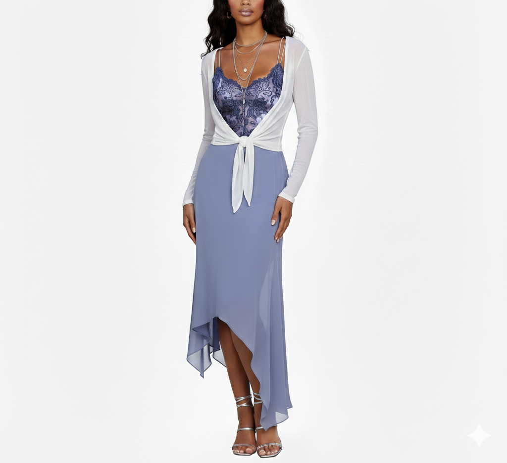
Ethereals are amazing when they wear two of their best colors in the same outfit—for example, a light green top and blue skirt

or a purple top and blue pants

Ethereals are extremely flattered by combining adjacent colors on the color wheel, as shown above.
You can also try colors that are farther apart (e.g., green and purple), though you may find that this doesn’t feel ideal. If combining non-adjacent colors, you’ll likely want to choose (very) light shades, to ensure the effect still feels relatively gentle and serious, rather than playful.
Similarly, you can experiment with combining three or more large amounts of color, though that can feel a bit energetic for Ethereal (especially since this necessarily involves wearing at least two colors that aren’t next to each other on the color wheel).
Tonal color combinations (wearing different shades all from the same color family) are extremely flattering for Ethereal. For instance, you could wear an entirely blue outfit that includes light, medium, and/or dark shades (e.g., light blue top, medium blue pants, optionally add a dark blue sweater). This creates a gradient that Ethereal loves:

This can also work well if you include different colors that are next to each other on the color wheel, like wearing a light purple top and medium blue sweater with dark blue pants.
As noted, including some neutrals can help communicate Ethereal seriousness. Ethereal also loves metallics, such as in layered necklaces or narrow-strapped sandals:
This outfit would suit an Ethereal Romantic blend!
Incorporating metallics can also be a good way to add color contrast while still feeling serious and formal. For example, pairing purple and gold or blue and gold.
Ethereal can do outfits without much light/dark variation, including monochromatic looks. This tends to best suit people with low contrast coloring.
If you have medium or high contrast coloring, you can absolutely include light and dark colors in an Ethereal look. Ethereal has powerful, complex energy that is flattered by contrast.
However, since Ethereal energy is simultaneously peaceful, you may want to be strategic about how you incorporate contrast:
A simple choice is selecting light and dark colors from the same color family, like a light blue top and dark blue pants.
Another strategy is choosing three different darkness levels to create a gentler-feeling transition from dark to light—e.g., dark pants, medium top, light sweater.
You can also choose prints that already include color contrast (especially ombre or watercolor), which can make the contrast feel gentler and less jarring.
Very light or very dark neutrals, or metallics, can also add contrast.
While Ethereal’s absolute best colors are stereotypically cool, the essence is also really flattered by “sunset” color schemes, especially combining adjacent colors on the color wheel. For instance, wearing light pink, yellow, and/or orange in the same outfit:

Sunset color schemes tend to work best when the colors are mostly (very) light to medium-light, and when at least some of your silhouettes or fabrics are also Ethereal.
You can certainly explore sunset color schemes in darker colors, or in fabrics or silhouettes that suit one of your other essences. However, this may sometimes end up creating a playful Gamine feel.
You can also do tonal color combinations with your warmer-feeling colors, such as wearing light pink, medium pink, and red all in the same outfit.
Makeup will be a separate topic, since fashion guidelines don’t always translate directly to makeup. But if you’re highly Ethereal, you might want to try some purple eyeshadow or even purple lipgloss or lipstick!
***
Upcoming posts will explore the best colors and color combinations for the other essences!